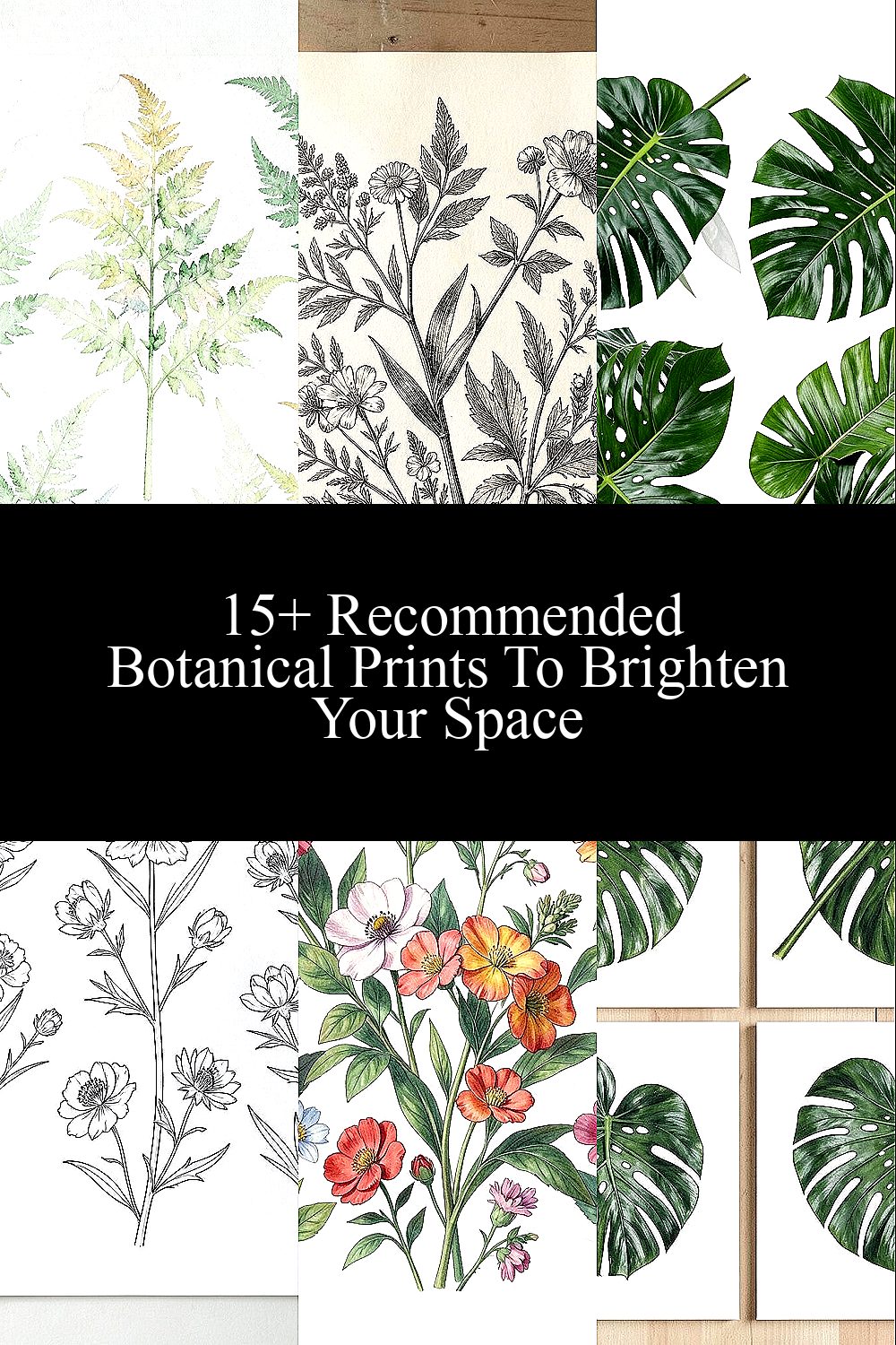
The room feels calmer when walls carry living color. Botanical prints are the easiest way to bring that “fresh outside” feeling indoors.
They can make a small corner look taller, soften a busy space, and add a personal touch without needing heavy changes.
1. Watercolor Ferns for Soft, Airy Walls
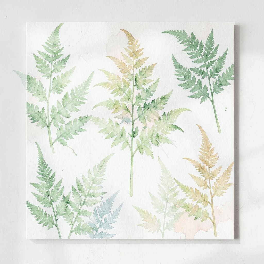
Picture feathery fern leaves floating across pale paper, like a light breeze caught in paint. The greens vary from mint to deeper forest tones, so the artwork feels gentle but not boring.
Ferns create a relaxing vibe that works in bedrooms, reading nooks, and bathrooms. They also hide minor wall unevenness because the brush texture looks organic, not flat. If you want a brighter room, pair the print with warm white frames and a small lamp that bounces light off the glass.
2. Vintage Botanical Engravings for Instant Cozy Charm
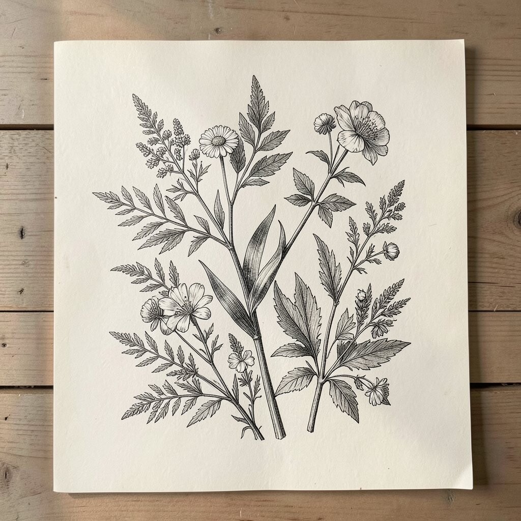
Imagine classic engravings with delicate line work and faded ink tones, almost like old pages from a plant journal. The stems and seed pods feel detailed, and the muted palette makes the space look collected and comfortable.
These prints are great for people who love character without loud colors. They blend nicely with wood shelves, linen curtains, and warm metals. For a practical setup, choose a consistent frame finish across multiple pieces so the look stays neat even if you mix sizes.
To personalize, look for engravings that match what you already collect, like herbs, florals, or botanical labels. If you’re on a budget, search for smaller prints or download-friendly versions from reputable art sources and print at a local shop for crisp lines.
3. Bold Tropical Leaves for a Vacation Mood
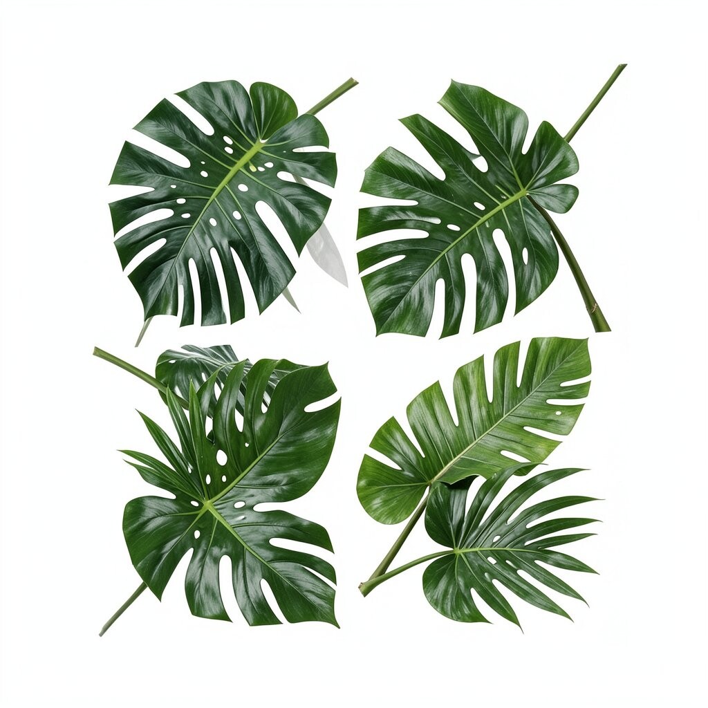
Think of big tropical leaves with glossy textures, like an island postcard spread across your wall. Colors often include deep emerald, sunny lime, and hints of gold that catch attention right away.
This style instantly lifts a room because the shapes are large and the colors feel energetic. It’s especially effective in entryways and kitchens where you want a quick “welcome” effect. Keep the rest of the décor fairly simple so the leaves remain the star.
To make it feel personal, pick a print that matches your favorite plant vibe, whether that’s banana leaves, palm fronds, or monstera silhouettes. If you want an easy match, coordinate pillow colors with one or two leaf tones. For cost considerations, larger prints can be pricey, so consider a triptych set of smaller panels that still creates that bold tropical feel.
4. Minimal Line-Drawn Blooms for Clean, Modern Calm
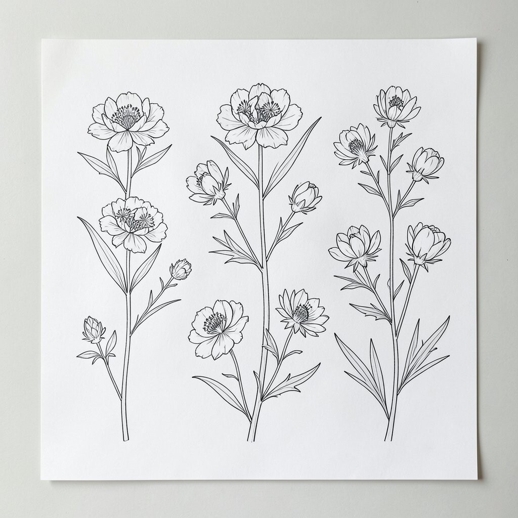
Picture thin black lines forming roses, blossoms, or wildflowers, with wide space around them. The result feels airy and modern, like a quiet sketch rather than a crowded collage.
This kind of botanical print works well in apartments and offices because it doesn’t overwhelm the room. It’s also a smart choice if you love neutral décor, since the artwork adds interest without turning everything colorful. Choose a matte frame to keep the look crisp, and keep the print slightly above eye level for an effortless gallery feel.
5. Color-Blocked Florals for Playful Contrast
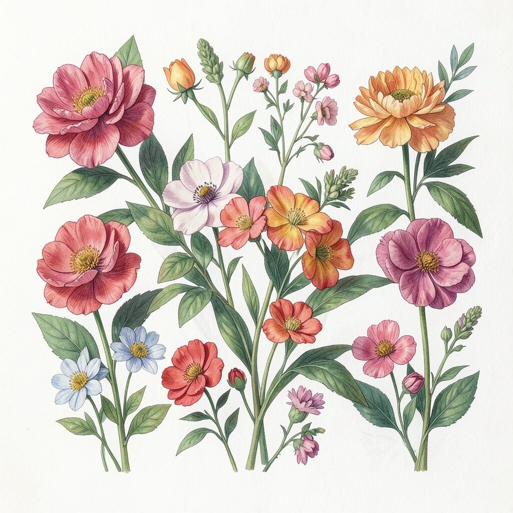
Imagine flowers arranged in bright blocks of color, with petals simplified into shapes that pop. This style looks fun even when you choose only a few hues, like coral with teal or sunflower yellow with soft lavender.
Color-blocked florals are great for sparking energy in creative spaces. They pair beautifully with geometric rugs and modern furniture because the forms echo the design style. To avoid visual chaos, choose a print where one background color repeats in your room, like the color of a chair, curtain, or lamp base.
For personalization, pick florals that match your seasonal favorites, such as spring blossoms in warmer shades or deeper tones for fall. If you’re watching your budget, look for affordable print runs or poster-size options, then upgrade the presentation with a quality frame you can keep for years.
6. Monstera Prints for Bold Structure and Easy Style
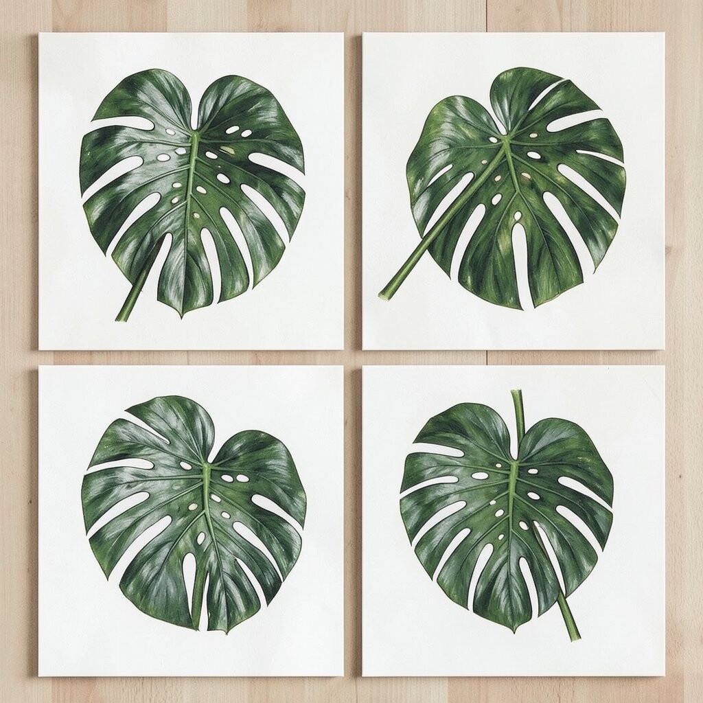
Monstera leaves have that iconic shape that instantly reads as stylish, even from across the room. A print featuring bold splits and thick outlines feels structured, like modern architecture made of plants.
This artwork brings a strong focal point while still staying natural and soothing. It’s a great pick for living rooms, especially if your furniture is simple and you want the wall to do the talking. To set it up well, measure the wall area and choose a size that leaves a little breathing space around the frame.
You can personalize it by matching the leaf tones to your plant collection, such as echoing the depth of your own monstera’s green. If you want a smoother look, pair the print with solid curtains and keep plant pots in similar finishes like terracotta or matte black. Cost-wise, monstera styles are often widely available, so you can find options from budget posters to premium art without too much trouble.
7. Botanical Still Life for a Painterly, Romantic Feel
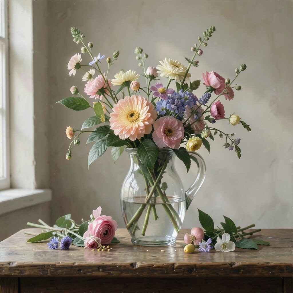
Picture a vase or arrangement of flowers rendered with soft shadows and gentle brushwork. Even when the blooms are simple, the composition feels balanced, like a calm moment captured on canvas.
Botanical still lifes add warmth because they suggest depth and careful styling. They work beautifully in dining rooms and hallways where you want a slightly romantic mood. For practical results, choose a print with a warm background tone if your floors or furniture lean honey-colored.
8. Pressed Flower Style for a Delicate, Natural Touch
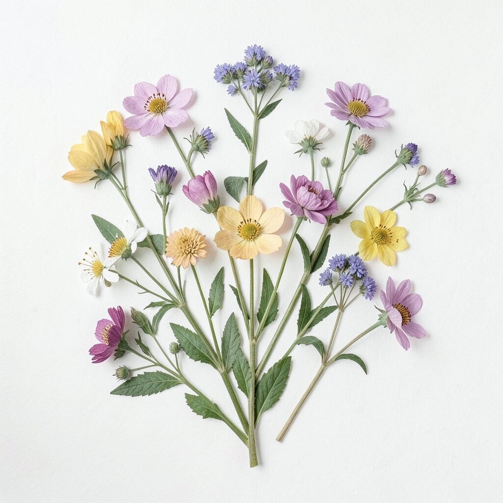
Pressed flower prints make leaves and petals look flattened and preserved, like nature’s own scrapbook. You’ll often see soft browns, dusty pinks, and quiet greens that feel gentle and real.
This look is perfect if you want something unique that won’t feel mass-produced. It also pairs nicely with rustic wood, wicker baskets, and simple fabric textures. To personalize, pick flowers that match your memories, like ones from a favorite garden, a wedding bouquet, or a roadside stop during a trip.
For cost considerations, smaller pressed-flower prints are usually easier to find within budget. You can also build a set over time, starting with one frame and adding matching pieces later so the collection feels intentional.
9. Citrus Branches for Bright, Fresh Energy
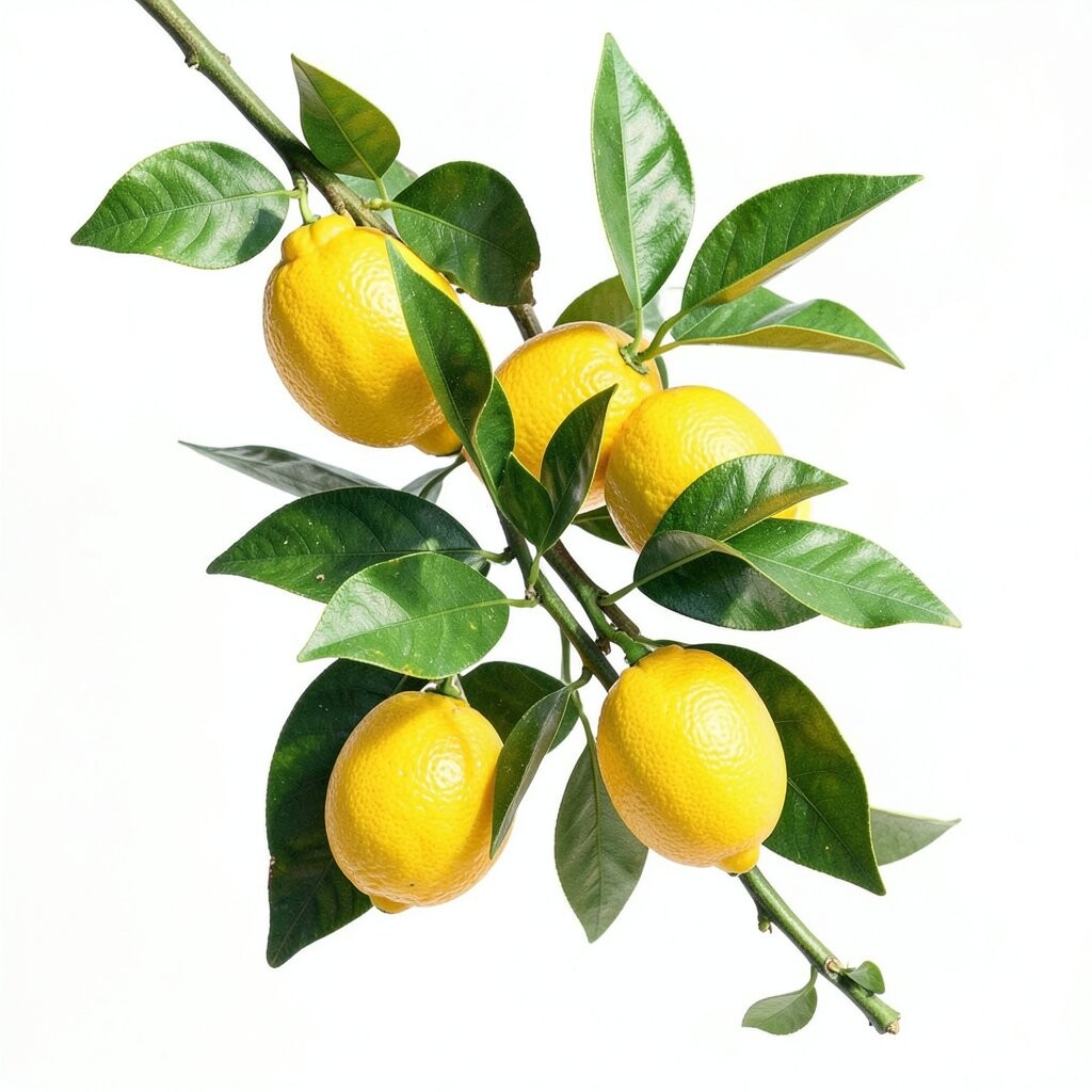
Imagine citrus branches with small leaves, round fruits, and a sunny color palette that feels like morning light. The artwork often includes warm yellows and oranges that can make a dim room look energized.
Citrus prints are a fun way to add brightness without turning your décor into a neon party. They work especially well in kitchens, breakfast nooks, and sunny hallways. For an easy match, coordinate with dishware colors or a curtain shade that echoes the fruit tones.
Personalize by choosing a print that includes both fruit and blossom details, which gives the piece more visual texture. If you want a trend-friendly look, lean toward modern botanical illustrations with clean shapes and minimal shading. For budget comfort, search for standard frame sizes and buy the print as part of a set to reduce extra costs.
10. Watercolor Wildflowers for Everyday Charm
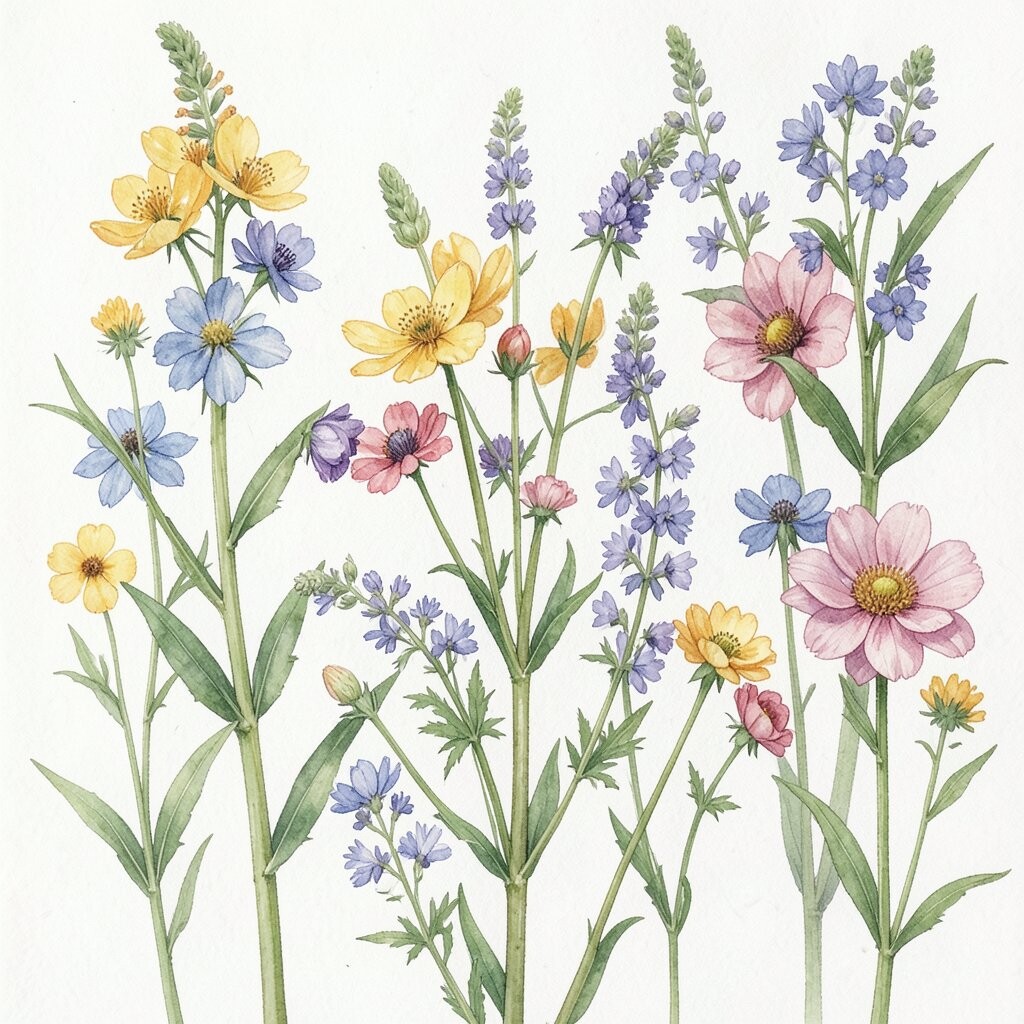
Wildflower paintings feel like a bouquet that never stops growing, with varied colors and soft edges. You might notice tiny details in petals and leaves that make you want to look closer.
They bring warmth and friendliness to everyday spaces, which is why they’re such a popular choice right now. Wildflowers also work well in rooms that already have patterns, because the artwork style usually looks light and breathable. For practical styling, keep the frame color simple, like oak, black, or white, so the colors stay the focus.
11. Botanical Maps for Curious, Worldly Style
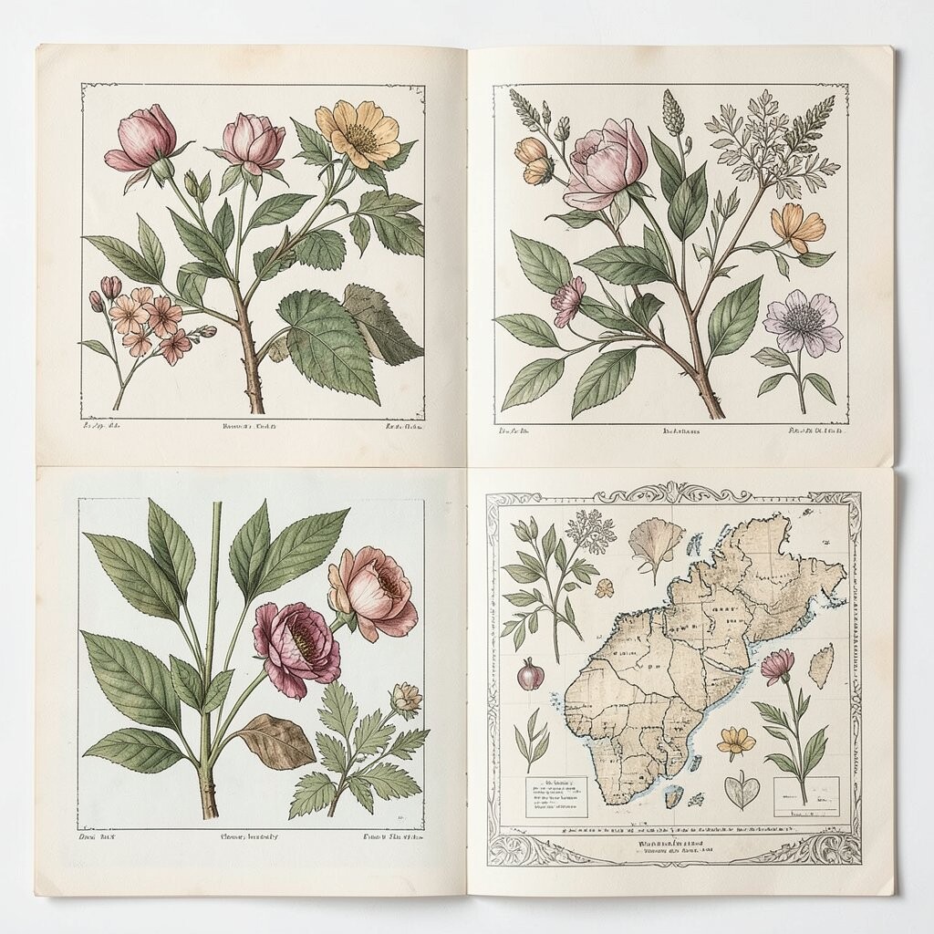
Think of illustrated plant names arranged like a map, with stylized roots, branches, and place-like labels. The design can feel both educational and artistic, giving your wall a story without needing extra décor.
This option is unique because it blends geography and nature, which makes it stand out from typical floral art. It’s a great fit for libraries, study corners, or home offices where you want a thoughtful vibe. To personalize, choose a map theme that fits your life, like a region you’ve visited or a style that matches your reading interests.
Cost considerations are usually flexible, since botanical map prints come in many sizes and price ranges. For an actionable approach, frame it with a mat that adds breathing room, which helps the small lettering look sharp and clean.
12. Botanical Patterns for a Layered, Textured Look
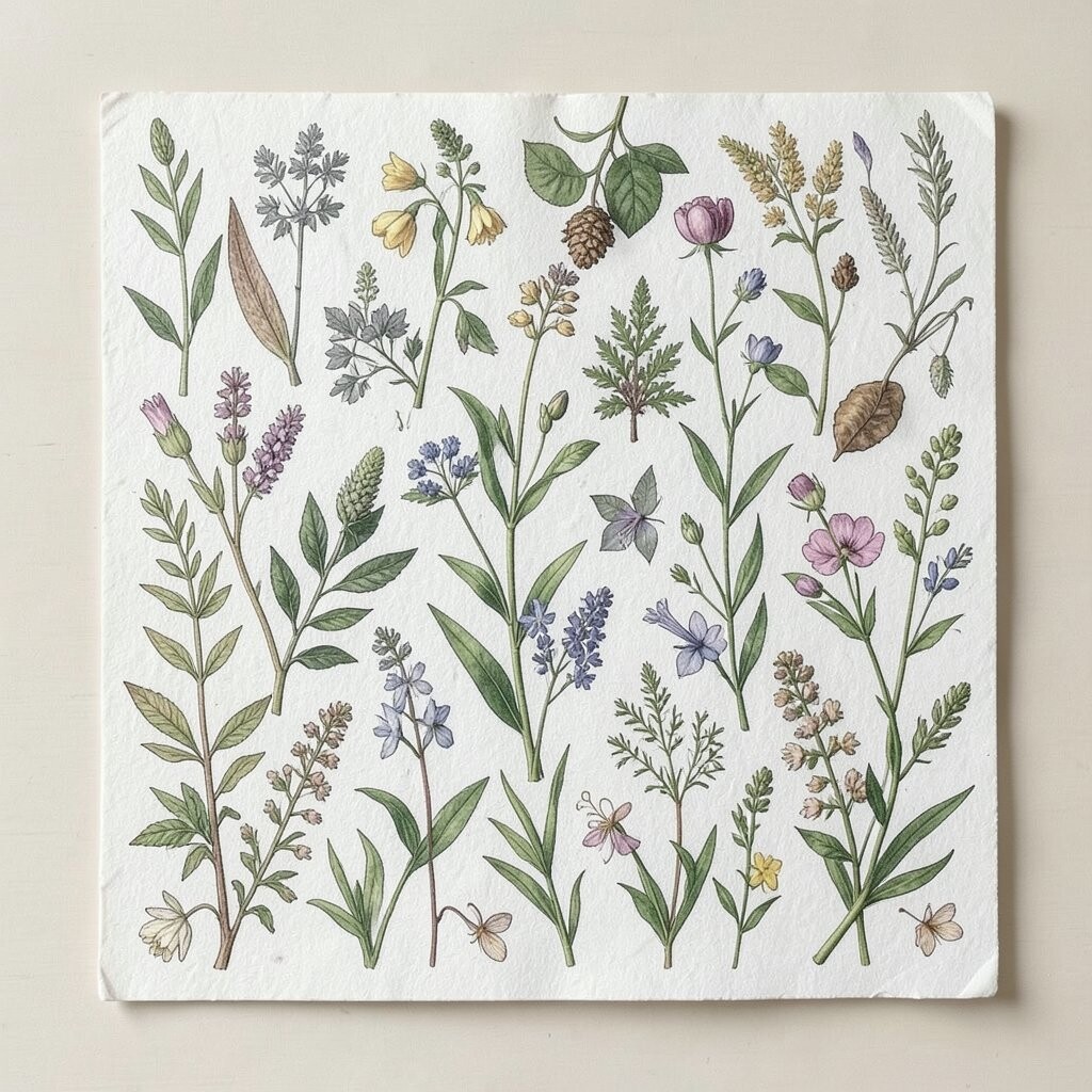
Some botanical prints are designed like repeating patterns, with leaves and flowers repeating in a steady rhythm. When you pick bold pattern scales, the wall can look richly layered even with a simple frame.
These prints are great when you want a modern twist, especially if your room already has neutral walls and furniture. Patterned botanical art can also tie together mismatched pieces by repeating color tones across the design. For a practical tip, choose a pattern print that includes at least one color already in your cushions, rug, or artwork.
13. Pressed Botanical Collage for Artistic Contrast
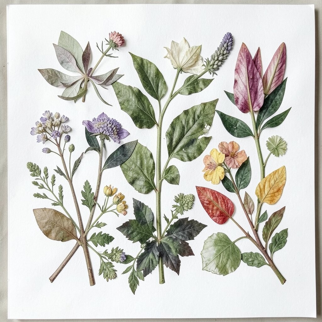
Imagine a collage where plant elements overlap like cut-paper layers, often with subtle edges and uneven textures. The piece feels handcrafted, and the mix of greens, creams, and light browns makes it easy to style.
This kind of print adds depth, which helps the wall feel more interesting without adding clutter. It’s unique because it can look like a one-of-a-kind craft, even when it’s produced as art. To personalize, choose a collage style that matches your décor textures, like pairing it with linen curtains or a woven basket shelf.
If you want a budget-friendly plan, consider smaller collage prints grouped together. That way you get the look of a larger statement without paying for one oversized piece.
14. Monochrome Botanical for Chic, Timeless Elegance
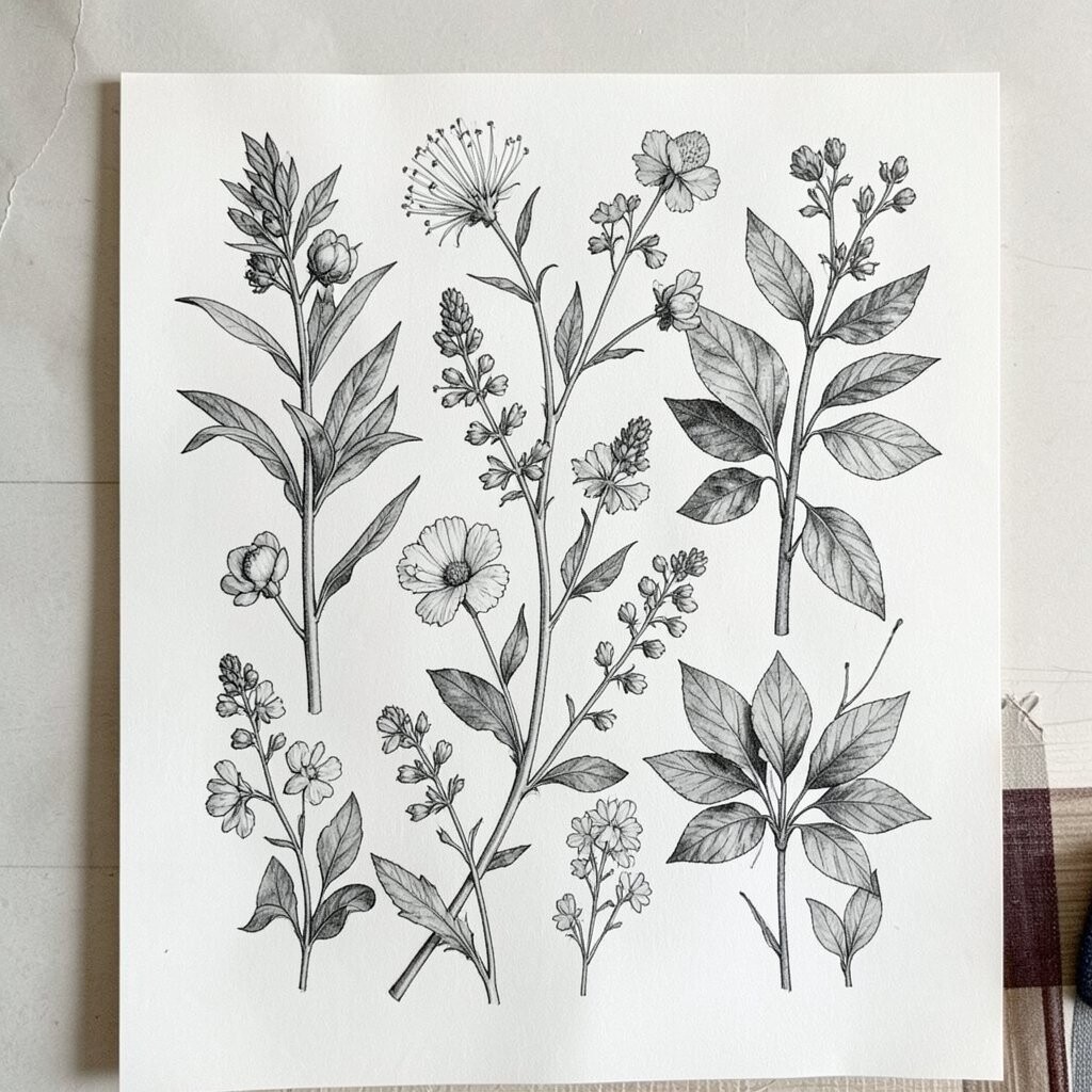
Monochrome botanical prints use one color family, usually black and white or deep charcoal, to create crisp plant shapes. The leaves and blossoms look graphic and stylish, almost like botanical photography without the glare.
This style is a smart choice if you want timeless elegance and easy coordination. It blends well with almost any color scheme, from warm beige to cool gray to bold accent walls. For practical tips, pair the print with a frame that matches your hardware, like brushed brass for warm tones or black for modern spaces.
Personalization is easy because you can build a mini gallery of monochrome pieces, mixing leaf silhouettes with flower studies. Cost considerations can be friendly here, too, since monochrome prints are widely available in many sizes.
15. Flower Portraits for High-Detail Drama
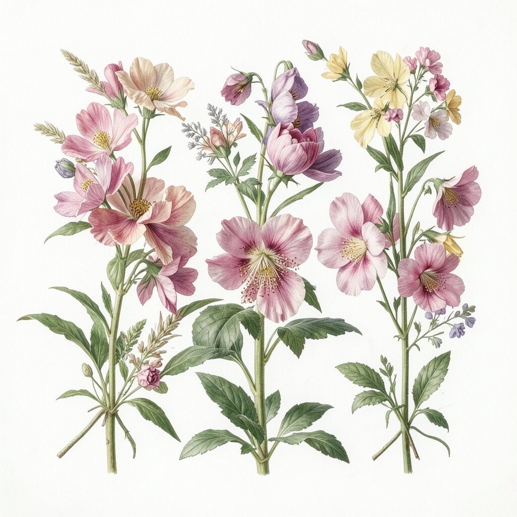
Flower portraits zoom in on petals and leaves so you feel like you’re close enough to smell the blossoms. High-detail prints often show realistic shading, veins, and subtle color gradients.
These prints add drama without needing bright colors, because the detail itself becomes the show. They work well in bedrooms and living rooms when you want one impressive focal point. To make the look actionable, place the print opposite a window or near a light source so textures catch shadows and the colors feel alive.
16. Seasonal Botanicals for Ongoing Refreshes
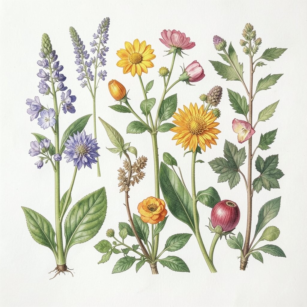
Seasonal botanical prints can shift your space throughout the year, like spring blossoms, summer palms, autumn leaves, or winter evergreens. The artwork feels like a gentle seasonal update rather than a total makeover.
This approach is popular because it keeps your décor feeling current without constant furniture changes. It also helps personalization because you can choose prints based on your actual experiences, like the trees you see outside or the colors you love during holidays. For practical tips, store the frames you already love and swap only the artwork inserts, which saves money and keeps your gallery consistent.
If you’re thinking about cost, buying a small set of seasonal prints is often cheaper than replacing everything at once. Look for prints that share a similar frame size, so each swap feels seamless and cohesive.