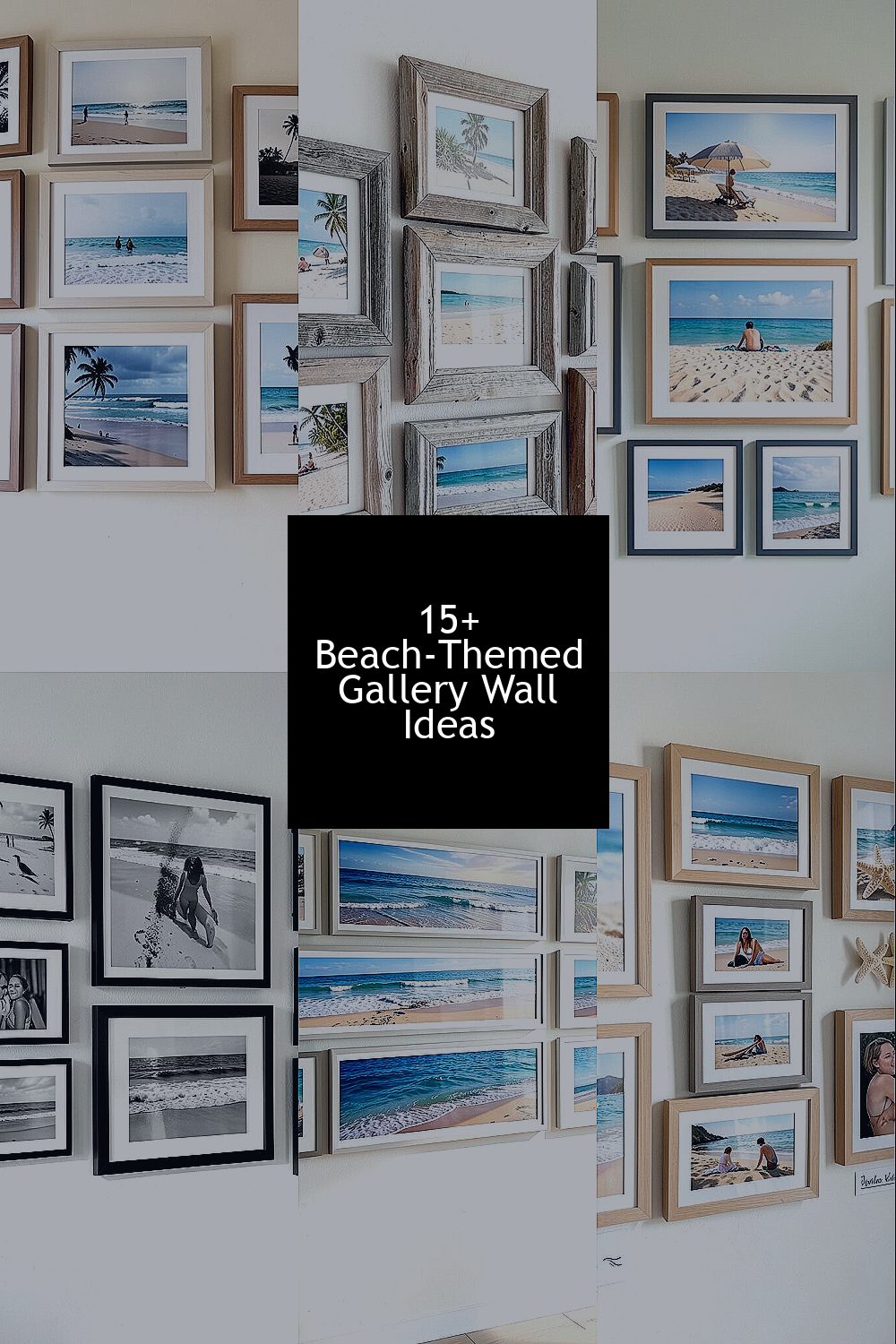
The ocean has a way of making rooms feel calmer. A beach-themed photo gallery wall can bring that mood home, day after day.
1. Seaside Silhouettes in Matching Frames
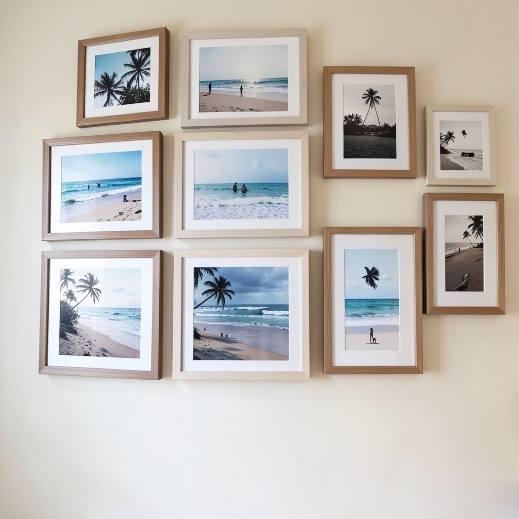
Choose a set of frames that match in color and finish, then fill them with photos that feature sandy shores, gentle waves, or faint silhouettes at sunset. As you look at the wall, your eyes naturally settle into a soothing rhythm, because every image feels part of the same story.
To keep the layout easy, start by dry-arranging frames on the floor before you hang anything. Use consistent spacing so the wall looks tidy even when the photos vary in size. For personalization, add one frame with a close-up shot of seashells or driftwood so it feels special instead of overly themed.
2. Weathered Driftwood Frames for Rustic Charm
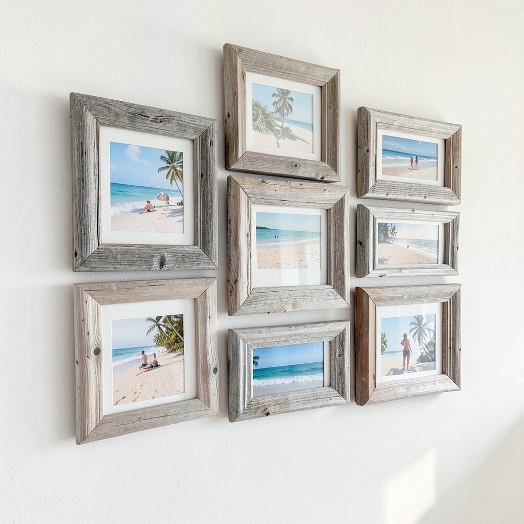
Pick frames that look weathered, like driftwood, and pair them with beach photos that show tide pools, rocks, or shoreline textures. The worn look adds character, and it pairs perfectly with warm, earthy decor.
When you hang these frames, aim for a slightly organic arrangement rather than perfectly straight lines. That small choice helps the wall feel natural, like it belongs in a coastal cottage. If you want to keep things affordable, check thrift stores, discount craft shops, and online marketplaces for similar frame styles.
For practical balance, keep the photos mostly in similar tones, such as sand, seafoam, and muted sky. A wall like this can make a hallway feel inviting, because it brings a lived-in calm to every step. Personalize further by using one photo printed on matte paper to reduce glare under bright lighting.
3. Sun, Sand, and Sea Color-Block Gallery Layout

Build your gallery wall around a simple color plan using your beach photos as the palette. If you group warm sand tones, cool ocean blues, and pale sky images together, the wall will look like it was designed, not randomly arranged.
Try a layout where you cluster similar colors in blocks, then leave small breathing space between clusters. This makes the wall feel intentional and helps the eye move smoothly across it. Use thin frames in white or light wood so the colors stay bright and fresh.
For personalization, swap one standard beach photo for a vintage-style print or a photo with softer contrast. If you love current trends, the mix of modern clean frames with slightly nostalgic photo looks is very popular right now. When budgeting, remember that print quality and good spacing can matter more than expensive frames.
4. Coastal Black-and-White for Timeless Style
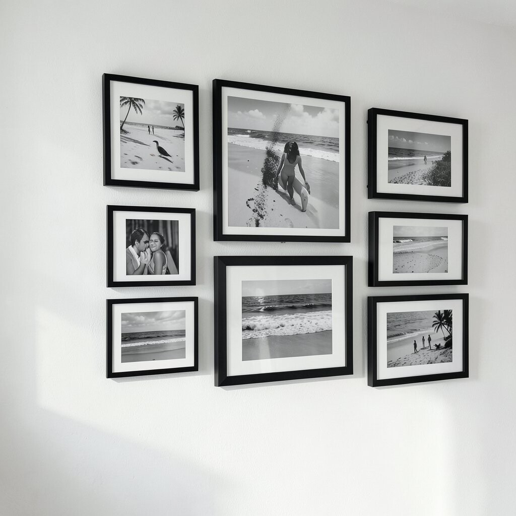
Black-and-white beach photos can look surprisingly classy, especially when you frame them with sleek borders. The contrast of waves and sand becomes graphic, and the wall feels timeless instead of overly literal.
Use a mix of sizes if you want a gallery feel, but keep the frame color consistent. This helps the wall stay neat while still looking full. A practical trick is to label the back of each frame with which photo goes where, so you can reposition without confusion during setup.
5. Horizontal Photo Strips Like Ocean Panorama
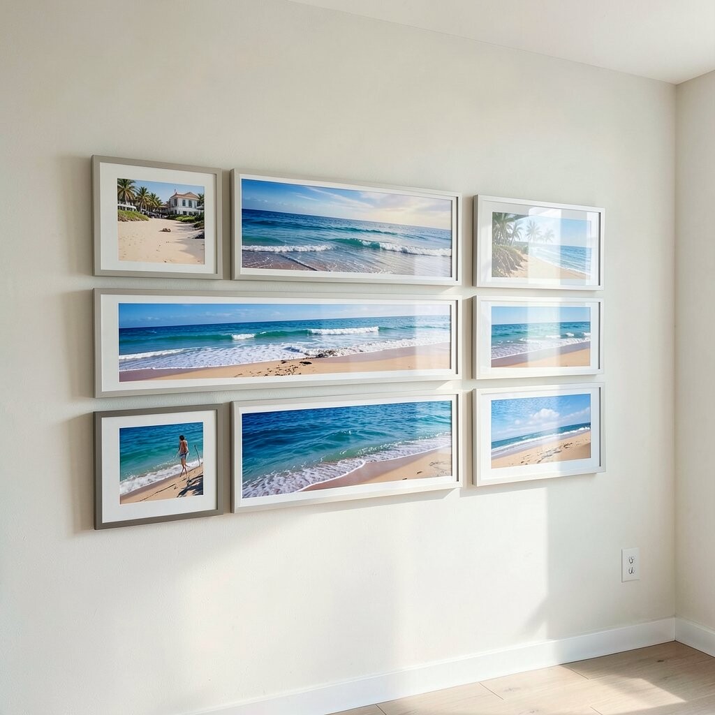
Instead of hanging only single photos, use horizontal strips that mimic wide ocean views. A row of panoramic images can make a room feel larger and more open, especially in spaces like dining areas or home offices.
Choose a repeating frame width and hang each strip at the same height, then vary the images slightly for natural movement. Personalize by including one photo that shows the shoreline from a low angle, which adds drama without needing extra decor.
To keep cost down, consider printing a few high-resolution panoramas and using inexpensive frames for the rest. When you choose paper, matte finishes often look great for coastal scenes because they reduce glare. This style also matches the trend toward warm minimalism, where fewer visual elements still create strong impact.
6. Starfish and Tides: Mix Photos With Small Clues
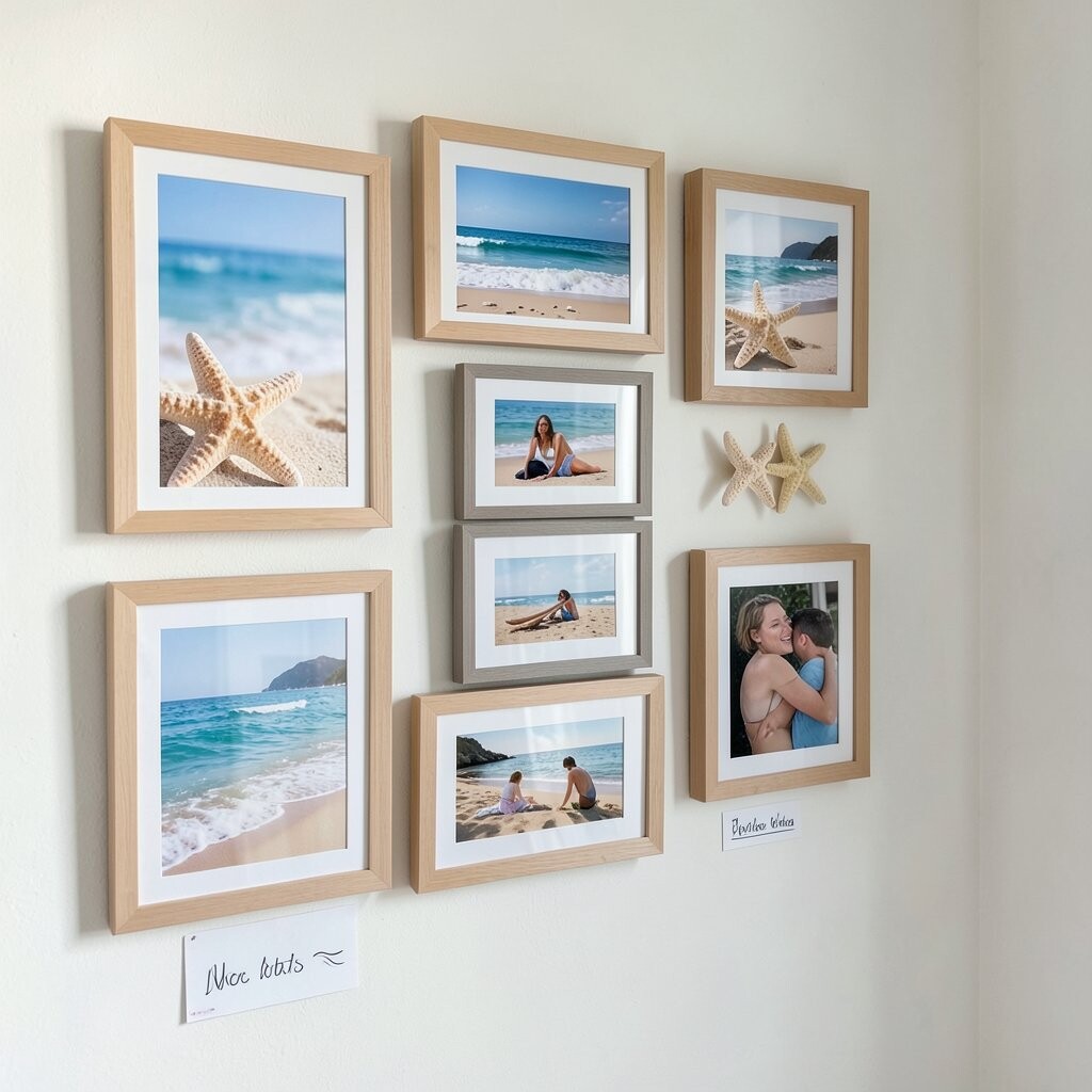
Make the wall feel playful by mixing framed photos with small beach-themed details tucked into the overall gallery. You can keep it subtle by choosing images that already include starfish, shells, or tidal markings, so the theme stays natural.
Use a consistent frame style, then rotate photos with one or two frames that have slightly different textures, like linen matting. That tiny texture change adds richness and makes the display look more curated. For practical hanging, measure from your floor and mark a center point so the wall stays balanced.
If you want uniqueness without clutter, pick one photo where the focal point is a single shell. That “quiet” image gives the gallery a pause, making the wall feel calmer rather than busy. Budget-wise, you can create that extra interest with matting and print choices instead of buying extra decor.
7. Floating Shelf Gallery With Framed Moments
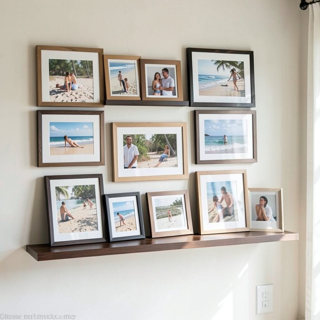
Use narrow floating shelves to support frames above and alongside each other. This approach adds dimension because part of the wall stays open, and your beach photos feel like they’re gently displayed.
When you place frames on shelves, keep the largest photo near the center and smaller ones toward the edges. The wall looks intentional, and it’s easier to swap prints seasonally. For personalization, change just the center frame for holidays, or add a new summer shot without reorganizing everything.
To stay practical, choose shelves that can handle the frame weight and use anchors where needed. If you’re working with a tighter budget, consider simple, painted shelves that match your frame color. Current styling trends often favor layered, display-like walls rather than flat, fully uniform grids.
8. Vertical Portrait Frames for a Tall, Airy Look

Vertical framed beach photos can stretch upward and make ceilings feel higher. The tall format works beautifully for images like cliffs, tall waves, or sun rays breaking through clouds.
Hang your vertical frames with even alignment so they form a tidy backbone, then add a few horizontal photos as accents. This gives you movement without losing structure. For personalization, choose one photo of a shoreline path so it visually leads the eye through the wall.
Cost considerations are simple here since you can buy fewer frames by focusing on vertical storytelling. If you want to keep the theme cohesive, use similar print finishes and avoid overly bright colors that may fight with your home’s palette. Many modern coastal interiors also lean into airy, vertical composition to keep rooms feeling light.
9. Vintage Travel Prints With Beach Postmark Vibes
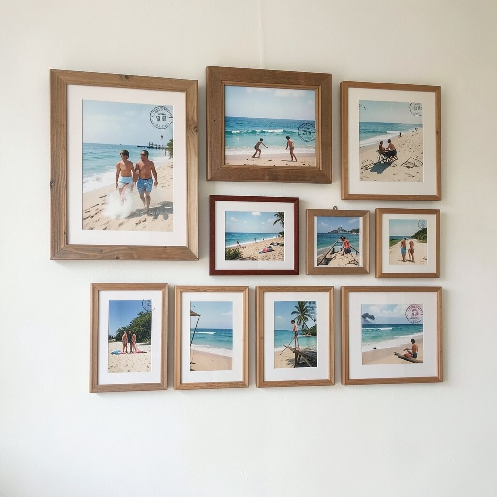
Bring nostalgia into your home by framing vintage-style beach prints that look like postcards. The visual charm feels warm, and it turns everyday wall space into a mini memory shelf.
To make it authentic, choose photos with soft grain or slightly faded colors, then pair them with frames in antique white or dark walnut. That mix adds uniqueness while still reading as coastal. Use practical labeling by keeping the digital files organized, because you may want to swap in new travel photos later.
If you’re customizing on a budget, you can often update the look just by changing the mat color and using consistent fonts for any simple text overlays. Current trends show interest in personal travel galleries, where the “story” matters as much as the images. Keep a few photos in color and a few in vintage tones to avoid a flat, uniform look.
10. Frame Wall Around a Central Statement Photo

Pick one “wow” beach photo and let it anchor the whole gallery. Place it at the center, then surround it with smaller frames that echo the same scene style, like sand textures, wave movement, or wide sky views.
This layout benefits busy homes because it gives the wall a clear focal point. Your guests won’t feel overwhelmed, and the room will look styled even when you only have a few beach photos. For practicality, use a level and confirm the center frame is straight before you hang anything else.
Personalize by choosing a center photo that means something to you, such as a place you visited as a family. You can also swap one surrounding frame to match a new photo each season so the display stays fresh. Cost-wise, the center frame can be your “splurge” while the rest can be simple and affordable.
11. Sea Glass Color Frames for Bright, Happy Contrast
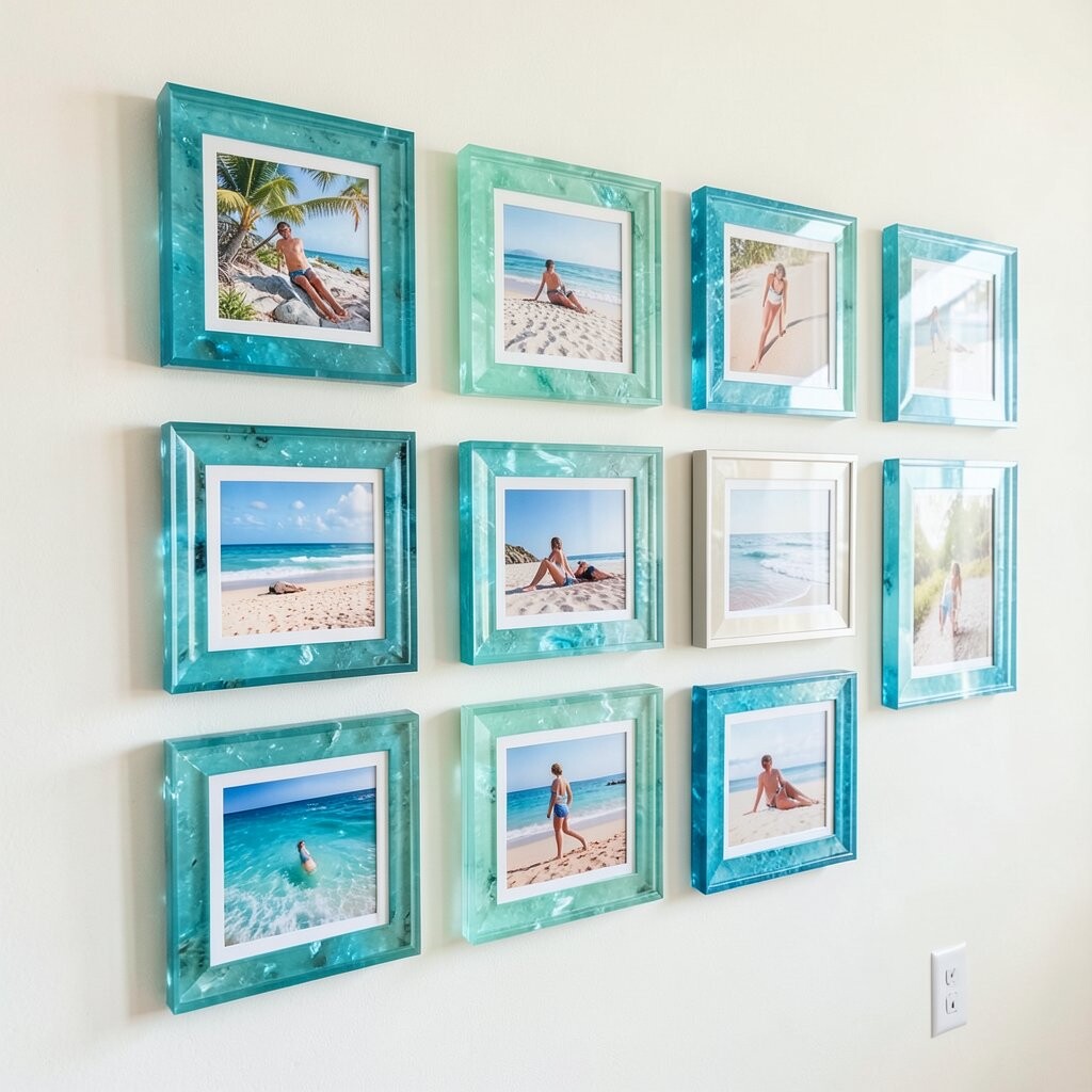
Go for frame colors that resemble sea glass, like mint, seafoam, soft aqua, or pale sand. When your beach photos include natural blues and greens, these frame colors make the whole wall feel cheerful.
To keep it from looking messy, limit yourself to a small palette and repeat those colors across multiple frames. That repetition creates a pattern, and patterns are one of the easiest ways to make a gallery look designer-made. For personalization, add one frame with a photo of shoreline rocks in cool gray tones so the sea glass colors feel balanced.
Cost considerations are manageable because you can paint thrifted frames yourself if you enjoy DIY. A quick coat of spray paint in a satin finish can refresh old frames fast. This style fits current coastal trends that lean bright and playful rather than purely muted.
12. Monochrome Seascapes With Navy Matting
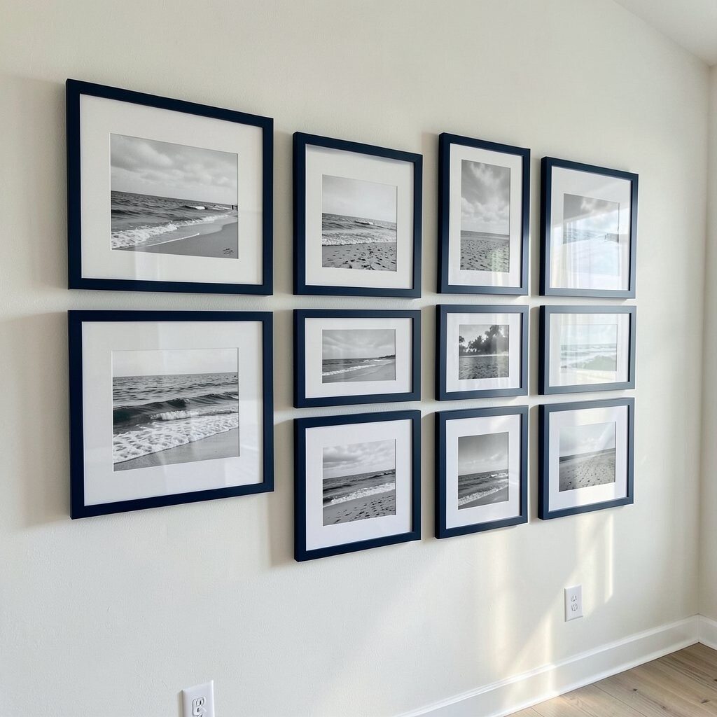
Pair black-and-white or soft monochrome seascapes with navy mats for a crisp, ocean-inspired contrast. The navy makes the photos pop and adds depth without needing loud colors.
Choose frames that are simple and neutral, then keep mat openings consistent for a clean look. This benefit shows up every day since the wall stays neat visually, even if you have different photo sizes. Use a template cut from paper to mark mat placement, which is a practical way to avoid uneven lines.
Uniqueness can come from your photo selection, like close-ups of wave edges or the underside of piers. Personalize by adding one slightly different tone image, such as foggy shoreline, to keep the story varied. If you want to control spending, buy mats in bulk sizes and use fewer but higher-quality prints.
13. Gallery Wall With Different Frame Widths, Same Theme

Create a layered look by using different frame widths while keeping the style consistent. A mix of thin and medium frames can add movement, and your beach photos feel richer as they overlap in the eye.
To keep it cohesive, match frame finishes such as all wood tones or all painted finishes. This helps the wall stay unified even when the layout is varied. For personalization, include one oversized photo with a clear horizon line so the wall feels grounded.
Cost considerations are flexible since you can use a mix of affordable frames and a few pricier ones for the star images. Many people find that spending on print quality and matting makes the biggest difference in how “finished” the gallery looks. This design also mirrors a trend toward curated, eclectic styling where the theme is clear but the structure is relaxed.
14. Linen-Wrapped Frames for Soft Beach Texture
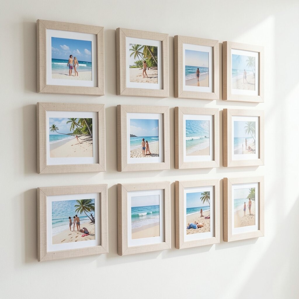
For a gentle, cozy vibe, use frames with linen or fabric-like matting, then choose beach photos that feel calm and airy. The texture adds warmth, and it makes the wall feel more like home than like a store display.
When you place these frames together, keep your color choices soft, such as sandy neutrals, pale blue skies, and muted seafoam. This visual approach helps the wall blend with everyday decor. Personalize by selecting one photo that includes a beach house facade or a worn boardwalk for extra story.
From a practical standpoint, linen textures can hide minor imperfections in prints, which is helpful if you’re using photos from different sources. If cost is a concern, look for linen-look mats or budget frames that you can add adhesive mat overlays to. The result feels unique while staying approachable.
15. Beach Map Prints and Photo Pairing for Storytelling
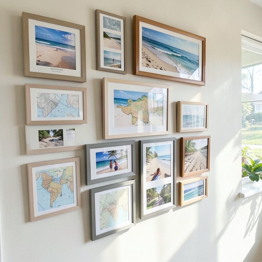
Pair framed photos with simple beach map prints to create a wall that tells where the memory happened. Even if the map is minimal, it adds meaning, and it gives the gallery an extra layer beyond just beautiful scenery.
Use thin-line map prints and frame them the same way as your photos so everything looks collected. The benefit is that the wall feels curated instead of random, because each element supports the theme. For personalization, use a map style that matches your favorite beach area, or include a small marker style through creative print editing.
Cost considerations are usually friendly because many map-style graphics can be sourced or designed inexpensively, and printing them on standard paper keeps it simple. If you want current trend alignment, this “place-based” styling is popular, since it feels personal and not generic. Keep the map frames fewer in number so your photos stay the main focus.
16. Coastal Gallery Wall for Kids’ Beach Memories

Create a beach photo gallery that includes kid-friendly moments like sandcastle days, playful wave splashes, and family walks along the shore. Bright, happy images can make a home feel joyful, and a gallery wall turns those moments into something you live with.
Use sturdy frames and consider acrylic fronts for extra durability if the wall sits near busy areas. A practical benefit is that these frames can handle everyday bumps better than glass, especially in high-traffic hallways. Personalize the story by adding one frame that captures a “then and now” comparison photo from different years.
When planning costs, you can balance the budget by printing fewer photos in larger sizes and using simple frames for the rest. This also matches current home trends that celebrate lived-in family spaces rather than overly formal decor. Keep spacing consistent and choose mats in cheerful neutrals so the wall stays cohesive even when the photos are high energy.