There’s something wonderfully calming about walking into a room with handmade texture underfoot or on the wall. Artisan clay tiles bring warmth, character, and a touch of color that feels personal.
1. Sunlit Terracotta Steps
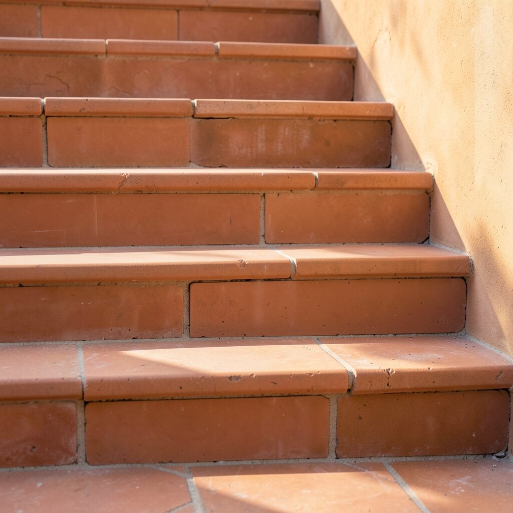
Picture a entryway where terracotta tiles catch the morning glow and turn it into a warm welcome. Their earthy tones look great with wood doors, woven baskets, and light curtains.
Clay tiles hold heat longer than you might expect, which can make chilly floors feel friendlier. They also resist everyday scuffs better than many glossy surfaces, especially when sealed well. If you want a cozy feel, choose a matte finish and pair it with soft neutral walls.
2. Hand-Painted Moroccan Starburst Walls
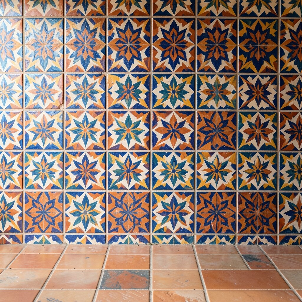
Think of bold star patterns that look like they were drawn by a careful artist, tile by tile. When the light hits the raised ridges, the design seems to move slightly throughout the day.
Because each tile is handcrafted, no two sections look exactly the same, which keeps your wall from feeling too perfect. To keep the look balanced, mix the patterned tiles with solid complementary colors in nearby areas. For a practical layout, install the stars behind a vanity mirror or on a short kitchen backsplash run.
While artisan paintwork can cost more than standard tile, you can save by using it as an accent rather than covering every inch. Consider asking about stain resistance and glaze thickness so the finished surface stays bright in a splash zone.
3. Sea-Glass Ocean Glaze Backsplashes
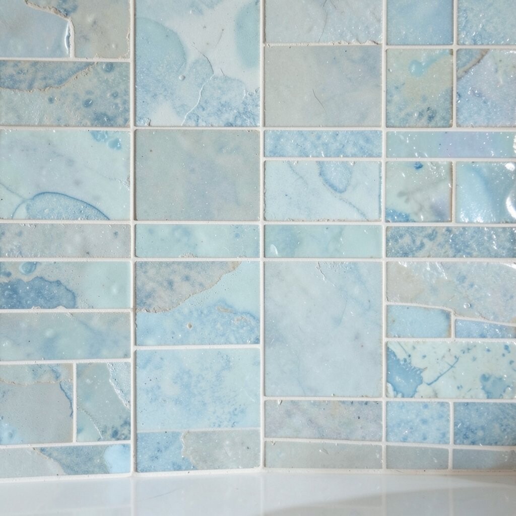
Imagine kitchen tiles that shimmer like sea glass, ranging from minty green to pale aqua. The glaze gives a gentle glow that makes counters look cleaner and more inviting.
That glassy surface helps water bead up, so splatters wipe away more easily during busy meal prep. If you love color but want it calm, pick a limited palette and let the glaze do the work.
For personalization, order a custom mix of tones so your backsplash matches your dishware or bar stools. As for cost, you can keep spending in check by choosing smaller tile sizes for the accent strip and using simpler coordinating tiles for the rest.
One practical tip is to use a grout color close to the glaze so everyday crumbs don’t stand out too much. Current kitchen trends lean toward “soft color” rather than harsh contrast, and ocean-inspired blues fit right in.
4. Vintage Marigold Micro-Mosaic Floors
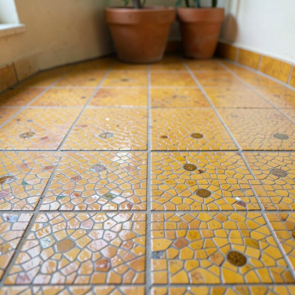
Warm marigold tiles in tiny pieces can turn a hallway into something that feels sunny even on cloudy days. The speckled texture also hides minor dust and wear better than smooth, high-contrast flooring.
Because micro-mosaics create lots of grout lines, they can help reduce the appearance of small chips over time. Keep cleaning easy by sealing the grout and using a gentle pH-friendly cleaner. If you’re aiming for a bright but not loud look, pair the floor with cream paint and simple black hardware.
5. Forest-Flecked Botanical Relief Tiles
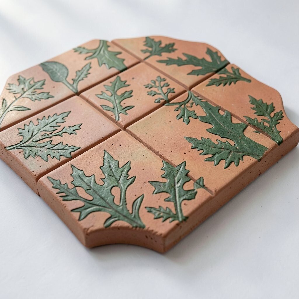
Close up, you can almost feel the leaves and stems pressed into the clay, giving the surface a natural rhythm. A soft green palette with specks of darker tones makes the room feel grounded and lively.
This type of textured tile adds depth without needing extra decor, which is great for small spaces. It can also reduce glare, so light looks softer on the floor or wall.
For personalization, choose a repeating motif that matches your style, like ferns, olive branches, or wildflower sprigs. When budgeting, remember that relief details can raise the price, so consider using them around a focal area like a fireplace hearth. A trend right now favors nature-inspired surfaces, especially in mudrooms and reading nooks.
6. Creamy Speckle “Cloud” Wall Panels
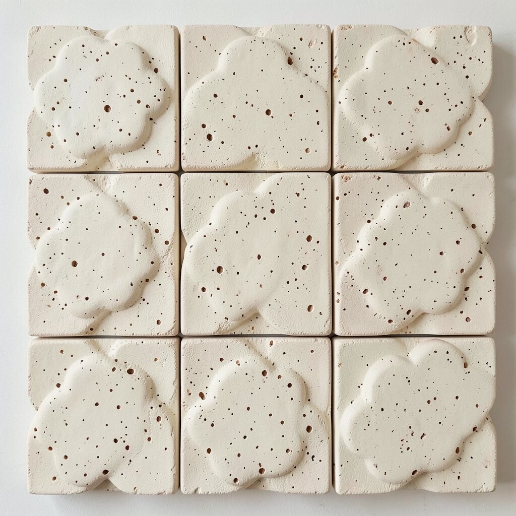
Imagine light tiles with creamy backgrounds and tiny speckles, like clouds drifting across a pale sky. The subtle pattern keeps walls interesting while still feeling calm and airy.
These tiles are especially useful when you want brightness without loud color. The speckling hides minor imperfections and makes the wall look tidy even between cleanings.
To make your home feel more personal, match the speckle tone to your existing hardware finish, like brushed brass or warm chrome. If you want a practical win, install them behind a desk or in a laundry room where stains happen often. Many artisan lines offer different speckle densities, so you can choose a look that fits your budget.
7. Citrus Zest Ombre Kitchen Corners
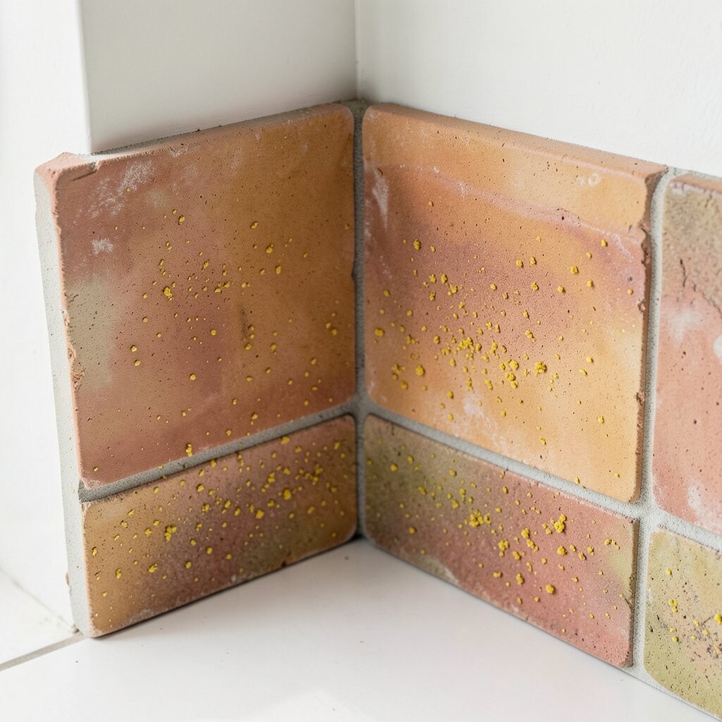
Ombre tiles that fade from bright lemon to mellow honey can make even a small corner feel cheerful. The gradient effect looks like sunlight sliding across the room.
Because artisan ombre is often created by mixing custom glaze batches, the color can feel richer and more layered than mass-produced options. It also creates a natural focal point, which is handy when your kitchen lacks a strong design moment.
For practical installation, keep the transition height consistent so the color flow feels smooth from countertop to backsplash. You can save money by limiting the ombre tiles to the corner or behind open shelving. This style is popular now because it mixes modern layouts with handmade warmth.
To keep it wearable, balance the boldness with simple cabinetry and light grout that doesn’t compete with the gradient.
8. Deep Cobalt Archway Accents
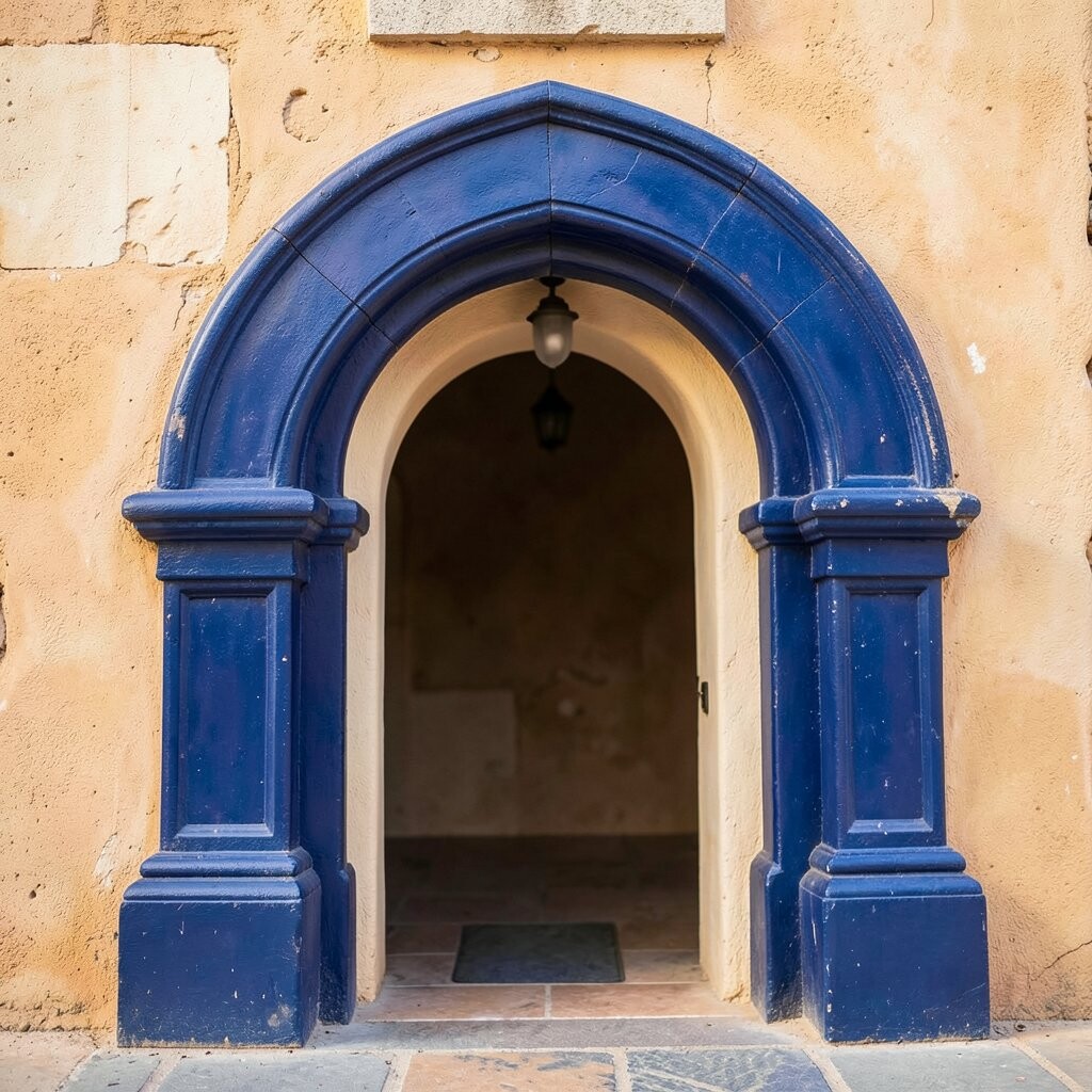
Bold cobalt tiles shaped into arches or curved forms can frame a doorway like a small work of art. When the glaze catches light, the color looks deeper and more saturated.
This kind of accent is a strong way to add personality without tiling the whole space. Curved clay forms can also help soften hard lines in older homes by giving transitions a gentle feel.
If you want it to feel timeless, combine cobalt accents with warm whites and classic materials like oak or travertine. For personalization, choose a slightly different cobalt intensity so it matches your wall undertone, especially if your paint leans warm or cool. Cost can be higher due to specialty shapes, so focus on one area, like around a niche or the sides of a bar.
9. Blush Rose Terracotta Powder Rooms
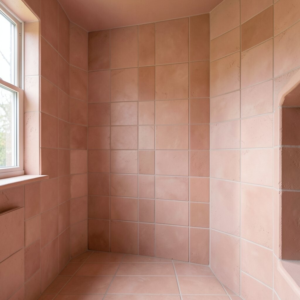
Blush tones with terracotta warmth bring a friendly “just right” color to bathrooms. The surface feels soft and grounded, not cold or clinical.
Clay tiles can be a good match for powder rooms because humidity is usually manageable with the right ventilation and sealing. They also resist everyday splashes when your glaze and grout are cared for properly. For practical style, use a slightly darker grout to keep the look crisp and low-maintenance.
Personalization is easy here, since blush pairs well with gold fixtures, matte black accents, and even pale blue linens. If you’re watching cost, cover the floor or a single wall first, then decide later if you want matching trim around mirrors. Current bathroom design trends lean toward warm color stories, and blush terracotta fits that mood beautifully.
When choosing tiles, ask for samples under your actual lighting so the blush doesn’t skew too pink or too peach.
10. Textured Linear “Ridge” Entryways
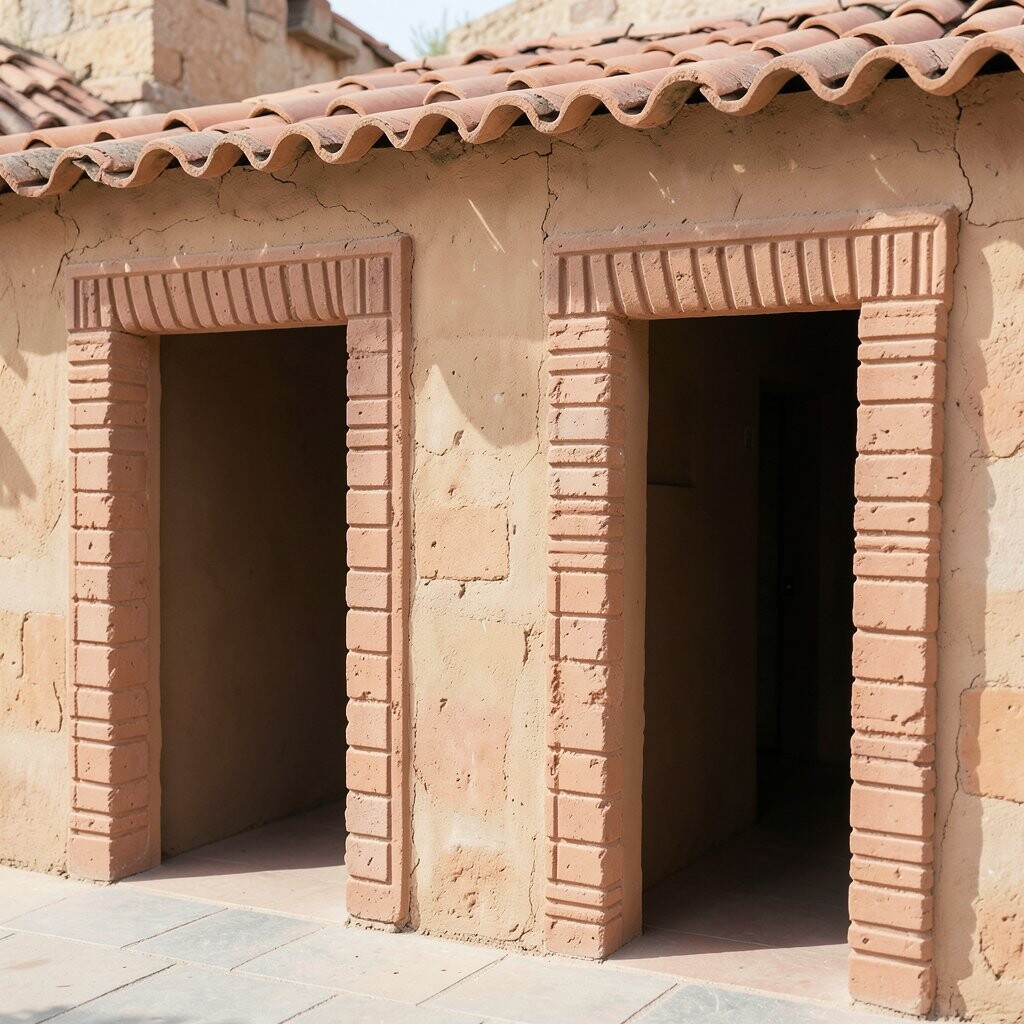
Ridge-pattern clay tiles create a subtle “ribbed” look that feels modern but still handmade. They also add grip, which can be helpful near doors where rain and shoes bring water.
The texture gives your entryway visual movement without needing bold colors or large patterns. To keep the style from feeling busy, choose a single glaze family such as warm white, sand, or light gray.
For practical upkeep, pick a grout color that’s close to the tile so crumbs and dust don’t stand out. If you want personalization, install ridges in a vertical direction along one wall and horizontal lines along the floor edge. Cost varies, but linear styles are often easier to batch in production, which can keep pricing reasonable compared to fully custom artwork.
11. Rusted Bronze Metallic Glaze Tablescapes
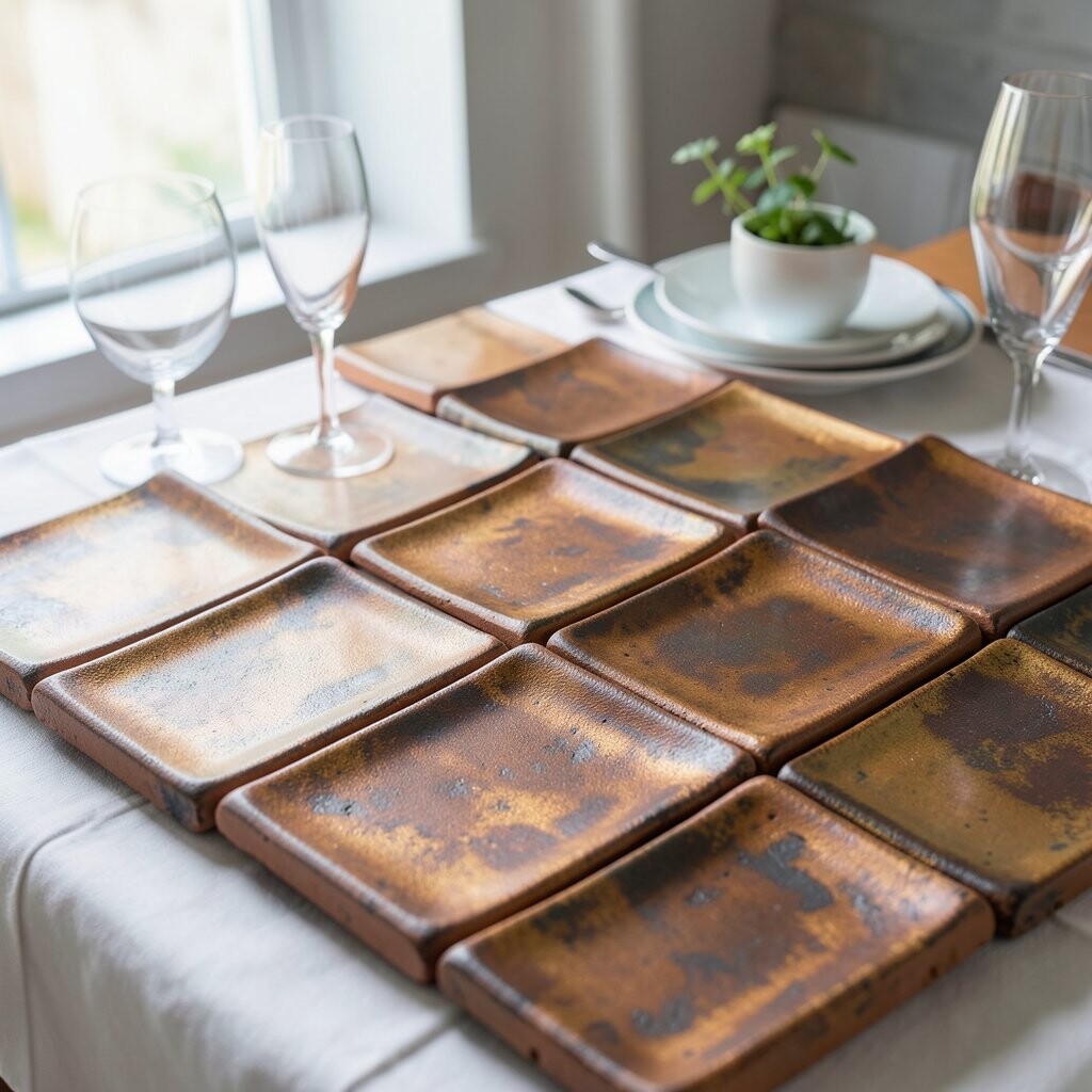
Some artisan clay tiles have a metallic glaze that looks like aged bronze, catching light like a quiet candle. The surface can make a simple kitchen wall or dining nook feel richer.
Metallic finishes can also help create a “spotlight” effect, so a small area looks more dramatic than it actually is. For best results, place these tiles where light naturally falls, like near pendant lights or a sunny window.
To personalize, pair bronze glaze with neutral tones such as warm cream, walnut wood, and natural linen. If you’re worried about cost, use metallic tiles as a border or small pattern inside a larger plain field. Consider how the glaze will wear over time, and look for products meant for walls or floors depending on your install.
12. Plum Velvet Dark Tones for Cozy Nooks
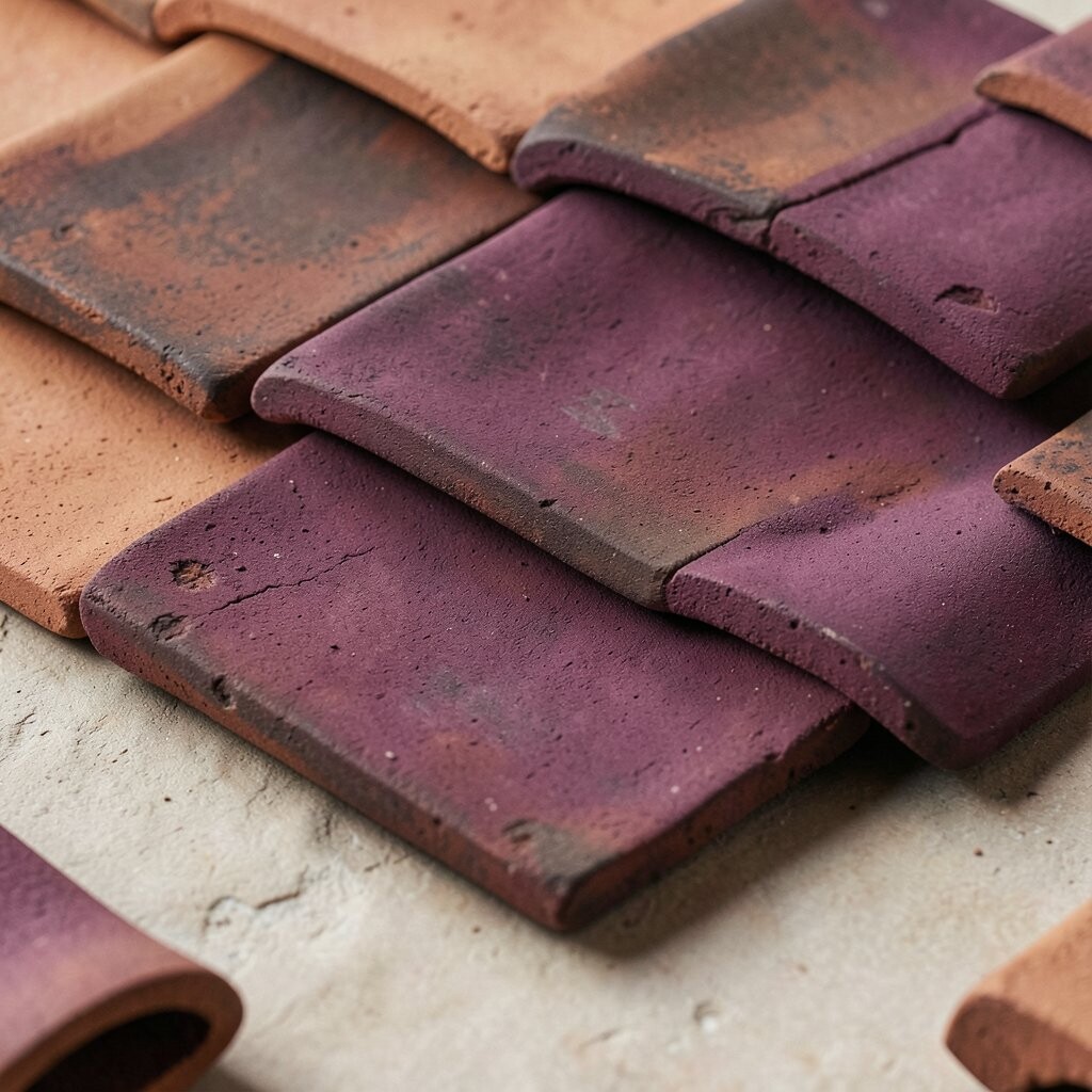
Plum and deep eggplant tiles can make a reading nook feel cozy and a little bit glamorous. The color looks especially stunning when the glaze is slightly satin, not mirror-shiny.
Dark tiles can hide dust and scuffs better than light ones, which is a practical benefit in high-use areas. They also make lighter furniture feel more balanced, like a soft throw on a deep-toned wall.
For personalization, keep the rest of the room light so the dark tile becomes a comforting backdrop rather than a heavy wall. If you want to control budget, cover only one wall or create a partial height feature behind a chair. A current trend favors moody colors, and plum clay tiles are a great way to bring that look in a warm, handmade way.
When cleaning, use gentle methods and avoid harsh abrasives so the glaze stays smooth and pretty.
13. Mint and Pearl Checkerboard Highlights
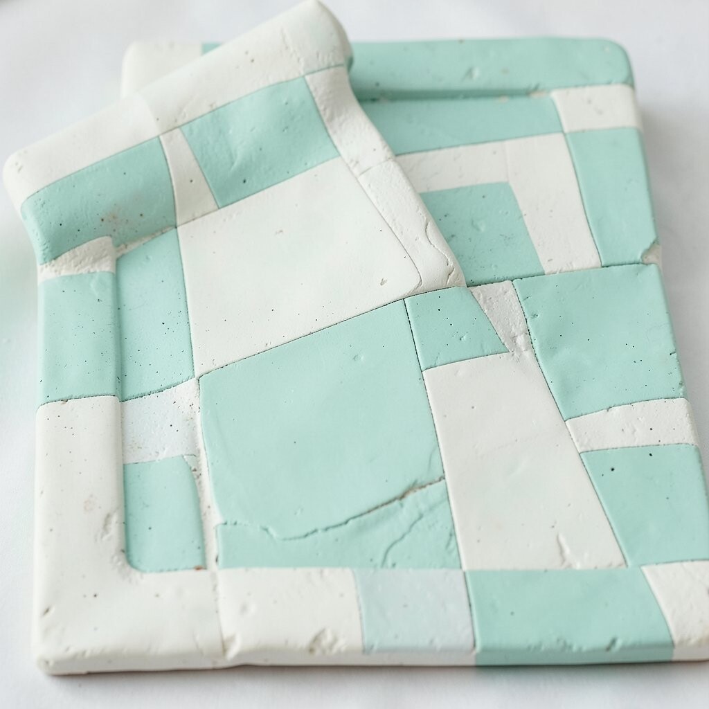
A mint and pearl checkerboard can brighten a kitchen or bath instantly while still feeling classic. The repeating rhythm looks crisp, especially when the edges are handmade and slightly irregular.
Checker patterns are great for practical design, because you can scale the size to fit tight spaces or larger walls. They also work well with many styles, from farmhouse charm to modern minimal.
For personalization, choose one accent shade, like a deeper mint, and limit it to the outer border or a small band. Keep costs in mind by installing checker tiles in a feature zone, such as around a shower bench or above a laundry counter. Because checkerboard tiles show grout lines more than solid patterns, consider grout colors that are stain-resistant and visually forgiving.
14. Custom Nameplate House Numbers on Tile
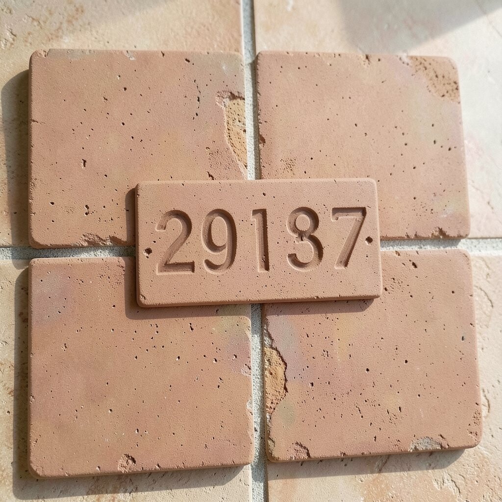
Turn your front step into a story by commissioning artisan tiles shaped into house numbers or a small nameplate. You get bright color, handmade charm, and a clear way for visitors to find you.
This is a smart blend of personalization and practicality, since signage tiles can be both decorative and functional. Choose a weather-safe glaze and mount it in a protected spot like near a covered porch.
For practical tips, measure spacing carefully and pick a font style that stays readable from the sidewalk. Cost considerations matter here too, since custom work can be priced per piece, but it often stays manageable because you’re ordering a small area. Current curb-appeal trends love handmade accents, and a tiled number is one of the most memorable options.
To make the design feel cohesive, match the tile tones to your interior palette, like the same mint, terracotta, or bronze you used inside.