Old ads can feel like little time machines. They still know how to grab the eye and stir fresh ideas.
1. Coca-Cola Holiday Posters
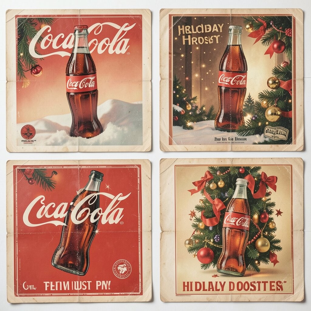
Classic Coca-Cola holiday posters glow with rich reds, soft snow, and happy faces that feel warm even on a cold day. Their charm comes from simple scenes that make the drink feel like part of a cozy family moment, which is great for anyone hunting for visual calm with strong seasonal energy.
These ads work well because they are easy to read from far away and can inspire your own color choices, especially if you want a look that feels friendly and bold. You can borrow the clean layout for social posts, a small shop sign, or a gift card design, and it often costs less to make something polished when you keep the shapes plain and the message clear.
2. Air France Travel Prints
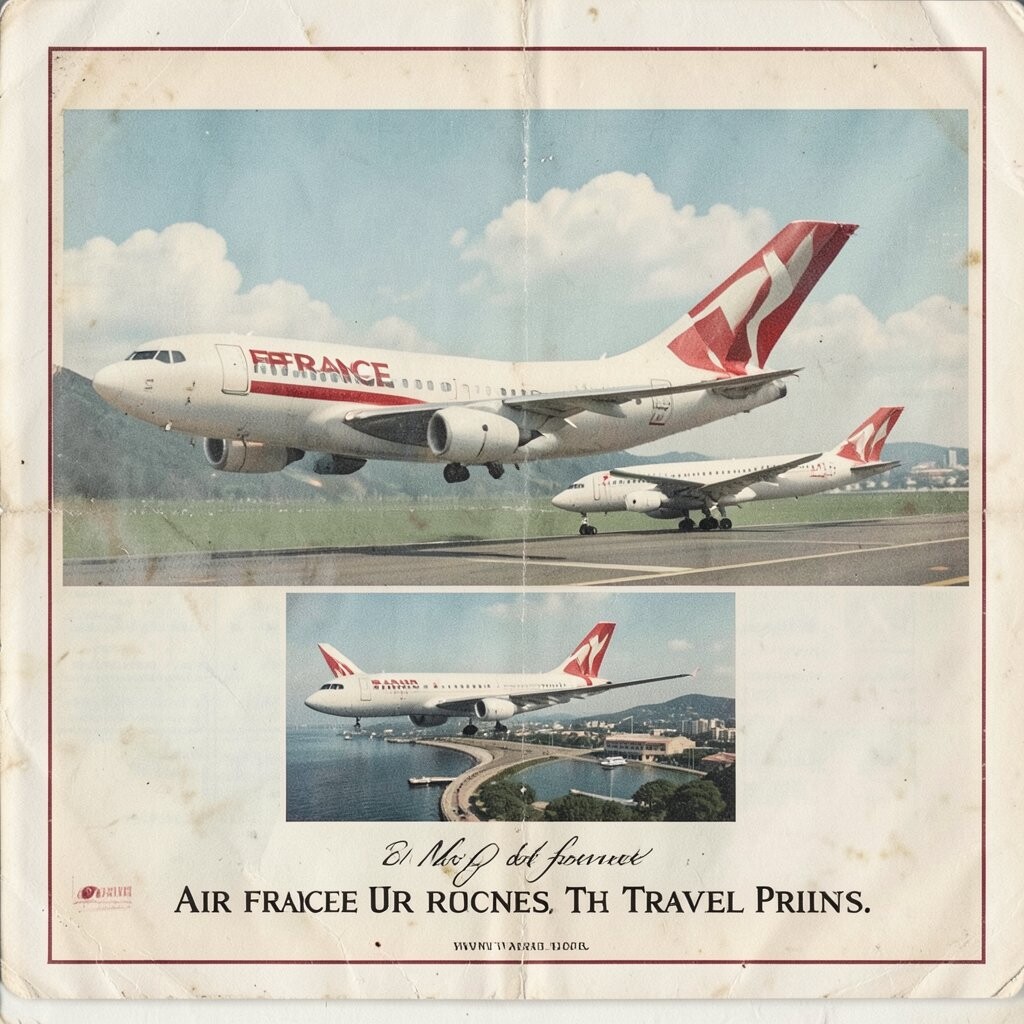
Air France travel ads often show slim planes, wide skies, and dreamy cities in a clean art style that feels light and modern at the same time. The posters stand out because they mix motion with elegance, which gives them a unique mood that still fits current travel branding and wall art trends.
That kind of look is useful if you want to sell a place, a service, or even a feeling of escape without cluttering the page. You can personalize the idea with local landmarks, soft pastel shades, or hand-drawn details, and it may stay budget-friendly if you keep the composition simple and reuse the same artwork in many sizes.
Designers still love these ads because they make travel feel hopeful rather than noisy, and that emotional lift is a big benefit for any campaign. A similar approach can work for websites, luggage tags, or event posters, especially when you want an airy style that feels fresh and easy to look at.
3. Campbell’s Soup Can Ads
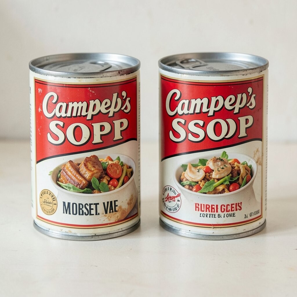
Campbell’s Soup ads are bold, bright, and easy to spot because they use strong cans, clear labels, and a neat pop-art look. The visual punch is unique because it turns a humble food item into something stylish, and that idea still feels useful for product shots and shelf displays today.
If you are making a brand on a small budget, this style teaches you how far simple repetition can go when the colors and shapes are strong. You can personalize the look by changing the background, using local ingredients, or pairing it with a playful slogan, and the trend of clean packaging graphics makes this approach feel current again.
The biggest benefit is how quickly people understand the message, which matters when attention is short and the design needs to work fast. A few repeated cans, a bright backdrop, and a clear focal point can give your project the same confident energy without much extra cost.
This is also a smart model for makers who want a sturdy, no-fuss layout that prints well on labels, menus, and sticker packs. The style can be adapted for kids’ products, home cooking brands, or even a newsletter header, and it stays memorable because it is simple in a bold way.
4. Volkswagen Beetle Print Ads
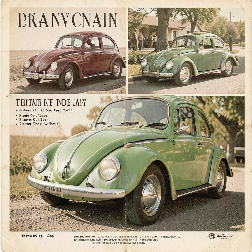
Volkswagen Beetle ads often use plenty of white space, one small car, and a witty line that makes you smile right away. The visual setup feels calm and clever, and that mix gives the ad its unique voice while also making it easy to copy for modern minimalist campaigns.
This kind of design is helpful because it proves you do not need a crowded page to make a strong point. You can personalize the idea by changing the object, the joke, or the road scene, and it is often a lower-cost route since a single photo and sharp copy can carry the whole piece.
5. Pears Soap Victorian Posters
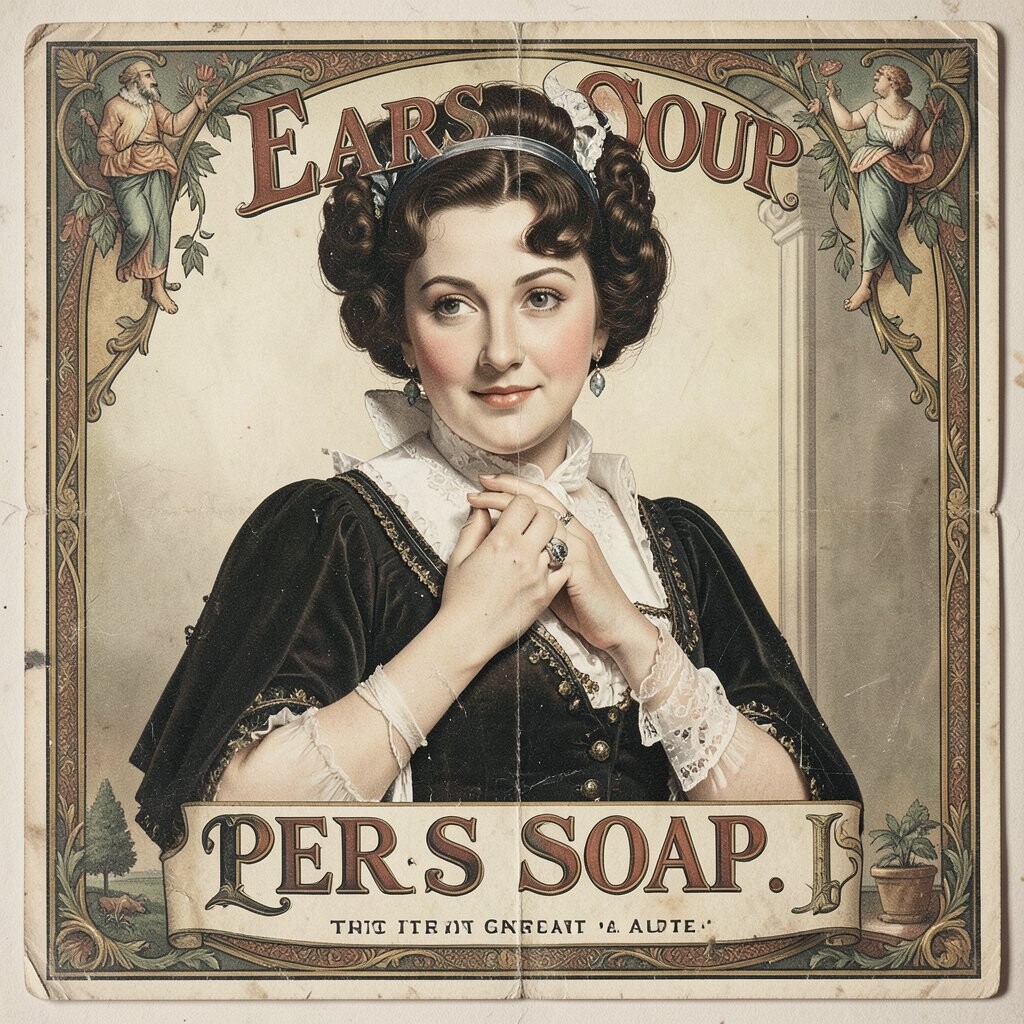
Pears Soap posters have a soft, graceful look with flowing lines, delicate faces, and rich old-world color. The artwork feels unique because it mixes beauty and selling in the same image, which makes it a lovely source for anyone who wants elegance without a modern hard edge.
These ads can help you think about packaging, boutique branding, or even invitation art, since they show how a product can feel special before a person ever touches it. A hand-drawn frame, a pale palette, or a vintage font can personalize the style, and the cost can stay manageable if you print it in one or two colors instead of a full fancy setup.
One reason this look keeps coming back is that people still enjoy romance in design, especially when screens feel crowded and loud. The benefit is a calm, premium mood that can make soap, lotion, tea, or paper goods seem more thoughtful and more worth buying.
If you want to echo this style, keep the posture, drape, and border details soft and graceful rather than busy. That small choice can give your work an old-fashioned glow that feels fresh in a world full of flat and fast images.
6. Shell Gasoline Road Posters
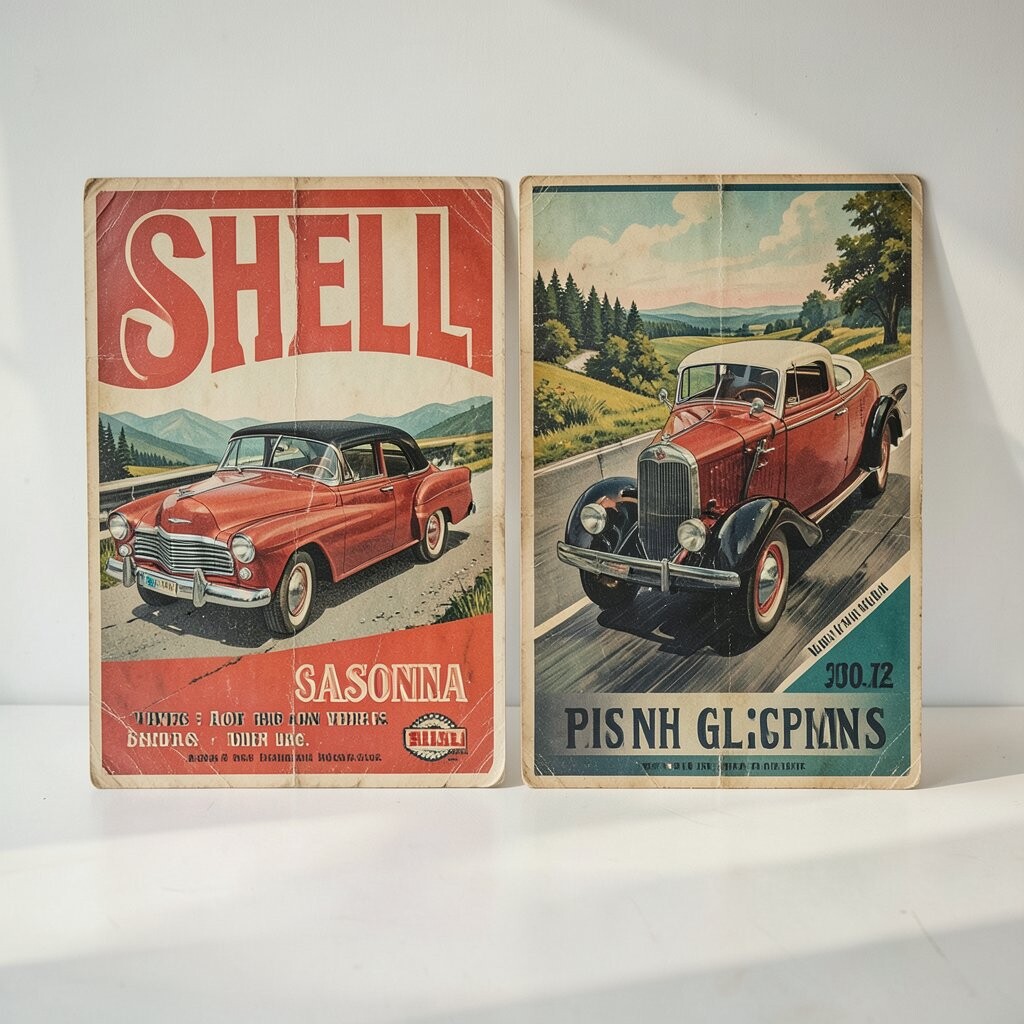
Shell gasoline ads from the road-trip era often show sunny highways, bright signs, and happy cars moving through open land. Their visual energy is cheerful and direct, and the shell shape itself gives the branding a unique icon that people can spot in a second.
That kind of clear symbol is useful if you need a logo, badge, or sticker that works at many sizes. You can personalize the scene with local roads, a favorite vehicle, or a bold sunset, and it fits current trends in retro travel art and service branding while keeping production costs simple.
The ads also show a smart way to make a basic product feel adventurous, which is a big benefit for any service-based business. A few strong colors, a wide horizon, and one clear focus point can keep the design from feeling cluttered or expensive.
7. Elizabeth Arden Beauty Illustrations
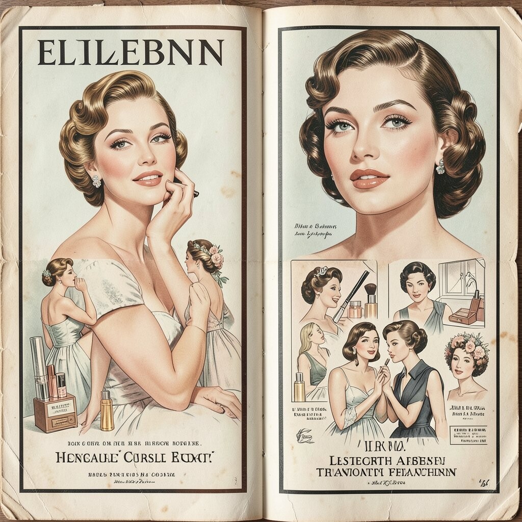
Elizabeth Arden beauty ads often feature elegant women, smooth skin tones, and glamorous product shots framed by refined borders. The images feel polished and unique because they use a soft, high-end mood that still gives plenty of room for modern beauty branding ideas.
This style can help you build trust, since beauty buyers often respond to calm, clean visuals that feel careful and thoughtful. You can personalize the artwork with skin-tone variety, modern type, or a brighter palette, and if you are working with a limited budget, one strong illustration can carry a whole campaign across print and social posts.
Another benefit is how easy it is to adapt the look to perfume, spa services, or skincare boxes without losing the sense of luxury. The trend toward vintage glamour is strong right now, so this kind of ad can feel both nostalgic and current when it is updated with modern faces and fresh lettering.
For your own work, try pairing one detailed image with lots of breathing room around it. That simple move can make even a small brand look more expensive, which is a powerful trick when you want style without a huge spend.
8. Ford Mustang Launch Ads
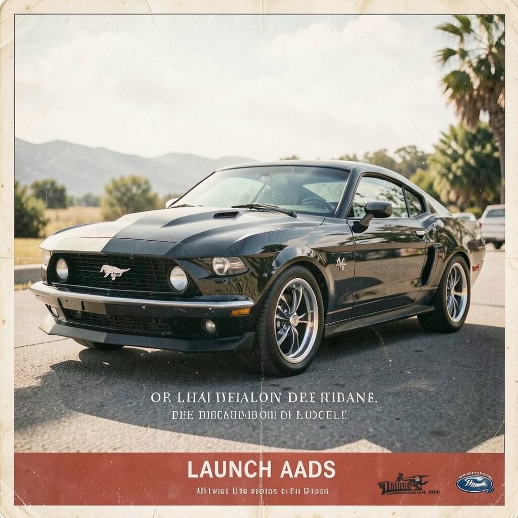
Ford Mustang launch ads are full of motion, chrome shine, and road energy that makes the car feel like a thrill machine. The visual style is bold and fast, and that unique sense of speed still works well for sports gear, tech launches, and youth-focused branding.
These ads are helpful because they prove that one strong object can carry an entire story if the pose and lighting are right. You can personalize the approach with your own product angle, a favorite color, or a local route, and the cost can stay lower when you use one main hero image rather than a full cast of scenes.
The benefit here is instant excitement, which matters when you need people to feel action before they read a full message. Current trends in brand design still favor strong single-subject images, so this classic auto look can feel very fresh when paired with simple text and a sharp crop.
If you are making a poster or ad of your own, choose a viewpoint that makes the subject seem ready to move. That little shift can add energy without adding extra work, and it often gives the final piece a cleaner, stronger finish.
9. Esso Map-Themed Ads
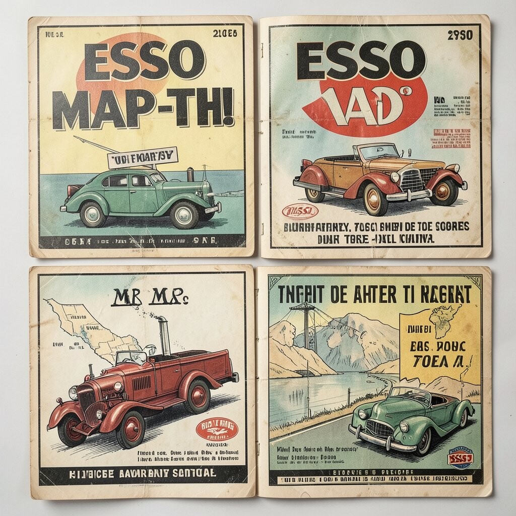
Esso map-themed ads often mix road maps, place names, and cheerful travel scenes in a way that feels playful and smart. Their visual style is unique because it turns a simple service into a guide for adventure, which makes the ad useful and memorable at the same time.
This approach can be a great fit for tourism, apps, delivery brands, or local shops that want to show where they belong. You can personalize the map with neighborhood names, favorite stops, or a custom route, and it can be affordable because line art and clean shapes are easier to print than complex scenes.
A clear map layout also brings a big benefit for readers, since they can understand the message almost at once. That quick clarity is still a strong trend in design, especially when people scroll fast and need a simple visual story that feels helpful rather than loud.
10. Kodak Camera Ads
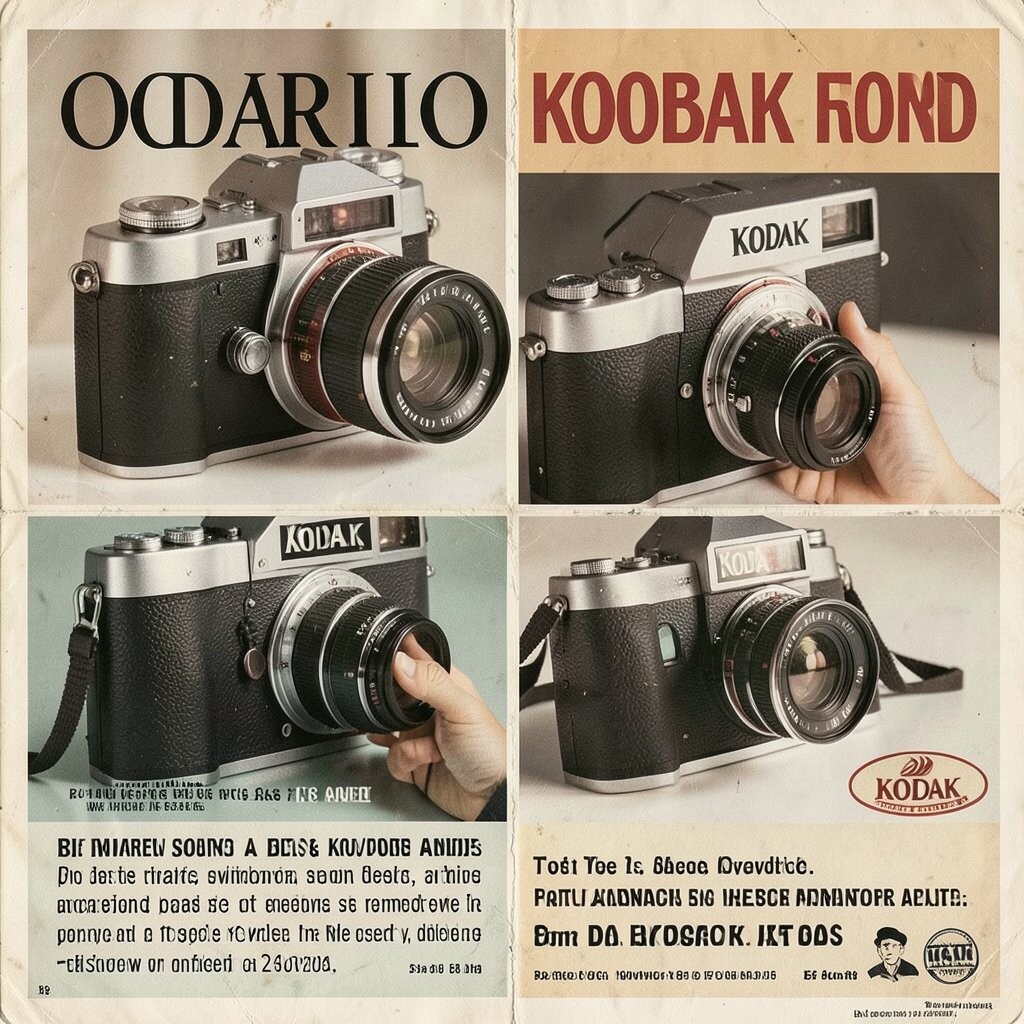
Kodak camera ads often glow with family moments, sunny vacations, and the promise of saving memories. The images feel warm and human, and that emotional tone is unique because it sells a feeling as much as a product.
These ads are useful for anyone making content about photos, books, keepsakes, or creative tools, since they show how memory can become part of the brand. You can personalize the idea with candid smiles, local settings, or even a pet at the center, and it may keep costs down if you use real-life snapshots instead of a large staged shoot.
The benefit of this style is that it makes people imagine themselves inside the picture, which is a strong reason to buy or share. Current trends in marketing still lean toward authentic, lived-in moments, so a Kodak-inspired look can feel both vintage and very now.
When you use this idea, think about the story after the photo, not just the product in the frame. That approach helps you create ads that feel heartfelt and useful, which is exactly why old camera posters still inspire new work.
11. Black-and-White Fashion Magazine Ads
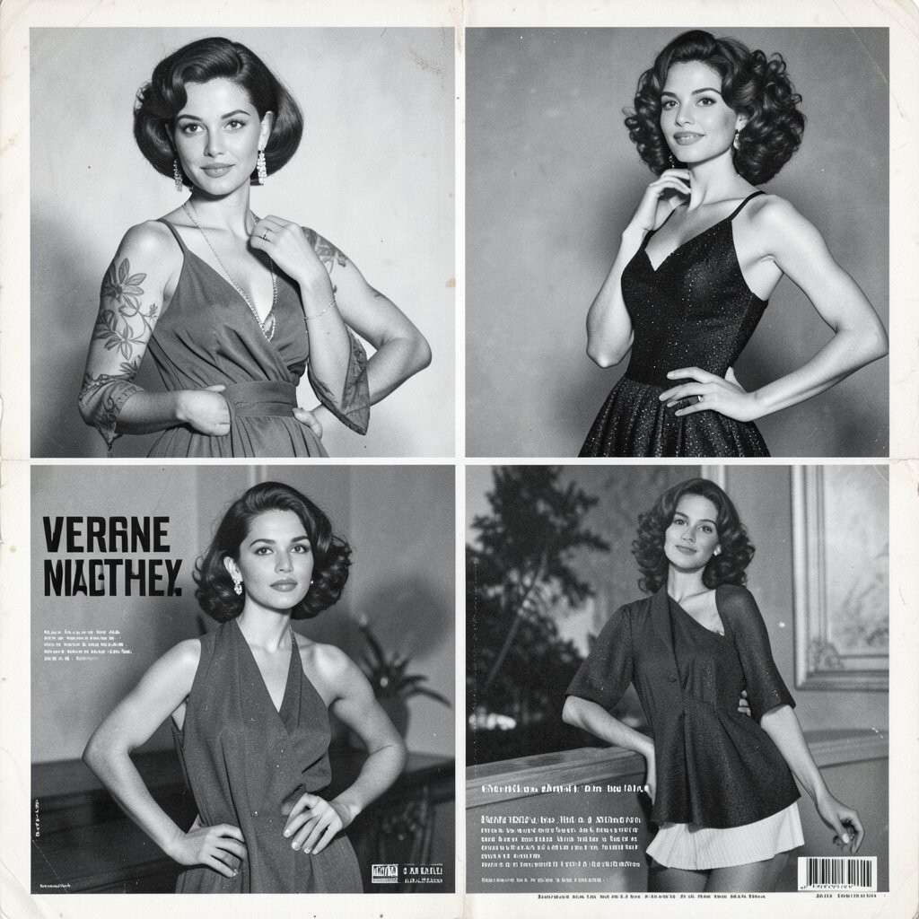
Black-and-white fashion ads bring sharp contrast, elegant poses, and a dramatic mood that makes clothes and accessories feel high-end. Their visual style is unique because the lack of color pushes attention toward shape, posture, and texture, which is useful when you want a clean, stylish look.
This kind of ad can help with branding for clothing lines, salons, or jewelry because it feels classy without needing a big rainbow palette. You can personalize it with your own model, a different fabric, or a signature pose, and the cost may be easier to control since black-and-white printing can be simpler than full color work.
There is also a strong benefit in how flexible the style can be across magazine pages, posters, and web banners. The current trend toward moody monochrome visuals keeps this look alive, and a single well-shot image can often do more than a busy spread full of extra props.
If you want the mood to feel modern, add one small detail that breaks the quiet, such as a bold lip color or a shiny shoe. That tiny contrast can give the whole piece a fresh edge while still holding onto the vintage feel people love.
12. Ray-Ban Sunglass Ads

Ray-Ban ads often show cool faces, strong angles, and sunny scenes that make the glasses feel like a symbol of confidence. The visual style is unique because it blends attitude and simplicity, giving the product a lifestyle feeling that works well for fashion and streetwear today.
This approach is useful when you want your audience to imagine how a product changes their whole look, not just how it works. You can personalize the ad with different face shapes, city backgrounds, or seasonal outfits, and it can stay cost-friendly if the styling is clean and the location is simple.
The benefit is that the product becomes part of a personal identity, which is a strong pull in modern branding. Trend-wise, people still respond to cool, straightforward portraits, so this vintage idea fits right in with today’s love for direct and stylish visuals.
For your own project, focus on the angle of the face and the reflection in the lens, since those small details create mood fast. A little shadow, a bold frame, and one strong pose can turn a basic product ad into something people remember.
13. Coca-Cola Bottle Cap and Neon Ads
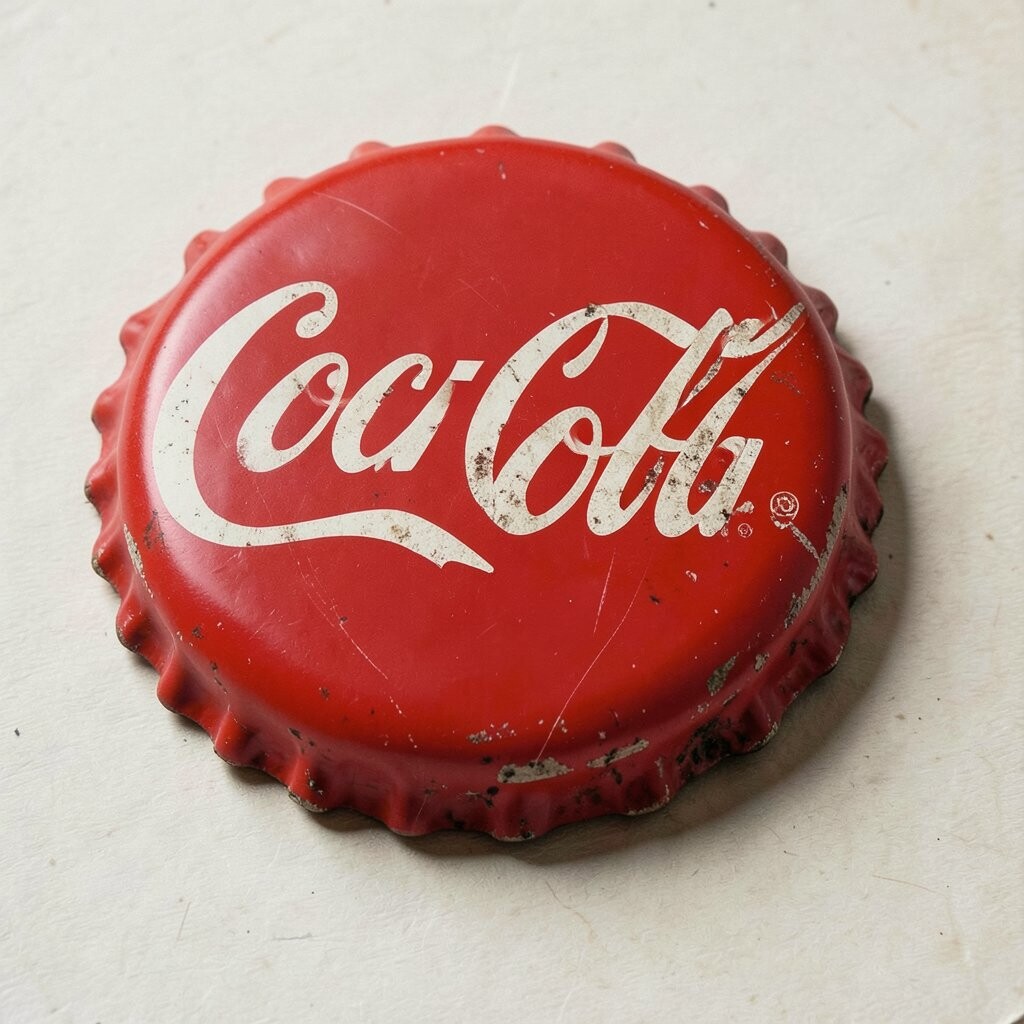
Coca-Cola bottle cap and neon ads often mix glowing signs, fizzy bubbles, and bright bottle shapes in a way that feels lively and fun. The look is unique because it brings together night lights and a familiar drink image, which gives you a strong visual spark for bars, diners, or social graphics.
This style is handy if you want something that feels energetic without becoming hard to read, since the main bottle or cap can stay at the center while the neon sets the mood. You can personalize it with your own brand colors, a favorite phrase, or a local hangout spot, and the cost can remain reasonable if you use one bold light effect instead of many layers.
The benefit is a cheerful glow that feels festive and easy to share, which suits current trends in retro nightlife art and short-form content. If you want to make your own version, keep the shine bright, the shapes simple, and the background dark enough for the colors to pop, because that balance gives the design its magic.
These ads also show how a familiar item can feel new when the light changes around it, and that is a powerful lesson for any creative project. A small neon edge, a glossy highlight, and a clear silhouette can make your work stand out while still feeling friendly and recognizable.