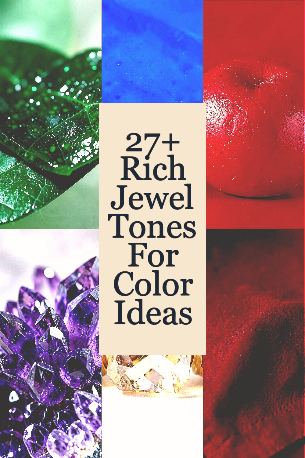
Rich color can change the mood of a room in seconds.
Jewel tones bring depth, shine, and a little bit of magic.
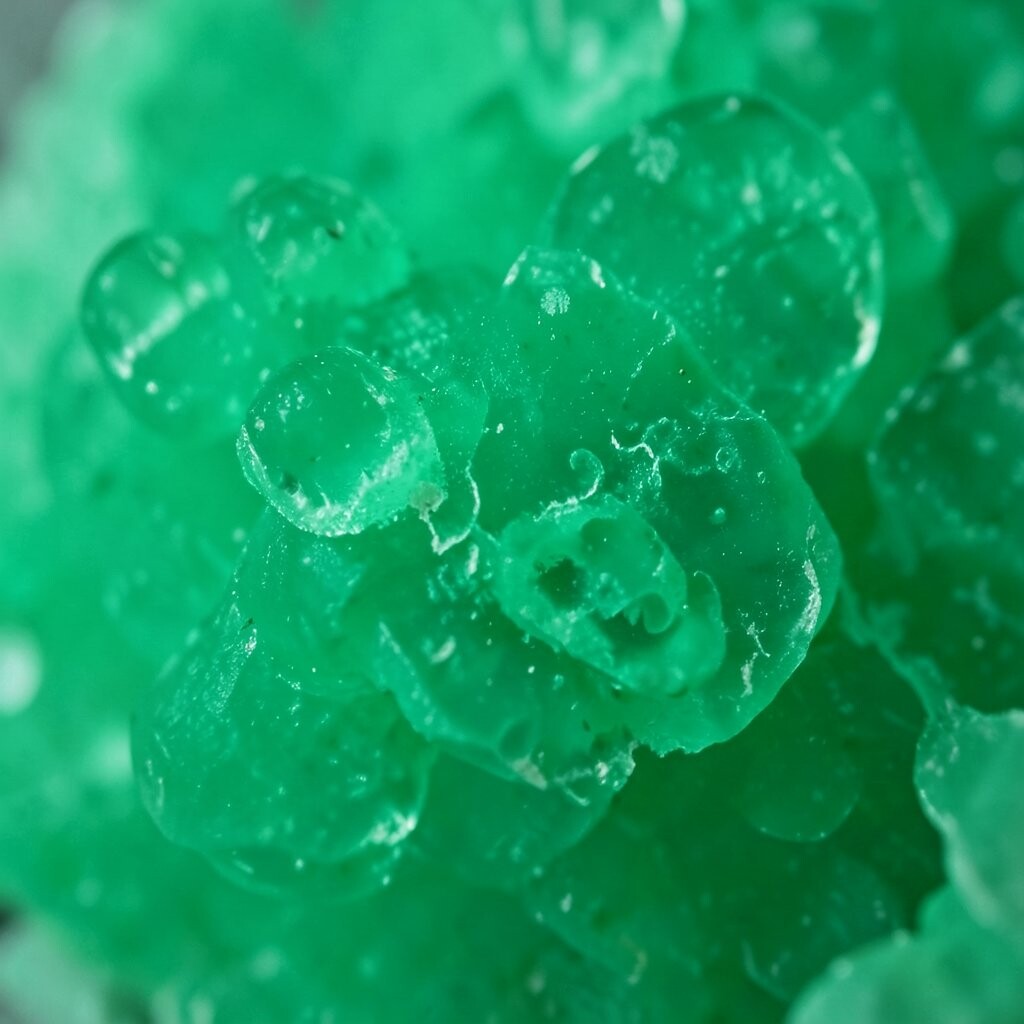
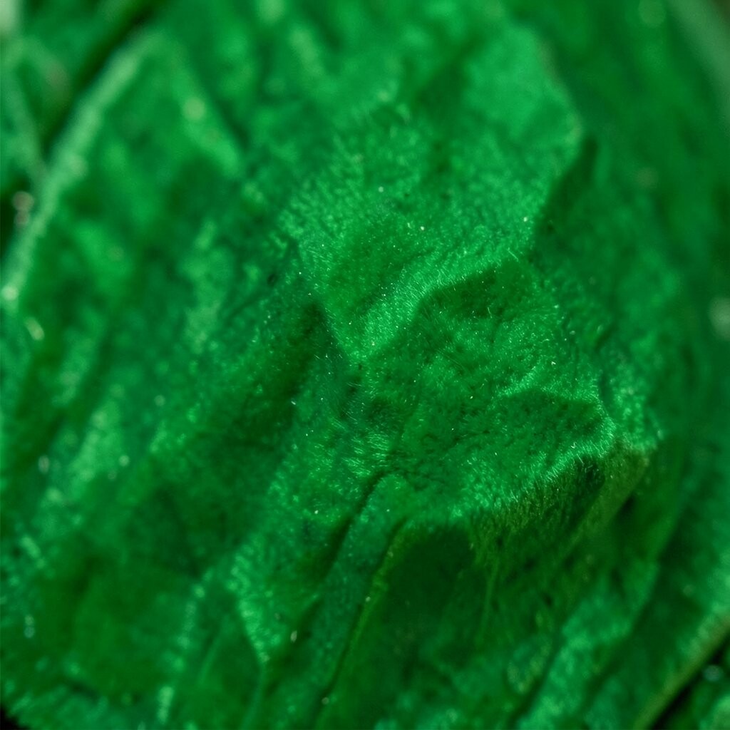
1. Emerald Green
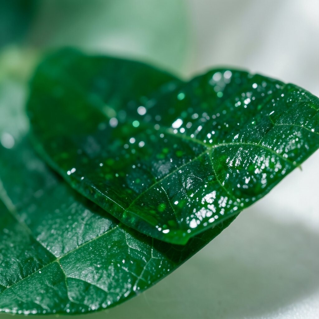
Emerald green feels lush, fresh, and full of life. It brings the look of forest leaves and polished gemstones into a space.
This shade works well in living rooms, bedrooms, and dining spaces because it feels calm but still bold. Try it on a velvet chair, painted wall, or even a set of pillows if you want a lower-cost update.
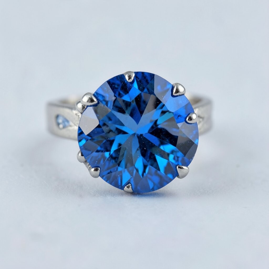
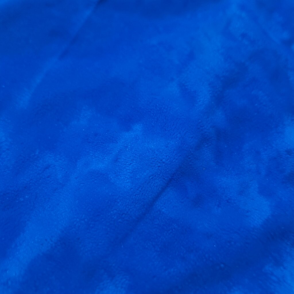
2. Sapphire Blue
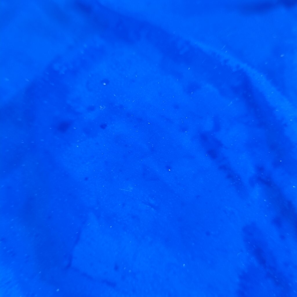
Sapphire blue gives a room a cool, rich glow that feels clean and strong. It can make white trim pop and help lighter colors stand out more.
This shade is a smart pick for accent walls, rugs, or curtains because it adds style without looking too loud. If you want a personal touch, pair it with brass, silver, or warm wood for a mix that feels special.
Many people love sapphire because it fits both classic and modern homes. It also works well in trend-forward spaces where deep color is used to make simple furniture feel more polished.
3. Ruby Red
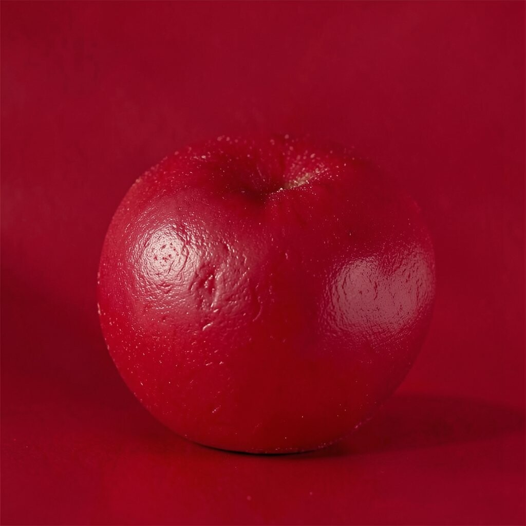
Ruby red brings a warm, glowing feel that can make a space seem lively and rich. It looks like a bright gem under soft light.
Use it in small doses if you want a strong punch without a big commitment. A ruby throw blanket, lamp base, or art print can give you that bold look at a low cost.
This color is great for rooms that need more energy, like a dining area or reading nook. For a custom feel, mix it with cream, navy, or dark wood so it feels deep instead of too bright.
4. Amethyst Purple
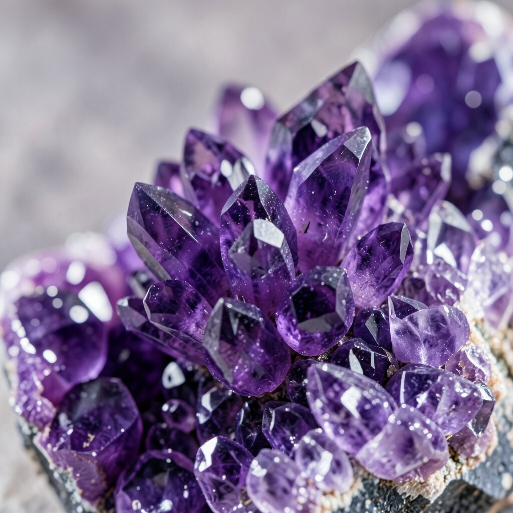
Amethyst purple feels dreamy, artistic, and a little bit royal. Its soft shine can make a space feel both cozy and special.
It works nicely in bedrooms, creative corners, and powder rooms because it adds charm without feeling harsh. If you want to keep costs down, try amethyst in pillows, glass decor, or a painted stool.
This shade stands out because it can feel playful or elegant depending on what you pair with it. Gold accents and soft gray tones help it look current and stylish.
For a personal twist, use different purple shades together, like lilac and plum, to build depth. That layered look can make even a small room feel thoughtfully styled.
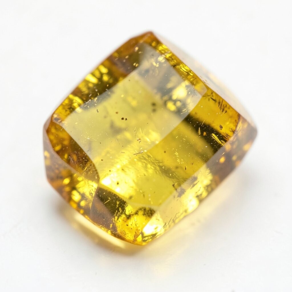
5. Topaz Gold
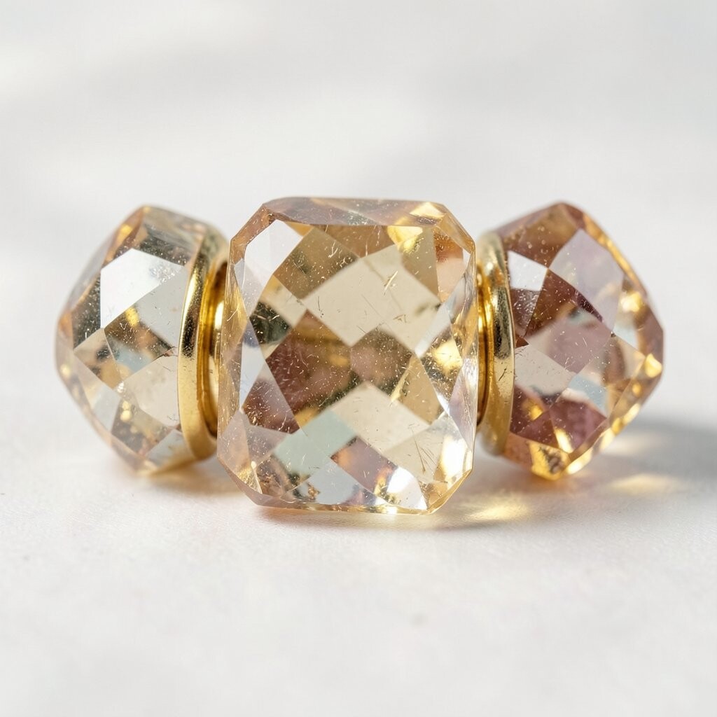
Topaz gold shines with warmth and gives a room a sunny, rich feel. It looks especially lovely when light hits it and makes the color glow.
This tone can brighten darker spaces and add a fancy touch to plain rooms. Try it in pillows, frames, or a small accent chair if you want the look without spending too much.
Topaz gold is a favorite in modern decor because it feels cheerful and upscale at the same time. It pairs well with deep blue, forest green, and warm white for a balanced style.
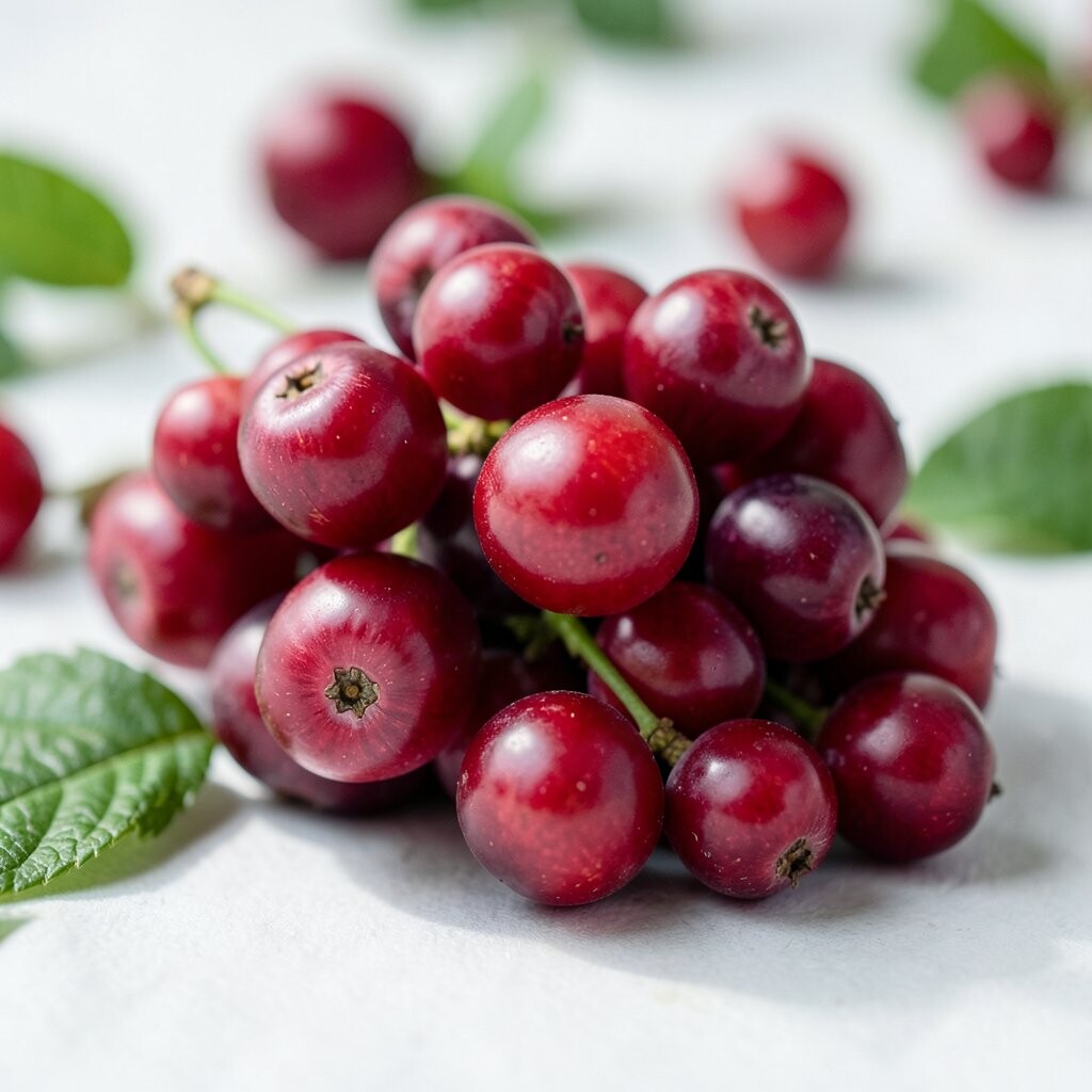
6. Garnet Red
Garnet red has a deep, wine-like look that feels cozy and bold. It brings a sense of warmth that can make a room feel more inviting right away.
This color is a strong choice for curtains, bedding, or a statement wall in a space that needs more character. If you are decorating on a budget, add garnet through candles, vases, or a patterned rug.
It stands apart from brighter reds because it feels richer and more grown-up. That makes it a good fit for both classic homes and newer spaces that want a layered look.
For a personal style boost, combine it with soft blush, black, or antique gold. The mix can feel romantic, bold, or moody depending on how much you use.
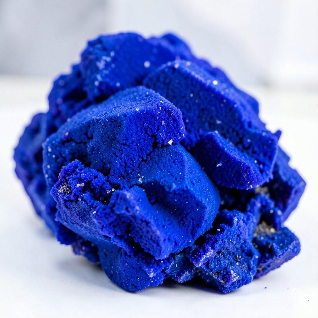
7. Cobalt Blue
Cobalt blue looks bright, deep, and full of confidence. It has a crisp energy that can wake up a room fast.
This color works well on pottery, accent chairs, and wall art because it gives strong visual impact. If you want a cheaper update, use cobalt in smaller decor pieces and repeat it across the room for unity.
Cobalt is trendy in homes that mix old and new styles because it feels fresh yet timeless. It also pairs well with white, tan, and bright green for a lively, clean look.
For a custom touch, use cobalt with patterns like stripes or florals. That helps the color feel more playful and personal.
8. Plum
Plum blends purple and red into a deep, velvety shade that feels rich and cozy. It can make a room seem more intimate and stylish.
Use plum in bedrooms, lounges, or reading spaces where you want a calm but bold mood. A plum rug or curtain panel can give strong style without a huge cost.
This shade is unique because it feels both warm and cool at the same time. That makes it easy to match with navy, gray, cream, or even pale pink.
Plum also fits well with current color trends that favor moody, layered rooms. If you want a softer look, try it in a matte finish instead of something shiny.
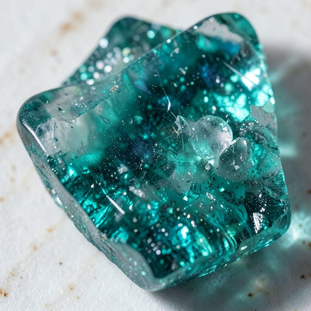
9. Teal
Teal has the calm feel of blue and the lively edge of green. It brings a fresh, jewel-like look that feels rich but still easy to live with.
This shade is great for kitchens, bathrooms, and living rooms because it feels clean and full of personality. You can keep costs low by using teal dishware, towels, or a painted side table.
Teal stands out because it works in both bright and dark spaces. It can look playful with coral or elegant with gold, depending on your style.
For a personal touch, use teal in small repeated accents so the room feels connected. That simple trick can make a space look planned and polished.
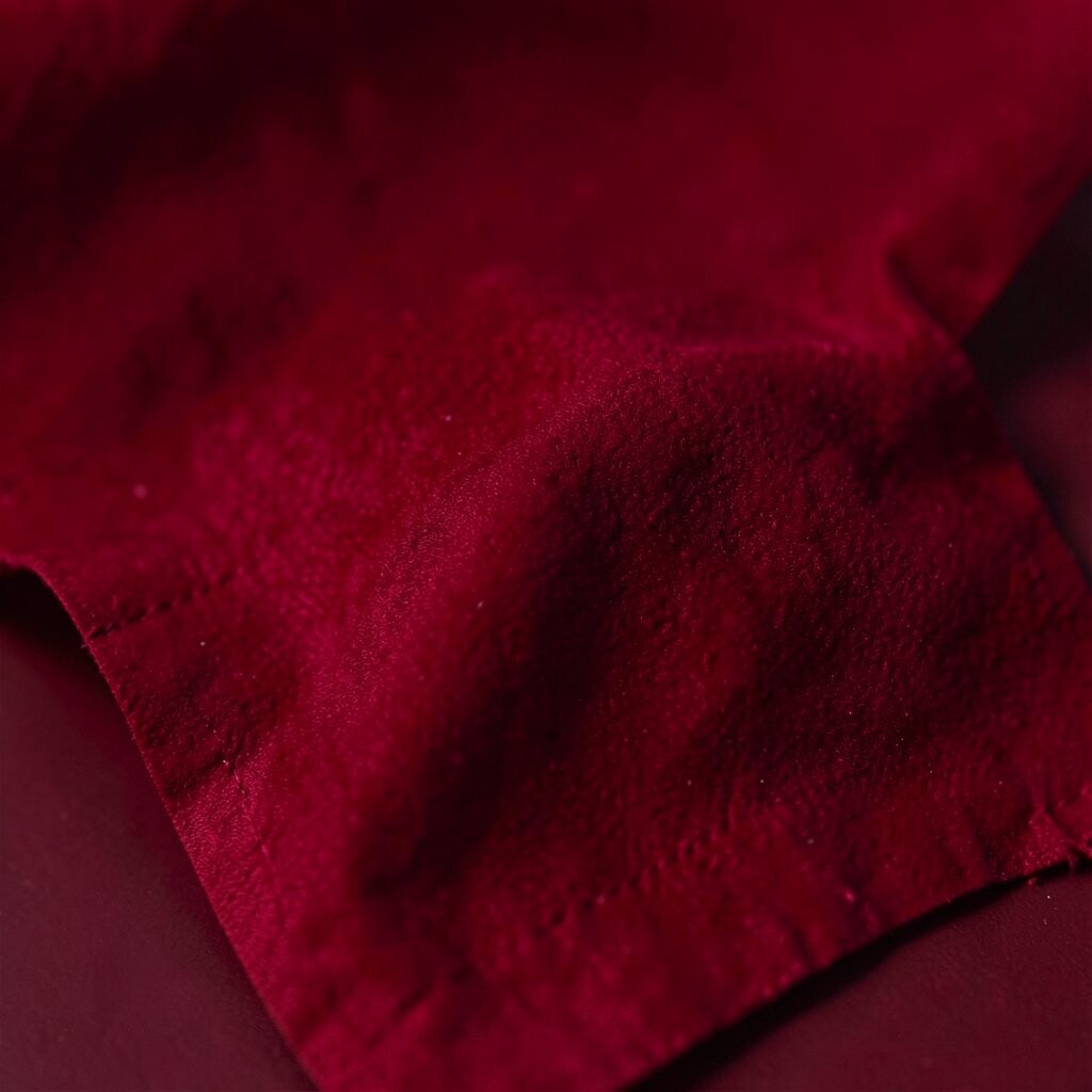
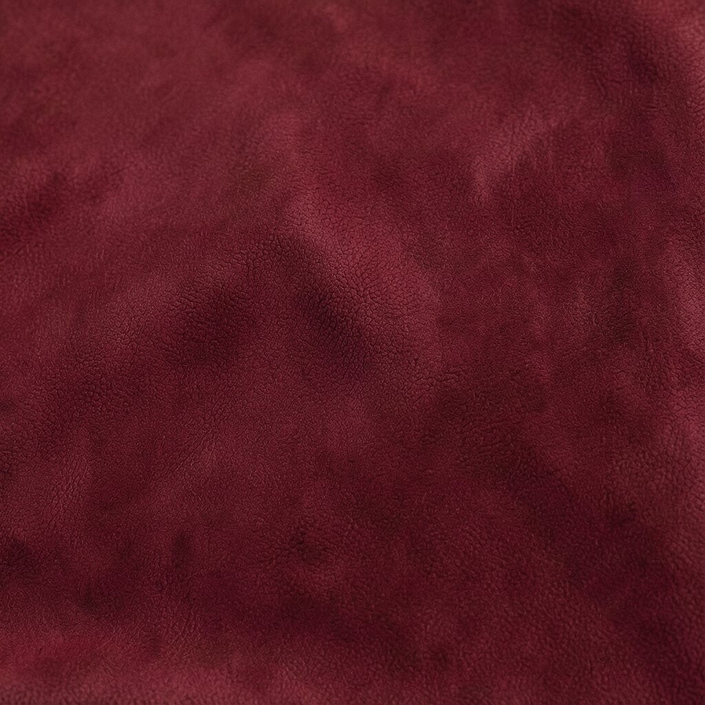
10. Burgundy
Burgundy feels deep, soft, and a little dramatic in the best way. It has the richness of red wine and the comfort of a warm blanket.
This color is a strong pick for sofas, drapes, and bedding because it adds weight and style to a room. If a large burgundy item feels too costly, start with a pillow set or table runner.
Burgundy is unique because it can feel both classic and trendy. It works especially well with cream, forest green, and dark brown for a grounded look.
For a custom style, mix burgundy with texture like leather, velvet, or woven fabric. That makes the color feel even deeper and more inviting.
11. Peacock Blue
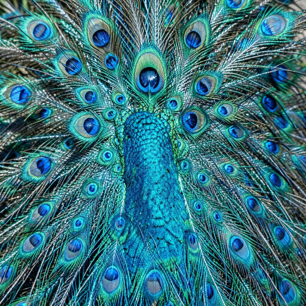
Peacock blue has a dramatic, jewel-box look that feels bold and fancy. It often shifts between blue and green, which gives it extra charm.
This shade works beautifully on statement furniture, wall paint, or patterned wallpaper. If you want a less expensive option, try peacock blue in artwork, vases, or lamps.
It is a favorite in modern decorating because it feels rich without needing many extra colors. Pair it with gold, ivory, or charcoal for a look that feels smooth and stylish.
For a personal twist, use peacock blue in a room that already has simple shapes and clean lines. The color can become the star and make everything else feel more special.
12. Citrine Yellow
Citrine yellow brings a bright, sunny sparkle that feels cheerful and bold. It has the glow of a gemstone and the warmth of fresh light.
This shade is perfect for small accents that need to stand out, like a chair, lamp, or vase. If you want to save money, use citrine in artwork or throw pillows for a quick refresh.
It is unique because it feels richer than a basic yellow and less soft than pastel tones. That makes it a nice choice for homes that need energy and personality.
Current style trends often use citrine with dark blue or green for a high-contrast look. You can also make it feel more personal by adding handmade or vintage pieces nearby.
13. Midnight Blue
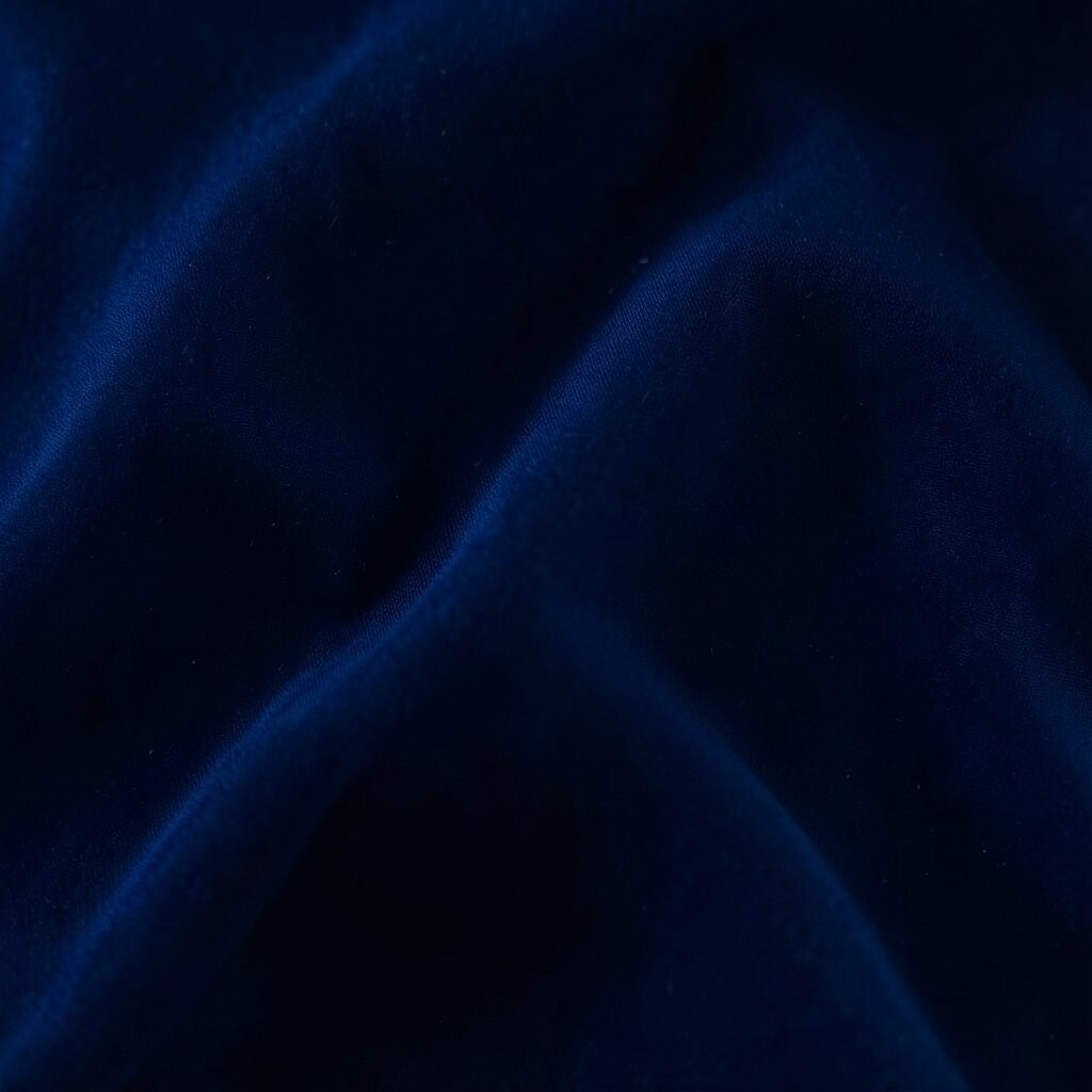
Midnight blue feels calm, deep, and full of quiet power. It can make a space look elegant without feeling too formal.
This color is ideal for bedrooms, offices, and media rooms because it helps create a restful mood. A midnight blue wall or rug can look expensive, but smaller items can keep the cost down.
It stands out because it works almost like a neutral while still giving a strong color story. Pair it with warm metal accents, cream fabrics, or light oak for a balanced feel.
For a personal touch, use it with art that has bright white lines or soft metallic details. That contrast makes the room feel crisp and finished.
14. Rose Quartz Pink
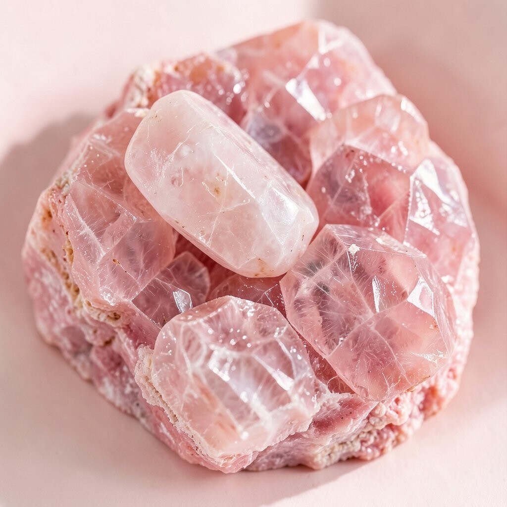
Rose quartz pink brings a soft sparkle that feels gentle but still rich. It gives a room a sweet, polished look without becoming too sugary.
This shade works well in bedrooms, dressers, and accent decor because it adds warmth in a light way. If you want a budget-friendly update, use rose quartz in candles, bedding, or framed prints.
It is unique because it can feel modern when paired with black or gray. It can also feel romantic when mixed with gold, cream, or deeper berry tones.
Many people use rose quartz in layered color schemes because it softens stronger jewel tones. That makes it a smart choice if you want bold color but still want the room to feel easy.
15. Turquoise
Turquoise feels bright, fresh, and full of movement. It can make a room feel like a sunny getaway with very little effort.
This color is great for playful spaces, craft rooms, or bathrooms because it brings a happy spark. If your budget is small, try turquoise in towels, pottery, or a single accent chair.
It stands out because it has both cool and warm energy, which makes it easy to style. Pair it with white, sand, or navy for a clean and lively result.
For a personal touch, combine turquoise with travel finds or handmade items. That can give the room a collected feel and make the color story more meaningful.
16. Garnet Plum
Garnet plum has a deep, moody look that feels rich and layered. It blends red and purple into a shade that feels both cozy and bold.
This tone is a smart choice for accent walls, bedding, or drapery in rooms that need more warmth. If you want to keep costs lower, use it in smaller decor pieces and repeat the color in art or textiles.
Garnet plum is unique because it changes with the light and can look different during the day and night. That shifting look gives a room extra interest and depth.
It also fits current color trends that favor darker, richer shades in simple rooms. For a custom style, pair it with soft beige, brass, or dusty rose.
17. Jade Green
Jade green feels smooth, fresh, and a little luxurious. It brings a polished look that can make a room feel calm and alive at once.
This color works well on cabinets, accent walls, and decorative objects because it has a clean, rich look. If you want a less costly option, use jade in dishware, pillows, or a painted tray.
It is different from brighter greens because it feels deeper and more refined. That makes it a good fit for homes that want color without chaos.
For a personal style choice, mix jade with natural textures like rattan, linen, or wood. The mix feels relaxed but still special.
18. Mulberry
Mulberry has a dark berry look that feels bold, warm, and inviting. It can add a soft drama that works well in cozy rooms.
This shade is lovely for accent furniture, pillows, or a painted nook because it creates a rich focal point. If a big piece is too expensive, start with a mulberry throw or piece of wall art.
Mulberry stands out because it can lean red, purple, or brown depending on the light. That makes it feel layered and interesting in a way flat colors do not.
It pairs well with cream, gold, and deep green for a look that feels current and full of depth. You can also make it feel more personal with vintage finds or soft patterned fabric.
19. Lapis Blue
Lapis blue has a bold, royal look that feels clean and rich at the same time. It can make a room seem more focused and stylish.
This color works well in offices, entryways, and living spaces because it adds strong character fast. If you want to keep spending low, use lapis in a rug, vase, or framed print.
It is unique because it has a stone-like depth that feels natural and fancy together. That makes it a strong choice for people who want color with a classic feel.
Current decorating styles often use lapis with warm woods and soft whites. For a personal touch, add a few handmade pieces so the room does not feel too formal.
20. Amber
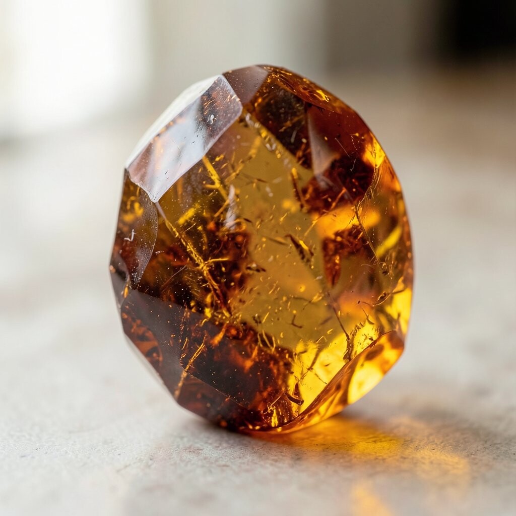
Amber glows with a warm golden-orange light that feels cozy and rich. It can make a space feel friendly and full of energy.
This shade is a great pick for fall-inspired rooms, reading areas, or dining spaces because it adds warmth fast. If you want a lower-cost update, try amber glass, a lamp, or a set of candles.
Amber is special because it can feel both earthy and elegant. It pairs nicely with navy, cream, and dark green for a balanced look.
For a personal style boost, use amber with natural materials like wood, wicker, or leather. That helps the color feel deeper and more welcoming.
21. Orchid
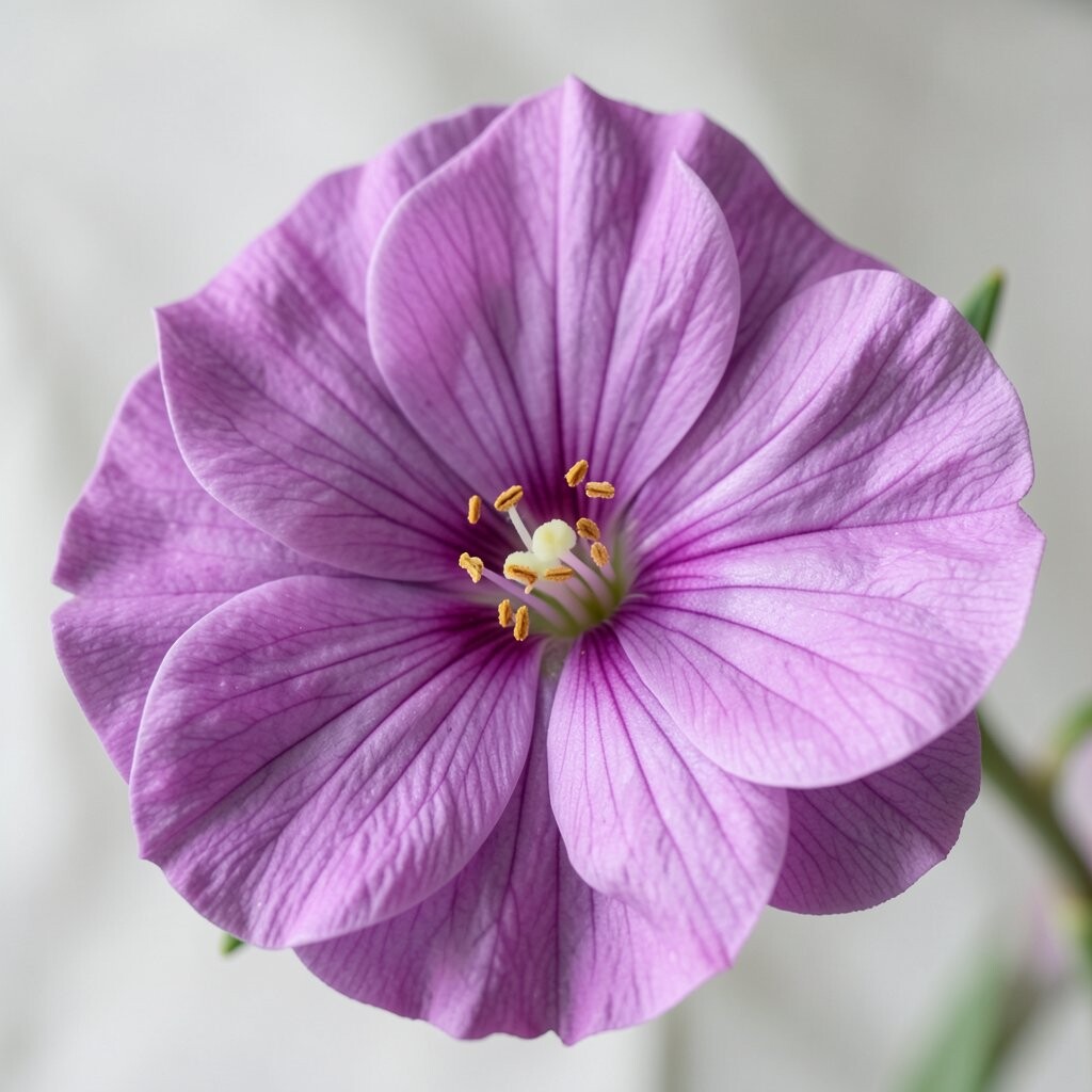
Orchid feels bright, graceful, and a little playful. It brings a fresh floral energy that can lift a room without making it feel too soft.
This color works well in bedrooms, bathrooms, and creative spaces because it adds charm and personality. If you want to save money, use orchid in small items like towels, art, or a bedside lamp.
It stands apart because it feels more vivid than pastel pink and more lively than deep purple. That makes it a fun choice for people who want something different.
Orchid is also popular in modern color mixes with gray, black, and gold. For a custom touch, pair it with patterns that have simple shapes so the color stays the star.
22. Forest Green
Forest green feels calm, deep, and grounded like a quiet walk under tall trees. It brings a strong natural mood that can make a room feel restful.
This shade is excellent for walls, cabinets, or large furniture because it adds depth without looking flashy. If a full room feels too costly, use forest green in pillows, curtains, or a painted shelf.
It is unique because it can feel classic, rustic, or modern depending on the room around it. Pair it with cream, brass, or warm brown for a rich and balanced style.
Many current homes use forest green to bring in a cozy, nature-inspired look. For a personal touch, add plants or botanical prints to make the space feel even more alive.
23. Berry
Berry tones feel juicy, bright, and full of personality. They add a happy richness that can make a room feel bold but still soft.
This color works well in accent pillows, bedding, and artwork because it adds color without taking over the whole space. If you want a cheaper update, berry in small decor pieces can go a long way.
Berry is special because it can lean pink, red, or purple depending on the shade you choose. That gives you room to match it with many different styles.
For a custom look, try berry with navy, blush, or gold. The mix feels lively and layered, which is great for a space that needs more charm.
24. Ink Blue
Ink blue has a dark, inky depth that feels sleek and strong. It gives a room a polished look that can feel both modern and timeless.
This shade is a smart choice for statement walls, cabinetry, or large art pieces because it makes other colors stand out. If you are watching your budget, use ink blue in a single bold item and let it anchor the room.
It stands out because it is darker than navy and can feel more dramatic. That makes it useful in spaces where you want quiet elegance with a little edge.
For a personal touch, pair it with soft texture like boucle, linen, or brushed metal. That keeps the color rich but not too heavy.
25. Magenta
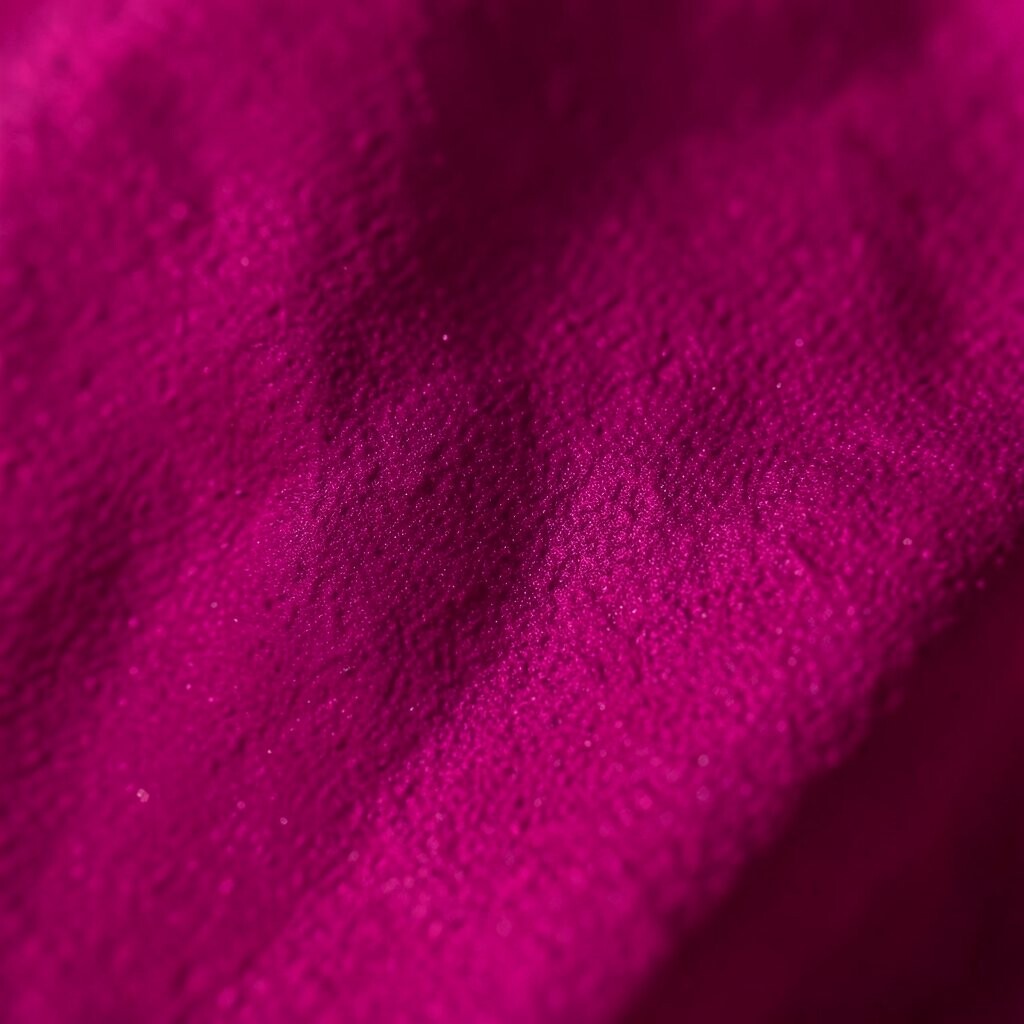
Magenta feels bright, lively, and full of confidence. It brings instant energy and can make a room feel creative and fun.
This color is great for accent chairs, pillows, or bold artwork because it adds a strong pop. If you want to keep costs lower, use magenta in small accents that you can switch out later.
Magenta is unique because it sits between pink and purple, so it feels fresh and unexpected. It pairs well with black, white, or deep blue for a high-impact look.
Current style trends often use magenta in playful rooms that need a spark. For a personal touch, mix it with favorite books, prints, or keepsakes so the room feels like you.
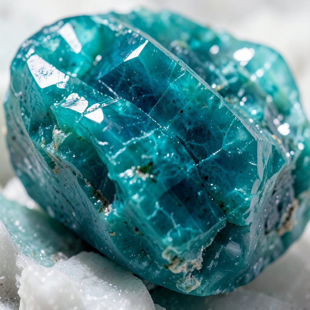
26. Sea Glass Teal
Sea glass teal has a soft, watery shine that feels calm and rich at the same time. It looks lighter than deep teal but still keeps that jewel-like charm.
This shade works well in bathrooms, bedrooms, and sunrooms because it feels fresh and easy. If you want a budget-friendly idea, try sea glass teal in towels, glass decor, or painted frames.
It is different from stronger jewel tones because it feels airy while still being colorful. That makes it a good choice for people who want bold style without a heavy look.
For a personal twist, pair it with sandy beige, white, or pale gold. The result feels soft, coastal, and still rich enough to stand out.
27. Deep Coral
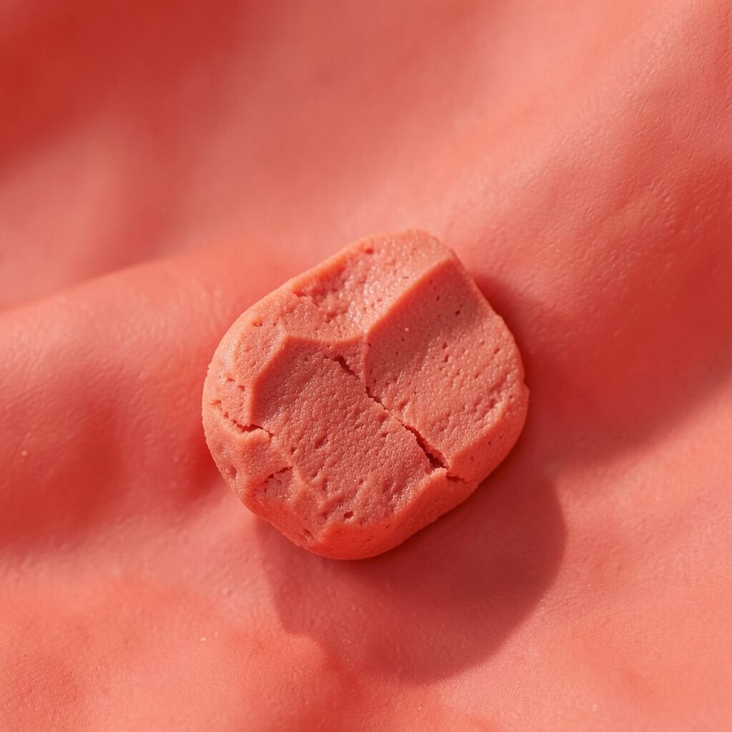
Deep coral brings a warm, glowing look that feels cheerful and rich. It has the brightness of coral with a deeper, more grown-up feel.
This color is a smart pick for accent walls, pillows, or kitchen decor because it adds life without feeling too loud. If you want to save money, use deep coral in smaller items that can be moved from room to room.
It stands out because it works well in both summer and winter settings. Pair it with navy, cream, or olive green for a balanced and stylish mix.
For a custom look, use deep coral with handmade pottery or patterned textiles. That helps the color feel personal and full of character.
28. Onyx Black with Jewel Shine
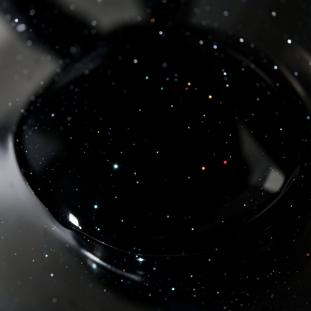
Onyx black with jewel shine feels rich, dramatic, and very polished. It creates a strong backdrop that makes bright colors and shiny finishes pop.
This look is perfect for modern rooms, dramatic dining spaces, or stylish entryways because it adds instant depth. If a full black room feels too bold or costly, start with black frames, a lamp, or a single accent wall.
What makes this choice unique is the way it lets jewel tones shine even more. Emerald, sapphire, ruby, and gold all look brighter next to onyx, which makes styling easier and more fun.
For a personal touch, add glossy finishes, mirrors, or metallic decor to keep the look lively. This style is very current and works well for people who want a strong, high-contrast room with a little glamour.