Retro type has a way of waking up a design. It feels warm, bold, and full of charm.
1. Chunky 70s Groovy Lettering
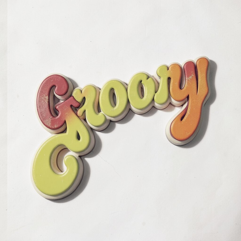
Chunky groovy lettering brings back the soft, playful feeling of old record covers and vintage posters. The thick curves and rounded edges make your design feel friendly and easy to notice.
This style works well for posters, social posts, and brand graphics because it stands out without feeling harsh. You can keep the cost low by using simple vector shapes, and you can make it personal with custom swashes, bright color choices, or a hand-drawn twist.
2. Neon Diner Script
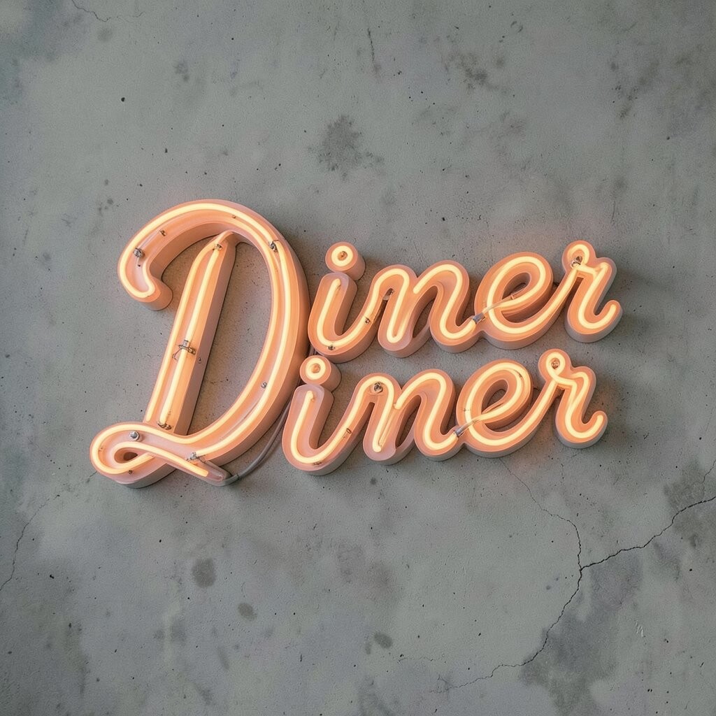
Neon diner script gives off a glowing sign look with smooth lines and a lively shape. It can make a design feel like late-night street lights, milkshakes, and old restaurant windows.
It is a smart choice when you want a retro mood that still feels fresh. Many designers use soft pink, blue, or yellow tones to match current neon trends, and you can save money by building the glow effect with basic digital tools instead of special artwork.
Try pairing it with a dark background for a strong shine, or place it on cream paper for a more vintage feel. A small custom detail, like a tilt or a tiny star, can make the lettering feel one of a kind.
3. Blocky 80s Arcade Type
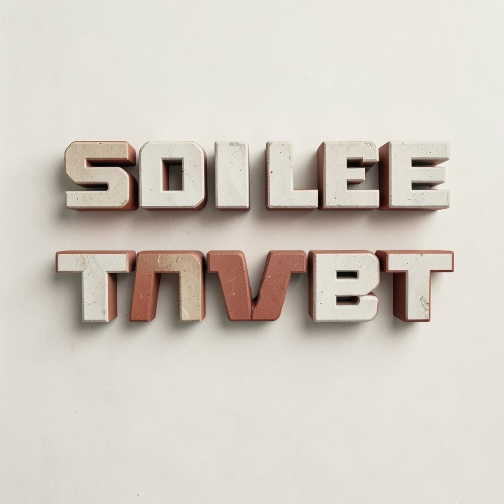
Blocky arcade type has sharp corners, bold lines, and a game-room energy that feels full of movement. It instantly reminds people of old cabinets, digital screens, and bright scoreboards.
This style is great for headlines because it grabs attention fast and stays easy to read. You can keep the design budget friendly by using solid shapes and simple layers, and you can make it more personal with scan lines, pixel edges, or glowing accents.
It also fits current retro-futurist trends that mix old gaming looks with new digital polish. If you want extra flair, use bright cyan, purple, or red, but keep enough space around the letters so the style does not feel crowded.
4. Art Deco Glamour Letters

Art Deco lettering looks rich, smooth, and elegant, with tall shapes and clean lines that feel polished. It brings to mind old theaters, fancy hotels, and shiny golden posters.
This style helps a brand feel classic and high-end without much effort. You can create a luxe look at a low cost by using straight geometric forms, and you can add your own touch with metallic colors, thin borders, or stacked spacing.
5. Hand-Drawn Vintage Sign Paint
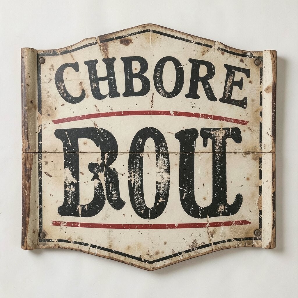
Hand-drawn sign paint lettering feels honest and warm, like it was brushed onto wood by a skilled shop owner. The uneven strokes and small flaws make it feel human and full of character.
That handmade look is useful for cafes, markets, and local brands that want to feel friendly. It is easy to personalize with rough edges, small flourishes, or a custom shadow, and it usually costs less when you sketch the idea yourself before refining it in digital form.
Many modern designs use this style because people like work that feels real and not too polished. If you want it to stay clear, keep the letter shapes bold and simple, then add texture around the edges instead of inside every letter.
6. Psychedelic Swirl Typography
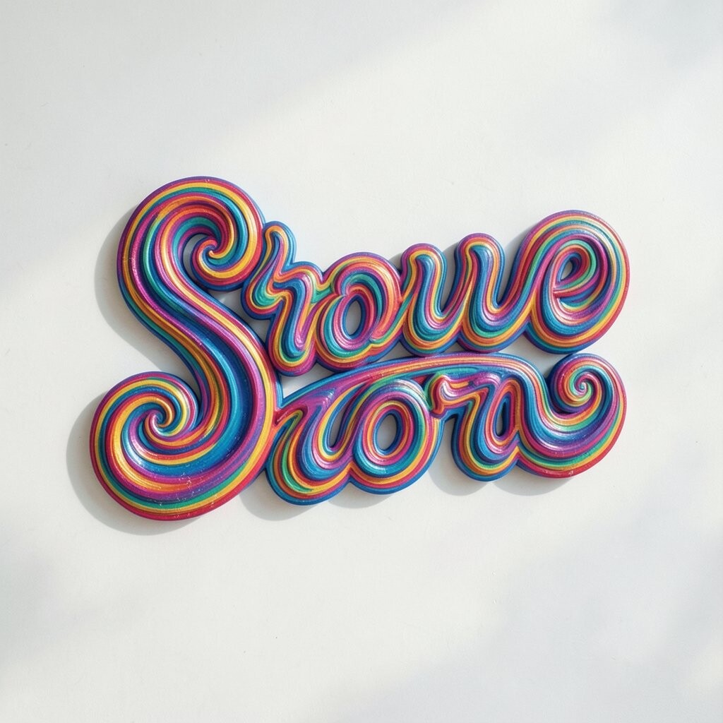
Psychedelic swirl typography bends, twists, and moves in a way that feels wild and dreamy. The letters can look like they are floating through music, color, and motion.
This is a fun choice when you want your work to feel bold and different from simple clean fonts. You can keep production costs low by using one or two strong colors and relying on shape rather than complex decoration, then make it unique with stretched curves or warped baselines.
It can work especially well for music flyers, art prints, and social graphics that need a loud voice. To keep it usable, pair the swirl style with a plain support font so the main message still reads easily.
7. Old Newspaper Serif Type
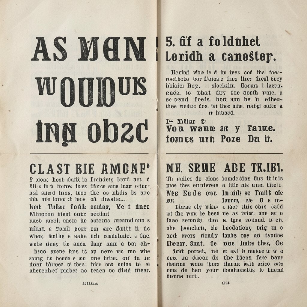
Old newspaper serif type has tight spacing, tiny feet, and a serious mood that feels tied to print history. It brings an immediate sense of trust and age, like something clipped from a headline or a classic ad.
This style is useful when you want your design to feel smart and rooted in the past. It usually costs very little to build because the letter shapes are simple, and you can make it feel fresh by mixing in bold size changes, textured paper, or a modern layout.
Current design trends often pair old serif styles with soft neutral colors and clean open space. A personal touch like a slight ink fade or uneven alignment can help the piece feel less formal and more alive.
8. Rounded Mid-Century Sans
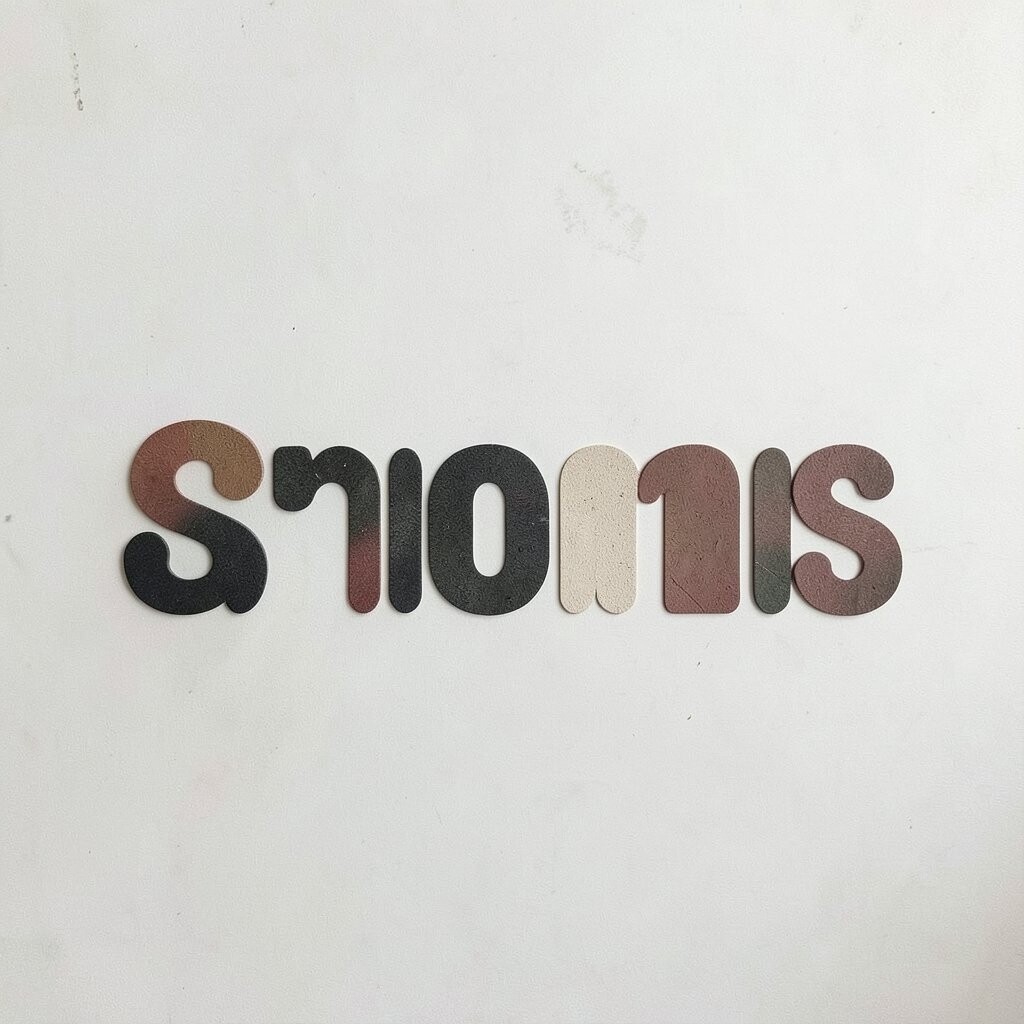
Rounded mid-century sans lettering feels smooth, neat, and full of quiet charm. Its soft corners and balanced shapes give a design a calm retro mood without looking heavy.
This makes it a good fit for packaging, logos, and lifestyle graphics that need to feel welcoming. It is practical because it reads well at many sizes, and it can stay affordable since the style does not need much extra decoration to look good.
You can personalize it with a tiny slant, playful spacing, or a bright accent color. It also fits well with current clean retro trends that mix old comfort with simple modern structure.
9. Western Rodeo Style Type
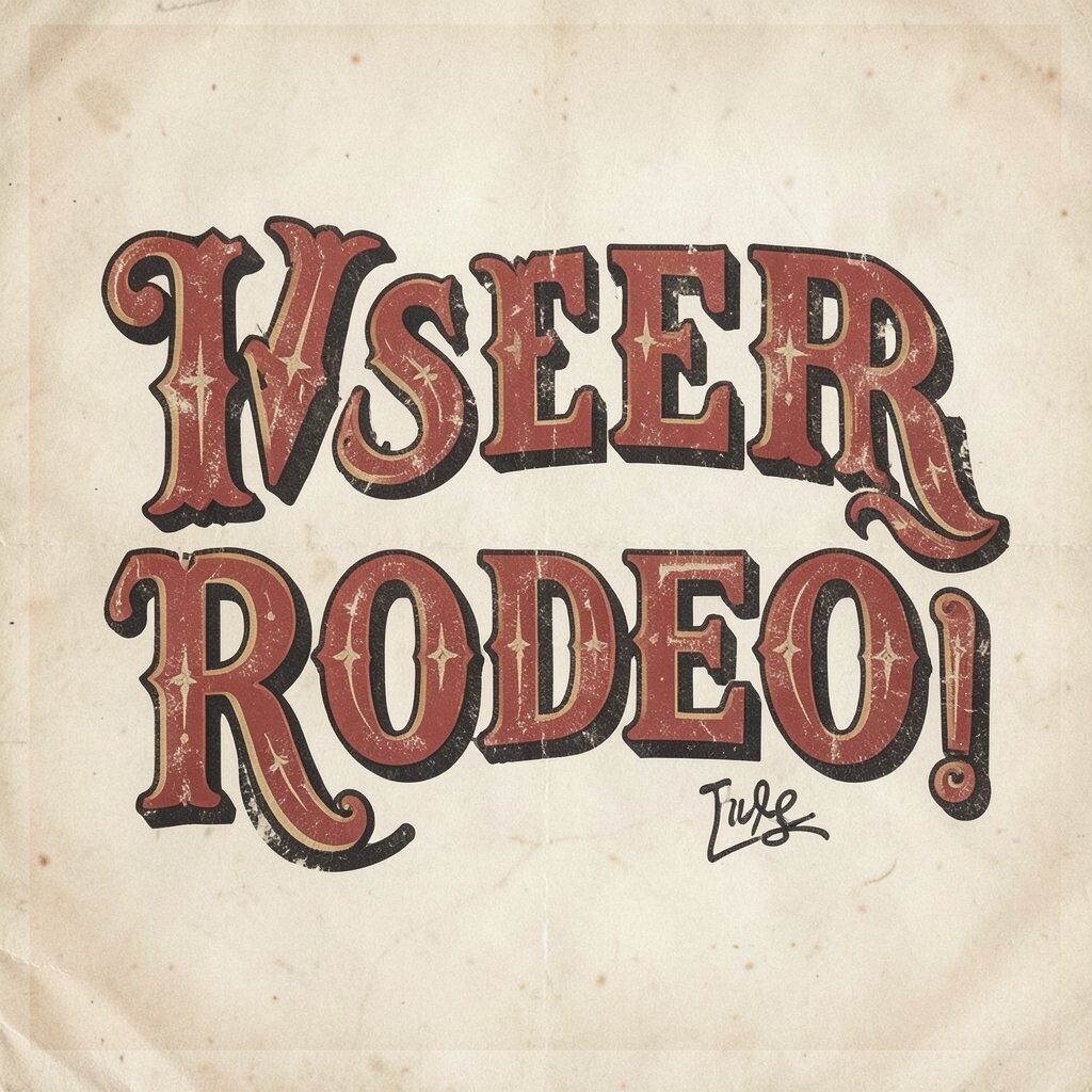
Western rodeo type has bold curves, decorative serifs, and a strong frontier feel that can make a piece stand tall. It often looks like it belongs on old festival posters, saddle shops, or country fair signs.
This style brings big personality, which makes it useful for event art and branding that wants a confident voice. You can keep costs manageable by using one strong display font and adding simple line work, then make it more personal with stars, ropes, or a custom badge shape.
It works best when the letters have room to breathe, since crowded western type can lose its charm. Many designers now pair it with muted earth colors for a more modern rustic look.
10. Faded Beach Resort Lettering
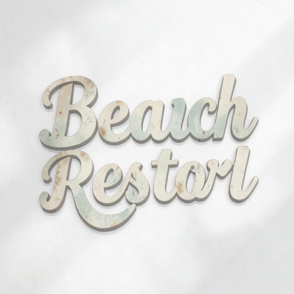
Faded beach resort lettering feels sun-washed, relaxed, and a little worn in the best way. The soft edges and light textures can make your design feel like an old postcard or a coastal sign.
This is a lovely choice for summer brands, travel graphics, and menu art because it feels easy and cheerful. It can be done on a small budget with washed colors and simple texture overlays, and you can make it unique by using wave-like curves or light shadow effects.
To keep it current, many designers use this look with soft coral, faded blue, and sandy beige. A personal detail such as a tiny palm, shell, or sun mark can make the type feel more memorable.
11. Retro Futurist Chrome Text
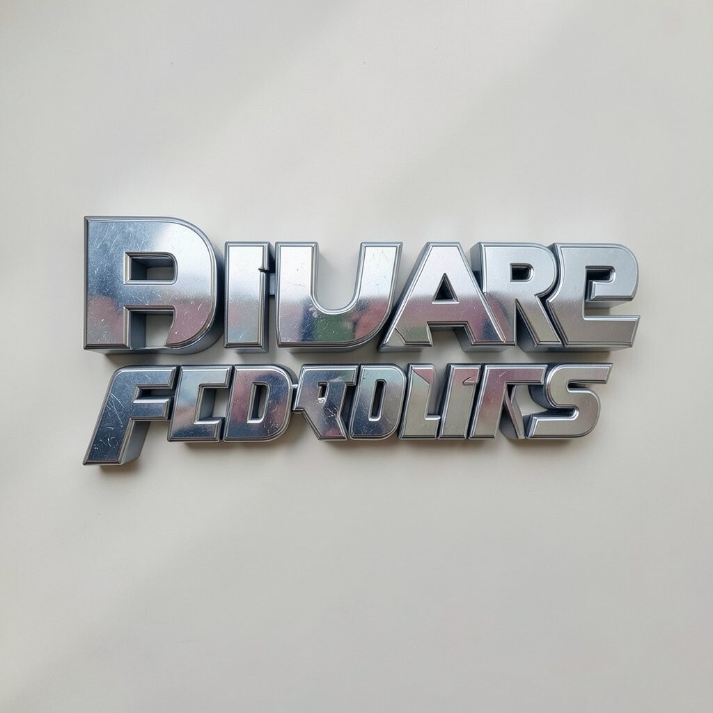
Retro futurist chrome text shines with a cool mirror effect that feels both old and new. It often looks like it came from an old sci-fi movie but still belongs in today’s digital world.
This style has strong visual power, so it works well for posters, music covers, and tech-inspired branding. It may take a bit more work than flat type, but simple gradients and highlights can keep costs down while still giving the letters a polished metal look.
You can make it more personal by changing the shine direction, adding a glow, or pairing it with a plain body font. The chrome trend stays popular because it gives retro work a fresh edge without losing the vintage feel.
12. Bold Circus Poster Letters
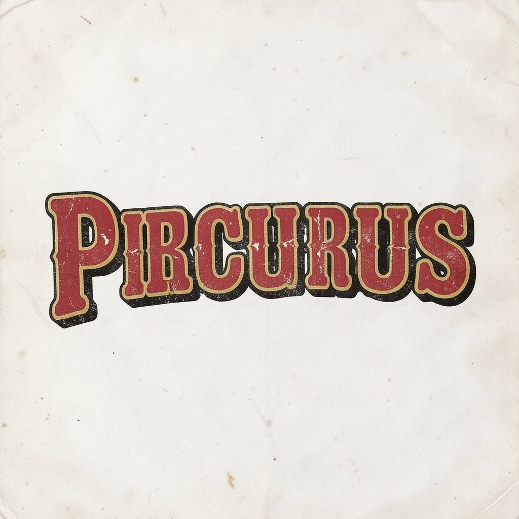
Bold circus poster letters feel loud, fun, and full of showtime energy. Their heavy shapes, decorative edges, and playful rhythm can make a design feel like a vintage fairground sign.
This style is useful when you want people to notice a message right away. You can keep the look affordable by using flat colors and simple outlines, then add uniqueness through shadow blocks, tiny stars, or slightly uneven letter widths that feel hand made.
It also works well in modern branding for food, events, and creative shops that want a joyful vibe. If you want the design to feel less busy, keep the background simple so the letters stay the star.
13. Tape-Labeled Cassette Type
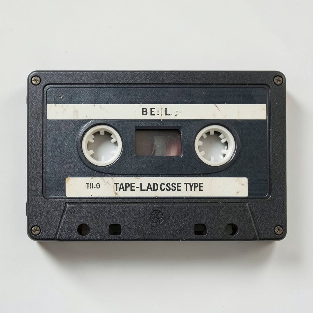
Tape-labeled cassette type has a compact, mechanical feel that brings back old mixtapes and music shelves. The letters often look neat, boxed, and a little rugged, which gives the design a cool archive mood.
This style is a strong choice for album art, sticker packs, and nostalgia-based branding because it feels instantly familiar. You can make it on a small budget with basic sans serif shapes and label-like frames, then personalize it with scribble marks, code numbers, or fake wear marks.
Current trends often mix this cassette feel with bright digital colors for a playful contrast. It helps to keep the spacing tight but readable, so the design feels true to the source without getting messy.
14. Inflated Bubble Lettering
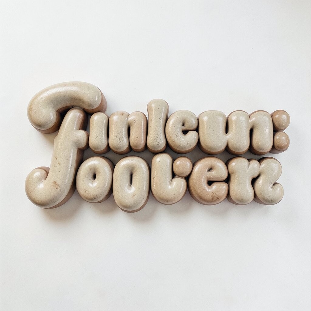
Inflated bubble lettering feels soft, bright, and full of happy energy. The rounded shapes can make words look almost touchable, like inflatable toys or old candy ads.
This style is great when you want your work to feel fun and youthful. It is easy to personalize with shiny highlights, thick outlines, or a custom color blend, and it can stay low cost because the forms are simple even when they look rich.
Many designers use bubble letters again because they fit social graphics and merch so well. To keep the look stylish, pair them with a clean layout and avoid too many extra effects around the letters.
15. Distressed Wood Type
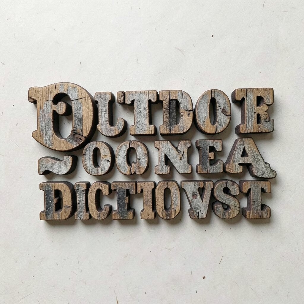
Distressed wood type feels rough, bold, and full of old-world charm, like a sign that has weathered years of sun and rain. The cracked texture and worn edges can give a design a strong story right away.
This style is helpful for brands that want a rustic or handmade voice, especially in food, outdoor, and craft spaces. It can be budget friendly because texture does much of the work, and you can make it personal with custom grain marks, faded ink, or a hand-cut shape.
It also fits current design trends that favor natural materials and authentic looking details. If you want the best result, keep the main letterforms bold so the texture adds interest without hurting readability.