
Soft color can change a room fast. The right faded shade feels calm, fresh, and full of charm.
1. Dusty Rose
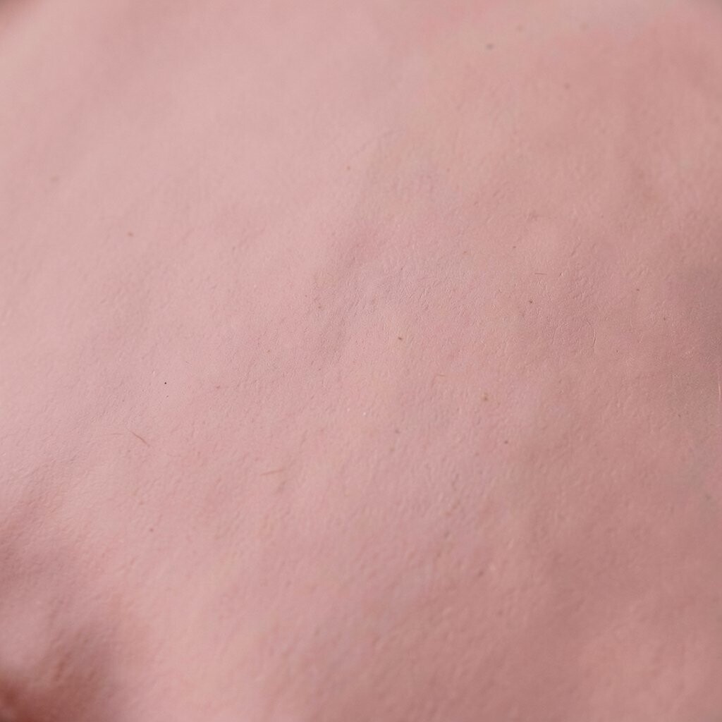
Dusty rose brings a gentle blush that warms a room without shouting for attention. It looks lovely on walls, pillows, or a single chair, and it pairs well with cream, wood, and soft gray.
This shade gives a cozy and romantic feel, which makes it great for bedrooms and sitting spots. It is easy on the eyes, often looks more expensive than it is, and small pieces like a lamp shade or throw blanket can keep costs low while still making the room feel special.
2. Powder Blue
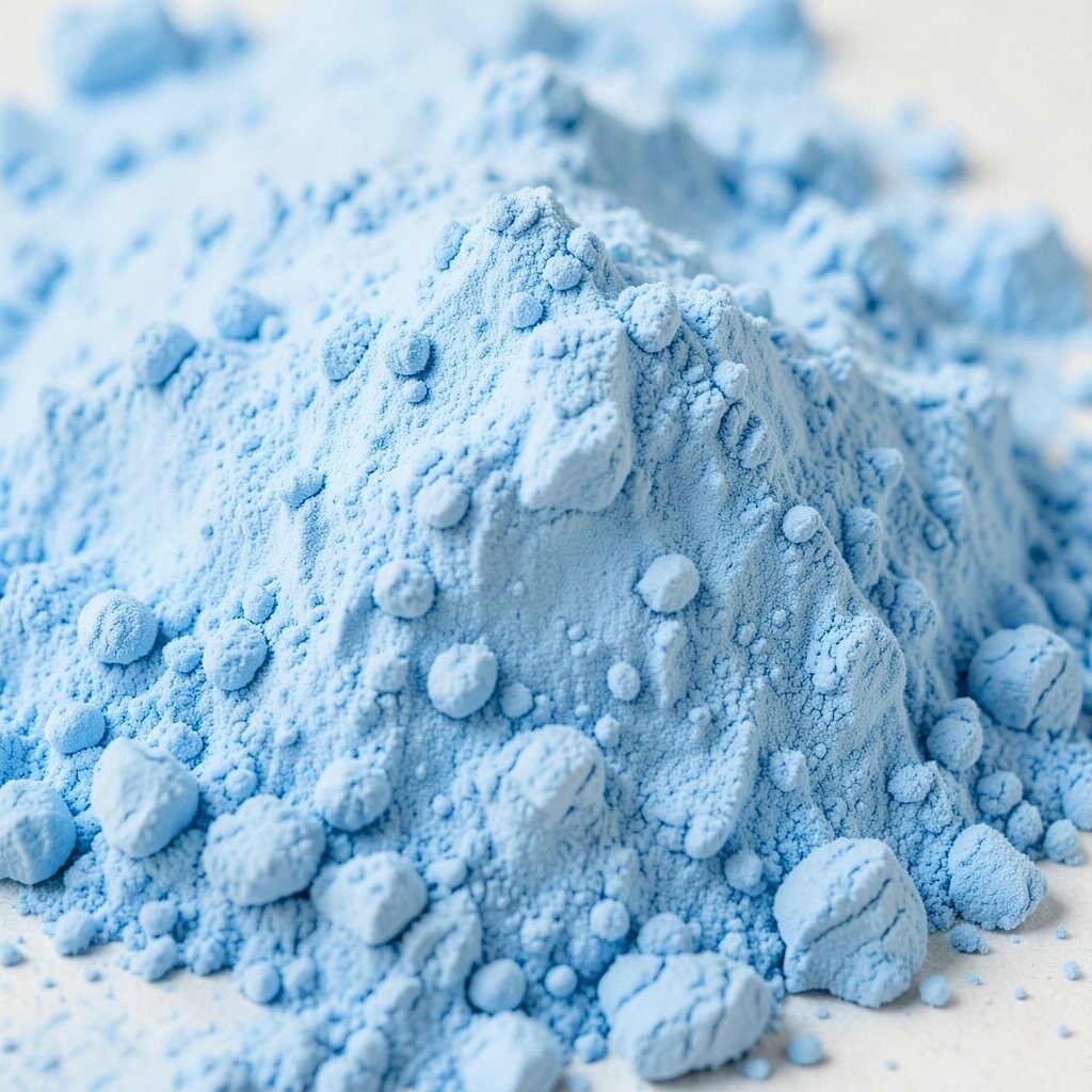
Powder blue feels light, airy, and clean, almost like a clear morning sky inside your home. It works well in bathrooms, bedrooms, and kitchens, and it can make small rooms seem more open.
Many people like it because it feels calm without becoming dull. It fits today’s love for quiet, soft spaces, and you can use it in simple ways such as curtains, dishes, or wall art, which keeps the budget friendly and lets you add your own style with brass, white, or pale wood.
If you want a fresh look, try powder blue beside leafy plants or woven baskets for a sweet mix of cool and warm textures. A little goes a long way, so even one painted shelf or old stool can bring this color into the room at a low price.
3. Sage Green
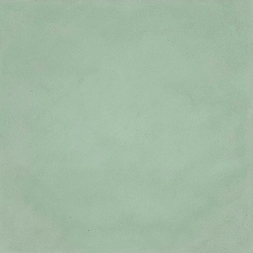
Sage green feels restful and natural, like a garden after rain. It can soften a space fast, and it looks pretty on cabinets, bedding, rugs, and painted furniture.
This color stands out because it feels earthy but still modern. It works well with the current love for nature-inspired rooms, and it is easy to personalize with terracotta, white, or gold pieces, which helps you build a look that feels calm and not costly.
For an easy update, use sage on a single wall or on a few shelves first. The color blends well with both new and vintage items, so you can reuse what you already own and save money while giving the room a gentle lift.
4. Buttercream Yellow
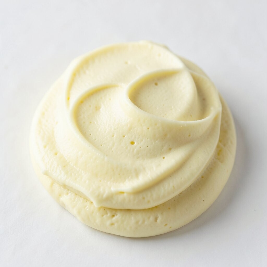
Buttercream yellow adds a soft glow that can make a room feel sunny even on cloudy days. It is brighter than beige but kinder than a bold yellow, so it feels cheerful without being loud.
This shade works nicely in kitchens, nurseries, and entryways where you want a happy welcome. It feels unique because it brings warmth in a quiet way, and it can be used with white trim, pale wood, or patterned fabric for a personal look that does not need a big budget.
5. Misty Lavender

Misty lavender offers a dreamy look that feels soft and a little magical. It can calm a bedroom, brighten a reading nook, or make a plain bathroom feel more thoughtful.
People like it because it feels fresh and a bit different from more common pastels. It fits a trend toward soft, mood-friendly colors, and you can use it in candles, bedding, or framed prints, which gives you room to play without spending much.
A faded lavender wall can look especially pretty with silver, white, or clear glass. If you want a personal touch, mix it with old books, floral art, or a quilt, and the room will feel layered without looking crowded.
6. Peach Haze
Peach haze gives a warm, gentle glow that feels friendly and inviting. It can make living rooms and bedrooms look softer, and it works well with tan, white, and light brown pieces.
This color feels unique because it sits between pink and orange, which makes it easy to use in many styles. It is also a smart low-cost choice since you can bring it in through pillow covers, vases, or an accent wall instead of repainting everything at once.
Right now, soft peach tones are popular in cozy home style because they feel sunny but still calm. Try it with a woven rug or simple ceramics if you want a handmade look that feels personal and warm.
7. Seafoam

Seafoam brings a cool, breezy feeling that can make a room seem fresh and open. It looks lovely on bathroom walls, kitchen tiles, or small decor pieces like picture frames and trays.
This shade stands out because it feels both playful and peaceful at the same time. It is easy to style with white, sandy beige, or light wood, and that makes it a useful choice when you want a pretty room without buying a lot of new things.
Seafoam also works well with shiny metal details, which can make it feel a little more modern. If you like a personal touch, use it with beach art, shell shapes, or soft stripes to bring in a relaxed look that still feels neat.
8. Cloud Gray

Cloud gray has a soft, misty look that can make a room feel clean and balanced. It is gentle enough for walls, but it also works on sofas, rugs, and cabinets when you want a calm base.
The beauty of this shade is that it lets other colors shine without taking over. It is easy to match and usually not expensive to use, especially if you choose it for large basics and add brighter pieces later for a little extra cheer.
Current home trends often lean toward quiet neutrals, and cloud gray fits right in. Add your own style with black frames, pale blue pillows, or a bold plant pot, and the room will feel put together without much effort.
9. Blush Beige

Blush beige gives a soft warm look that feels gentle and elegant. It can brighten a space by adding a hint of pink to a neutral base, which makes it useful for bedrooms, hallways, and family rooms.
This color is special because it feels both modern and classic. It works well with natural materials and can help older furniture look fresh again, which is great when you want a new look without a big spending plan.
Try blush beige with linen, rattan, or pale oak for a warm and easy style. Small touches like a painted side table or new cushion covers can be enough to change the mood of the room in a simple, affordable way.
10. Soft Teal
Soft teal brings a cool spark that can wake up a tired room. It feels like a mix of blue and green, and that mix makes it easy to use in both bold and quiet spaces.
This shade is unique because it has enough color to stand out, yet it still feels calm. It is a good fit for current rooms that mix old and new pieces, and you can add it with art, dishes, or a painted cabinet door without spending much.
Soft teal looks great next to warm wood and creamy white, which helps keep the room from feeling cold. If you want a personal touch, pair it with travel finds or handmade items so the color feels tied to your own story.
11. Pale Coral
Pale coral gives a sweet, sunlit feel that can make a room seem lively and warm. It works well in spots that need energy, such as a breakfast nook, a craft room, or a kid’s room.
This faded shade feels brighter than a plain pastel and softer than a strong orange. It is easy to use in small amounts, which keeps costs down, and it blends nicely with white, sand, or light green for a cheerful but easy look.
Many people like pale coral because it feels happy without being too bright. To make it personal, try mixing it with framed photos, painted jars, or patterned fabric that carries a little coral tone.
12. Warm Taupe

Warm taupe has a cozy, smooth look that can make a space feel settled and neat. It is a faded color that works well on walls, curtains, or big furniture pieces when you want something soft and useful.
This shade is popular because it gives a room quiet strength. It also hides wear better than very light colors, which can save money over time and make it a smart pick for busy homes.
Warm taupe pairs nicely with cream, olive, and black, so it is easy to style in many ways. Add texture with knit blankets, wood bowls, or woven baskets, and the room will feel richer without needing bright paint or costly decor.
13. Icy Mint

Icy mint brings a cool and crisp feeling that can make a room seem fresh right away. It looks clean on walls, shelving, and small decor pieces, and it can lighten darker corners in a gentle way.
This color feels unique because it is soft, but it still has a little sparkle. It fits the modern love for light, airy rooms, and you can personalize it with white, pale wood, or silver accents for a look that feels neat and easy to live with.
If you are watching your budget, start with one mint item like a vase, pillow, or painted chair. That small change can still shift the whole room, especially when you repeat the color in just a few tiny details.
14. Faded Terracotta

Faded terracotta gives a warm, sun-baked feel that adds depth without looking too strong. It works well in living rooms, dining rooms, and entry spaces where you want a cozy and welcoming mood.
This shade stands out because it feels earthy and stylish at the same time. It pairs beautifully with natural fibers and handmade objects, which makes it easy to create a personal space that feels thoughtful and not too costly.
Faded terracotta also works with today’s love for warm, grounded homes. Try it with cream walls, woven lights, or a clay pot, and the room will feel rich in color while still staying calm and simple.
15. Vanilla White
Vanilla white has a soft cream tone that feels warmer than bright white. It can make a room look cleaner, lighter, and more open, especially in small spaces or rooms with little sunlight.
This color is easy to live with because it matches almost everything and rarely feels harsh. It is a practical choice for people who want a fresh look on a smaller budget, since paint, fabric, and decor in this shade are often easy to find and simple to mix with what you already own.
To keep vanilla white from feeling plain, add texture through baskets, soft rugs, and layered fabrics. A little contrast from dark wood, green plants, or black picture frames can make the whole space feel finished, personal, and quietly bright.