Soft petals, faded leaves, and worn paper can feel full of life. These background ideas bring that gentle magic into your art.
1. Faded Herbarium Page Layers

A faded herbarium look gives you pressed leaves, soft stains, and a paper surface that feels old in the best way. It looks calm and wise, and it works well for art that needs a quiet nature mood.
This style is great because it feels detailed without looking too busy, so your main subject can still stand out. You can make it your own by adding handwritten notes, torn edges, or a light wash of cream, sage, or dusty tan, and that usually keeps the cost low if you use simple paper textures and free plant scans.
2. Watercolor Bloom Wash

A watercolor bloom wash gives you soft flower shapes that blur at the edges like they were painted in a rush on wet paper. The gentle color spread makes the whole background feel airy, and that lightness is a big reason artists keep coming back to it.
You can use pale pinks, faded blues, or mossy greens for a fresh look that feels current and easy to pair with digital art or collage. Try layering one large bloom under smaller leaves, and if you want a personal touch, add your favorite flower shape or a color that matches your room, sketchbook, or brand without spending much on materials.
Because the style is so soft, it helps portraits, quotes, and product art feel polished without stealing attention. A few rough brush marks or dry-brush edges can make the image feel more handmade, which is a nice way to add charm and keep the look from feeling flat.
3. Sepia Garden Scrapbook

A sepia garden scrapbook background feels like a page from an old travel journal, with warm brown tones and little plant pieces tucked across the surface. It has a cozy, antique feel that makes art seem thoughtful and collected over time.
This look is popular because it works in both rustic and modern art, especially when paired with lace, postage-style marks, or torn paper bits. You can personalize it with stems from your own garden, and if you are keeping an eye on cost, you can build the whole look with scanned scraps, thrifted paper, and a single tone filter.
The soft brown palette is also easy on the eyes, which helps when you want a background that supports text or layered images. If you want a richer finish, use a few darker leaf shadows near the corners so the center stays open and useful.
4. Ink-Washed Fern Field

An ink-washed fern field gives you long leaf shapes floating over a misty wash, and the result feels elegant without being fussy. The black or deep green lines add strong contrast, while the distressed wash keeps it from looking too sharp or polished.
Many artists like this idea because it fits posters, journals, packaging, and wall art with very little editing. You can add your own twist by changing the fern size, shifting the wash toward blue-gray, or making some edges blotchy for a more weathered feel, and that can still stay budget-friendly with simple brushes and texture overlays.
The trend right now leans toward clean natural forms mixed with worn surfaces, so this background feels both fresh and timeless. A little white space can help the fern shapes breathe, and that makes the art easier to read when you layer other elements on top.
5. Vintage Citrus Press Sheet

A vintage citrus press sheet brings sliced oranges, lemons, and leaves together in a way that feels sunny but gently aged. The colors are cheerful, yet the distressed paper look keeps them soft enough for calm art pieces.
This style is unique because it mixes kitchen garden charm with old botanical print style, which gives you a friendly and playful background. You can make it personal by using fruit from a family recipe or a summer memory, and if you are watching costs, a few fruit illustrations and a distressed cream backdrop can do most of the work.
It is especially useful for labels, recipe art, and gift prints because the shapes are easy to recognize and easy to place. For a current look, try faded coral, muted yellow, and dusty green instead of bright fruit colors, and the whole piece will feel more modern while staying soft.
6. Mossy Frame Collage

A mossy frame collage wraps the edges of your art with soft green growth, like plants are slowly reclaiming the page. The center stays open, so it feels useful for portraits, quotes, or a small focal image.
This idea stands out because it gives you a living border without making the whole background too crowded. You can shape the moss with loose brush marks, add tiny flower buds, or mirror the frame on all sides for a cleaner look, and the cost stays low if you use digital texture stamps or simple paint washes.
It is a nice choice when you want something that feels both wild and neat at once. The edge framing also helps guide the viewer’s eye, which is handy in posters and social art where you want quick impact.
7. Sun-Faded Wildflower Poster
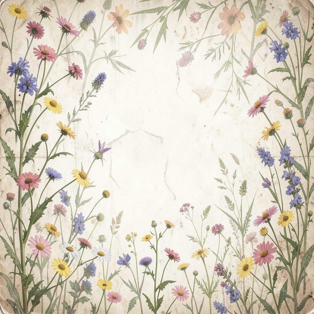
A sun-faded wildflower poster looks like it has spent time in a bright window, with pale petals and worn patches that give it charm. The faded areas make the flowers feel dreamy, almost like a memory instead of a sharp picture.
This background works well for soft branding, nursery art, and romantic prints because the flowers feel friendly and easy to like. You can personalize it by choosing wildflowers from your own region, and if you want to keep spending low, you can make the faded effect with one color overlay and a little grain.
Current design trends often favor gentle nostalgia, and this style fits that mood very well. A few uneven edges or slightly misaligned petals can make the piece feel more handmade, which adds character and keeps the art from feeling too perfect.
8. Cracked Paint Leaf Silhouette
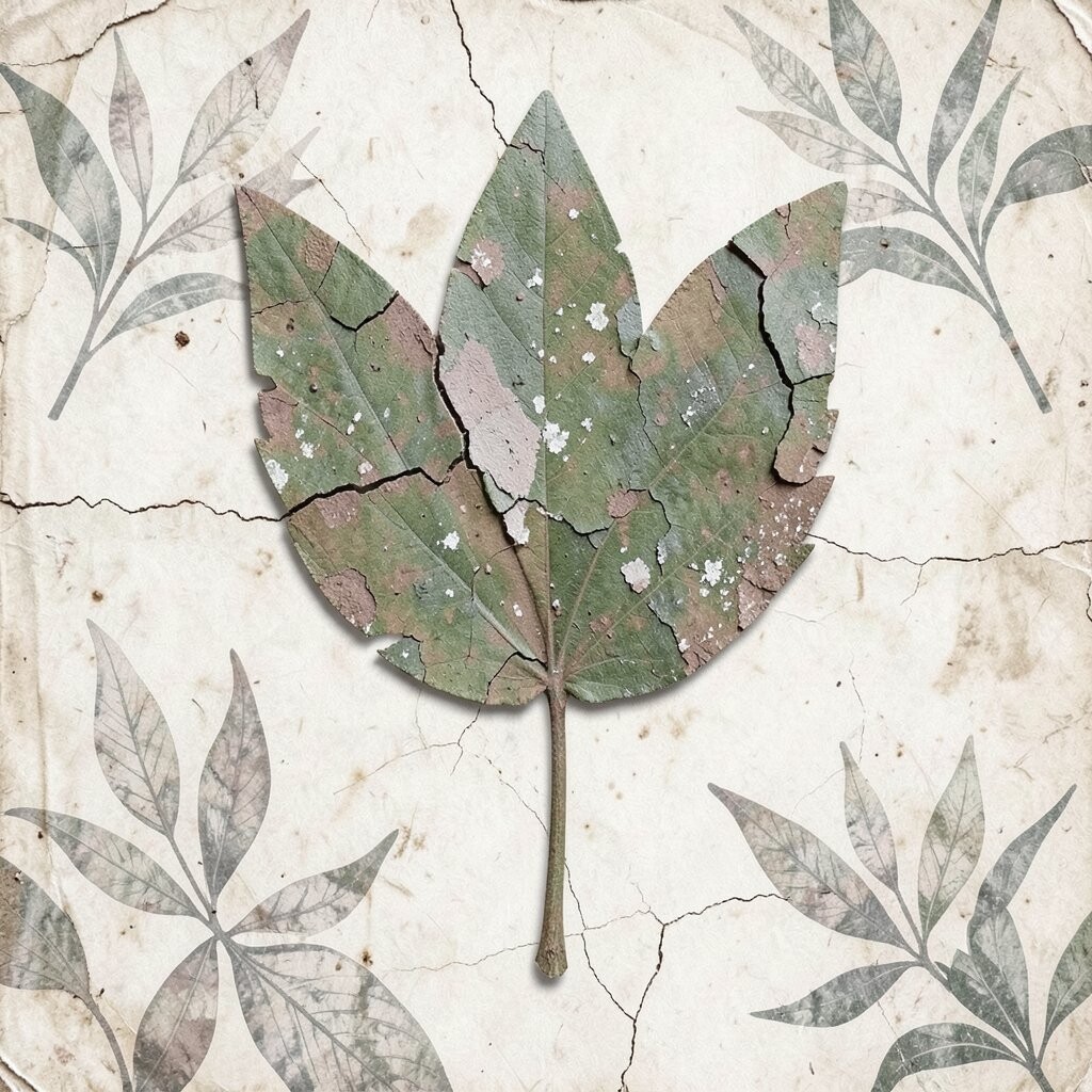
A cracked paint leaf silhouette gives you a bold plant shape with a worn surface that feels full of age and texture. The cracks add interest right away, and the simple silhouette keeps the whole image easy to read.
This idea is useful for modern wall art and mixed media pieces because it balances strong shape with soft distressing. You can make it your own by choosing a maple leaf, a palm frond, or a fern shape, and the cost stays friendly if you work with one strong shape and a few layered texture effects.
It also pairs well with neutral backgrounds, which makes it easy to match with home decor or product mockups. If you want a more artful look, try letting the cracks run unevenly so the image feels like it has real history.
9. Botanical Wallpaper Fade
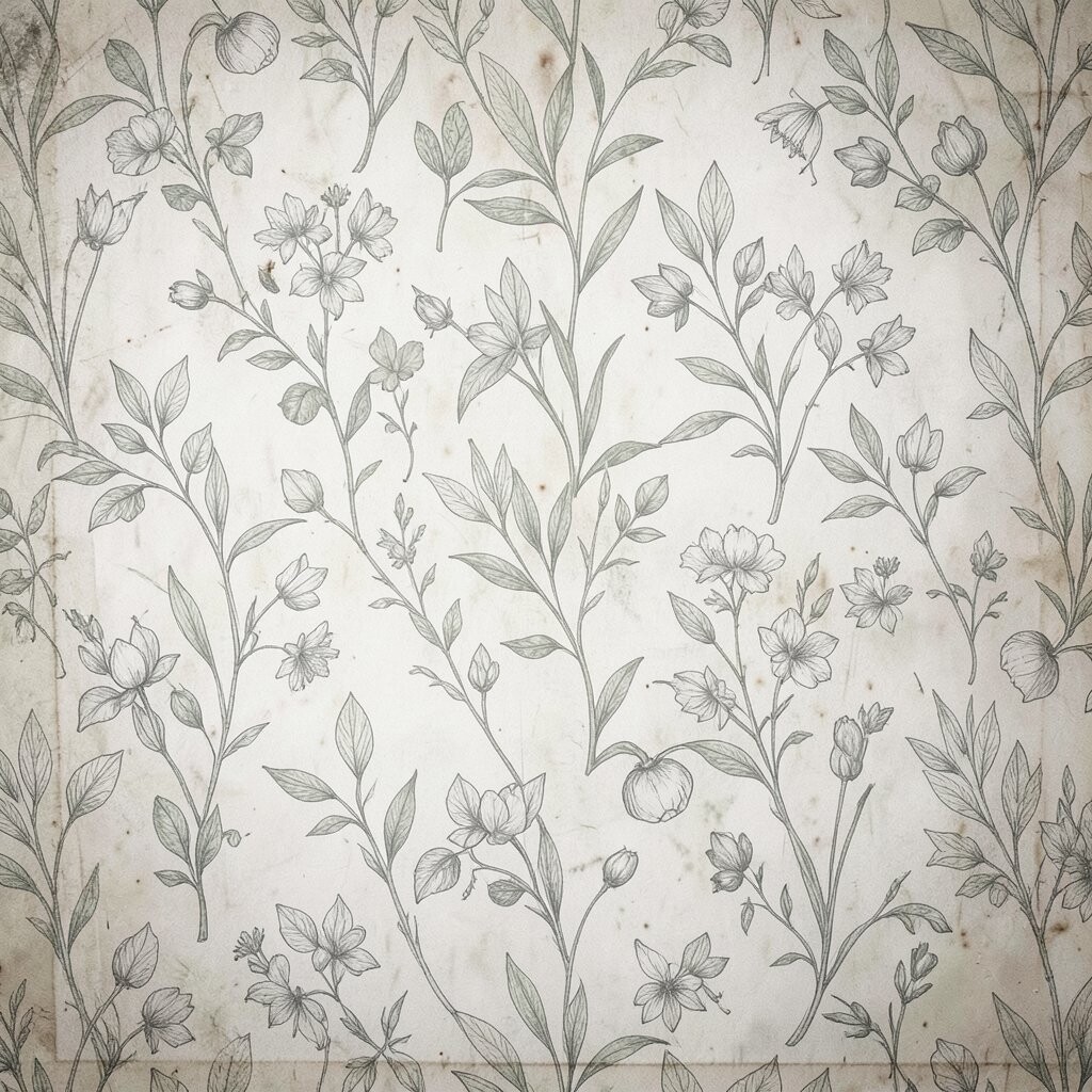
A botanical wallpaper fade looks like an old wall panel or a forgotten room in a garden house, with faded flowers repeating softly across the page. The repeated pattern creates rhythm, while the worn finish makes it feel warm and lived in.
This style is a smart pick when you want background art that can fill a big space without feeling loud. You can adjust the mood by using soft rose vines, tiny leaves, or pale blue blossoms, and personal touches like a favorite family flower can make it feel special without adding much cost.
It is also a good match for current pattern trends, since many artists are mixing classic repeats with rough texture now. If you want a more usable layout, keep one area lighter so text or a main figure can sit there without getting lost.
10. Tea-Stained Ivy Repeat

A tea-stained ivy repeat brings delicate vines across a warm, stained paper base, and the whole thing feels gentle and old-fashioned. The tea marks make the background look handmade, which adds a cozy human touch that many digital pieces need.
This idea is easy to personalize by shifting the ivy shape, adding tiny berry dots, or changing the stain color from tan to amber. It is also a cost-saving option because tea-stain textures are simple to create, and the repeating ivy can be built from one or two vine drawings.
The look is useful for stationery, journals, and social graphics because it fills space without crowding the page. A soft repeat pattern can feel very current when paired with clean type or a single focal flower in the center.
11. Burnished Rose Transfer

A burnished rose transfer gives you roses that look lightly rubbed onto the paper, with edges that fade in and out. The effect feels romantic, but the distressed surface keeps it from becoming too sweet.
Many artists choose this style because it brings a rich floral mood while still leaving room for text or portrait work. You can give it your own spin by using a single large rose, a cluster of small blooms, or a mix of rose and thorn details, and that can stay affordable if you use one strong transfer texture instead of many layers.
The worn shine of the background also works well in elegant poster art and packaging design. If you want a trend-aware finish, try muted plum, dusty blush, and soft brown instead of bright red, since those tones feel more modern now.
12. Weathered Tropical Palms
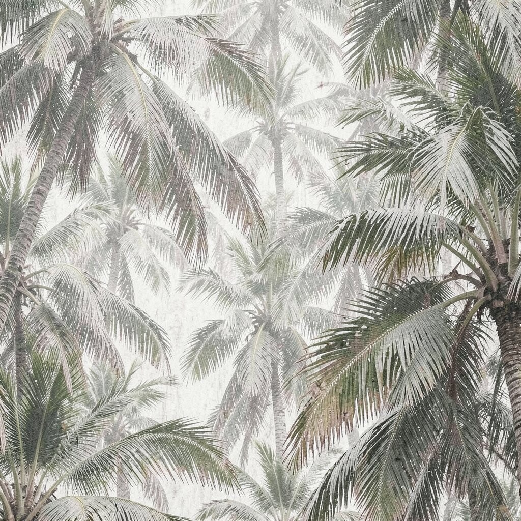
Weathered tropical palms bring wide leaves, broken color, and a breezy feel that still looks a little aged. The mix of island shapes and rough texture gives the art a relaxed style with a bit of drama.
This background is great when you want something lively but not too shiny or polished. You can make it personal with palm types from a favorite trip, and if you need to watch spending, a simple leaf set plus a grainy overlay can create the whole mood without extra tools.
It is also a nice choice for summer art that needs a calmer color palette, since muted teal and sand can feel fresh without being loud. A few faded spots in the leaves can make the design feel sun-touched, which adds life and uniqueness to the scene.
13. Soft Moss and Mushroom Study
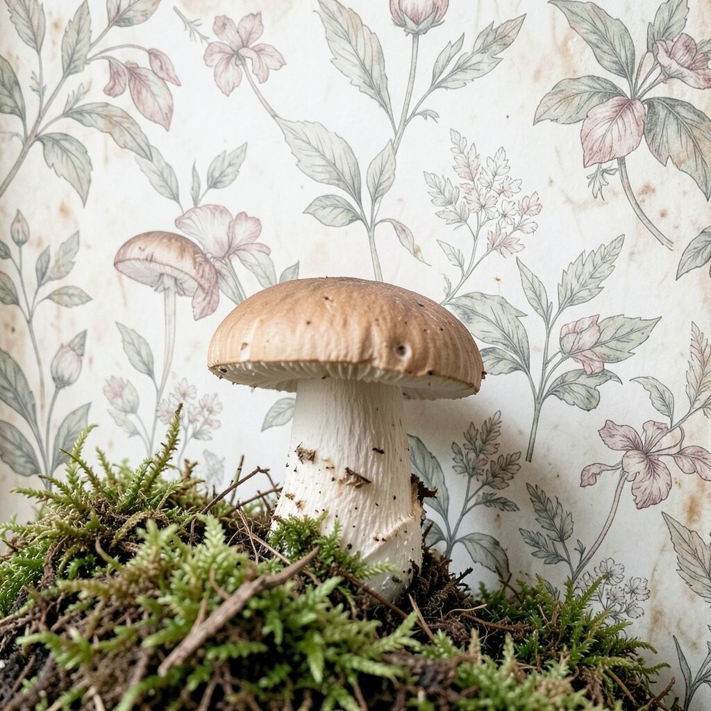
A soft moss and mushroom study feels like a page from a nature notebook, with tiny fungi, low moss patches, and a damp forest mood. The small details make it charming, and the gentle distressing keeps it from looking too exact.
This style is special because it leans into quiet woodland beauty instead of big floral shapes. You can personalize it with mushrooms from your local woods, little initials hidden in the moss, or a favorite earthy color mix, and it can be very affordable if you build it from a few simple sketches and texture layers.
It fits well with the current love for cottage-style art and nature journal looks. If you want the best result, leave some soft open areas so the scene feels airy instead of crowded.
14. Torn Paper Posy Mix

A torn paper posy mix combines cut flower shapes with rough paper edges, and that contrast gives the background a handmade scrapbook feel. The torn sides make the flowers seem a little imperfect in a way that feels honest and lovely.
This idea is useful for artists who want a playful background that still feels polished enough for prints or posts. You can personalize it with flowers from a birthday, wedding, or childhood garden, and if you are keeping costs low, paper scraps and scanned textures can do most of the visual work.
The style also matches today’s collage trend, where rough edges and layered shapes are very popular. A light shadow behind each torn piece can help the posies pop, and that makes the design easier to use across different projects.
15. Dusty Wild Meadow Horizon

A dusty wild meadow horizon gives you a wide, open scene with low flowers, soft grass, and a hazy line in the distance. The distressed finish makes the meadow feel aged by sun and wind, which adds a peaceful, story-like mood.
This background is useful when you want space for text, a character, or a center object, since the open horizon keeps the layout balanced. You can make it personal with flowers from a place you love, and if you want to keep the price down, a simple horizon wash and a few repeated meadow marks can carry the whole piece.
It also fits current art tastes because people are drawn to calm landscapes and muted earth tones right now. A little grain, some softened edges, and a pale sky can make the scene feel dreamy while still leaving it practical for posters, covers, and art prints.