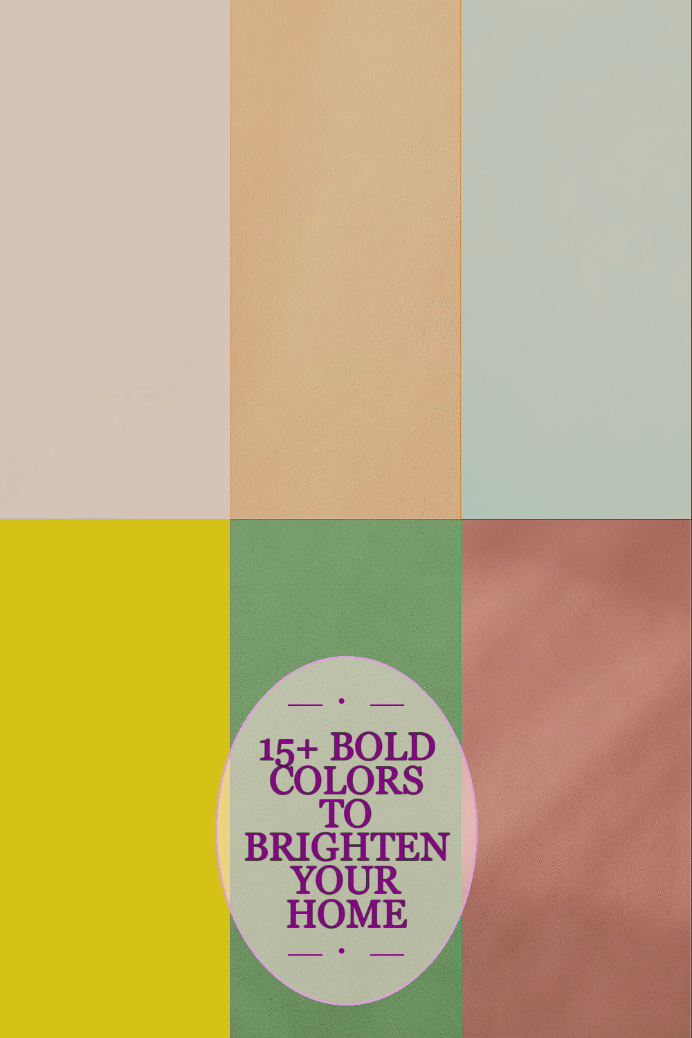
Color can change the whole mood of a room. A fresh shade can make home life feel lighter, warmer, and more alive.
1. Soft White

Soft white brings a clean glow that makes rooms feel open and airy. It works well on walls, trim, and ceilings, and it helps natural light bounce around in a gentle way.
This shade feels calm and easy, which is great for busy homes that need a fresh reset. It also pairs with almost any style, so you can change furniture, art, or pillows later without worry, and that saves money over time.
2. Warm Beige

Warm beige gives a room a cozy look without making it feel dark. Its soft sandy feel adds comfort, and it looks lovely with wood, woven baskets, and cream decor.
Many people like it because it feels rich but still simple, which makes it a smart choice for living rooms and bedrooms. If you want a personal touch, try mixing it with brass lamps or soft green plants, and the cost stays friendly because it works with many budget pieces.
Warm beige is also on trend in homes that want a calm, natural look. It is a nice pick if you want something timeless that does not shout for attention.
3. Pale Blue

Pale blue brings a fresh sky-like feeling that can make a room seem bigger and brighter. It looks sweet in bedrooms, bathrooms, and quiet reading corners where you want a peaceful mood.
This color has a cool charm that feels neat and clean, and it can soften bold furniture in a nice way. Pair it with white curtains or light wood for a breezy look, and choose matte paint if you want to keep the cost low while still getting a polished finish.
It also feels very current in rooms that lean toward seaside or cottage style. For a personal touch, add navy pillows or silver frames to give it more depth.
4. Sunny Yellow

Sunny yellow adds a happy spark that can wake up dull spaces fast. It looks bright and cheerful on an accent wall, in a breakfast nook, or on small furniture pieces.
This shade is special because it brings energy without needing much extra decor. To keep it from feeling too loud, use it with white, gray, or light wood, and remember that a small splash of yellow often costs less than painting a whole room.
5. Sage Green

Sage green feels fresh, gentle, and easy on the eyes. It gives a room a soft garden look, which can make your home feel more calm and cared for.
People love it because it works in both modern and farmhouse spaces, so it has a wide appeal. Try it with cream textiles and natural wood for a balanced look, and add a handmade planter or framed print if you want the room to feel more personal.
Sage green is also a favorite in current home design because it brings nature indoors without being too bright. Since it looks good with many thrifted or simple pieces, it can be a smart choice for saving money.
6. Dusty Rose

Dusty rose adds a soft blush that feels warm and inviting. It can make bedrooms, sitting areas, and dressing corners feel sweet without looking too childish.
This color stands out because it has a muted charm that works well with gold, beige, and even dark wood. If you want a custom look, mix it with velvet pillows or art with soft line drawings, and choose one painted chair or lamp base if you want a lower-cost way to use it.
Dusty rose is stylish right now because many homes are moving toward gentle, welcoming color. It gives rooms a bit of romance while still keeping things relaxed.
7. Light Gray

Light gray gives a room a smooth, fresh base that feels clean and modern. It can brighten spaces that do not get much sun, and it makes colorful art or rugs stand out in a simple way.
Its biggest strength is that it feels neat without being cold when the right undertone is chosen. Use warm lighting, soft blankets, and wood pieces to keep it cozy, and the paint cost usually stays reasonable because it works well across many rooms.
Light gray is still popular in homes that want a tidy, calm look. You can make it your own with black frames, blue pillows, or soft cream curtains.
8. Coral

Coral has a lively glow that feels cheerful and full of personality. It looks bright in kitchens, playrooms, and entry spaces where you want guests to feel welcome right away.
This color is unique because it sits between pink and orange, so it feels playful without losing warmth. Pair it with white shelves or pale wood to keep the room balanced, and use it on a smaller wall or chair if you want to manage the cost.
Coral fits well with current bold-color trends that still aim for friendly, easy living. A few coral pillows or a patterned vase can give your space a fun pop without much effort.
9. Cream

Cream gives a soft glow that feels richer than plain white but still very light. It works well in almost any room and helps create a warm, polished look.
Because it is so flexible, cream can make colorful decor look brighter and more cared for. Add texture with knit throws, linen curtains, or woven rugs to keep it interesting, and it can be a cost-smart base since you can change small accents instead of repainting often.
Many people like cream for its classic feel and easy style. It is a quiet color, but it still makes a room feel finished and inviting.
10. Powder Blue

Powder blue has a light, airy feel that can make a room seem restful and open. It is lovely in bathrooms, nurseries, and small bedrooms where a soft color can do a lot of work.
This shade feels fresh and neat, and it has a gentle old-fashioned charm that still looks current. Try it with crisp white trim, glass decor, or pale oak furniture, and choose a single painted shelf or dresser if you want a lower-cost way to add it.
Powder blue can be made more personal with nautical art, floral prints, or silver touches. It is a nice pick for anyone who wants color without a heavy look.
11. Blush Pink
Blush pink brings a delicate warmth that feels soft and uplifting. It can brighten a bedroom, a home office, or even a hallway with a gentle glow.
This color is special because it feels sweet but grown-up, so it fits many styles from modern to vintage. Use it with white, tan, or muted green, and keep the cost simple by adding blush through pillows, bedding, or a painted side table.
Blush pink remains a favorite in home design because it feels welcoming and easy to live with. If you want a personal twist, mix in handmade ceramics or framed family photos.
12. Mint Green

Mint green brings a crisp, cool look that feels fresh the moment you walk in. It can brighten kitchens, laundry rooms, and kids’ spaces with a clean and happy mood.
This color feels unique because it is light enough to stay soft, yet colorful enough to stand out. Pair it with white tile, silver hardware, or pale wood to keep the look easy and bright, and it often stays affordable when used on one wall, chair, or cabinet set.
Mint green is a good choice for current homes that want a playful but neat style. You can make it feel more yours with simple art, striped towels, or glass jars.
13. Terracotta

Terracotta gives a room a warm earth tone that feels rich and lively. It works well in dining rooms, living rooms, and cozy corners that need more depth and color.
This shade stands out because it brings the feeling of clay, sunshine, and natural texture all at once. Use it with cream, olive, or black accents for a grounded look, and if you want to keep spending low, try terracotta pillows, pottery, or a single painted accent wall.
Terracotta is very popular right now because homes are leaning toward warmer, nature-inspired colors. It also makes a room feel personal and lived in, which many people find comforting.
14. Lavender

Lavender adds a light, dreamy feel that can make a space seem calm and cheerful at the same time. It looks pretty in bedrooms, craft rooms, and quiet sitting areas where softness matters.
Its uniqueness comes from the way it feels both fresh and a little playful. Pair it with white, pale gray, or silver, and add simple floral art or soft fabrics to make it feel special without a big cost.
Lavender is often used in modern homes that want a gentle splash of color. A few lavender candles or cushions can change the mood without needing a full room update.
15. Navy Blue

Navy blue gives a room a strong, clean look that still feels bright when balanced well. It can add style to an office, bedroom, or dining area and make light decor stand out clearly.
This color feels unique because it is deep and bold, yet it can still work like a neutral in the right setting. Use it with white trim, warm wood, or brass details, and if you want a budget-friendly option, paint just one wall or a set of cabinets.
Navy blue is still a steady trend because it brings a tailored look to homes. You can make it more personal with family art, patterned rugs, or a soft cream throw.
16. Soft Peach

Soft peach gives a room a warm glow that feels cheerful and kind. It can brighten kitchens, guest rooms, and entry spaces with a gentle color that feels friendly right away.
This shade is special because it adds warmth without going too bold, and that makes it easy to live with every day. Pair it with white, tan, or light gray for a smooth look, and use it on accent pieces or a feature wall if you want to keep the cost under control.
Soft peach fits well with today’s love for cozy, welcoming spaces. It is also easy to personalize with woven textures, simple art, or a few green plants that make the whole room feel complete.