
Color can change the whole mood of a room. A fresh palette can make a space feel cheerful, calm, bold, or cozy.
1. Soft Sunshine Yellow and Cream
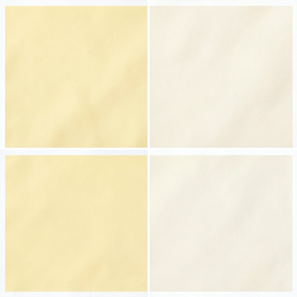
Soft sunshine yellow paired with cream brings a warm glow that feels happy right away. It works well in rooms that need a lift without feeling too loud.
This palette looks lovely on walls, throw pillows, and small decor pieces. It is a smart pick if you want brightness on a low budget because you can add it with paint, fabric, or even art prints. For a personal touch, mix in wood tones or white frames so the room feels light and friendly.
2. Sky Blue, White, and Pale Gray

Sky blue with white and pale gray creates a clean, open look that feels fresh and airy. The mix can make a small room seem bigger and calmer.
This palette is great for bedrooms, bathrooms, and quiet reading corners. It feels unique when you use soft blue curtains, gray rugs, and white shelves together. If you want to keep costs down, start with one painted wall and add matching accents over time.
Many people like this style because it fits modern homes and coastal looks. It is also easy to personalize with silver lamps, glass vases, or framed beach art.
3. Coral, Peach, and Warm White
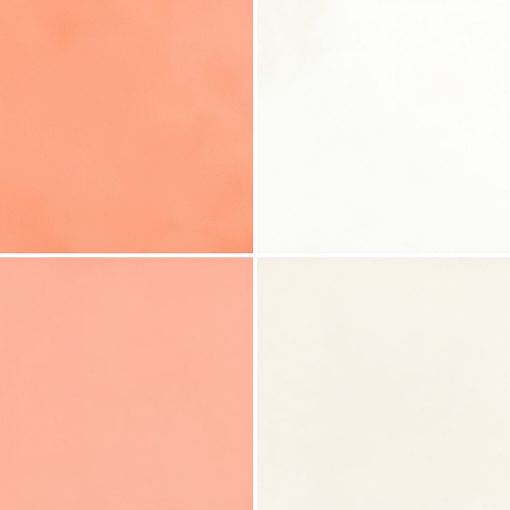
Coral and peach bring a sweet, glowing feeling that can make any room seem more lively. Warm white keeps the look soft so it never feels too strong.
This palette is wonderful for living rooms, entryways, and kids’ spaces. It stands out because it feels playful but still polished. Try coral cushions, peach candles, and a warm white rug to make the colors blend in a gentle way.
If you want a lower-cost update, swap in pillow covers or lampshades first. This color mix is also trendy in cozy, social spaces because it feels welcoming and bright.
4. Mint Green and Soft Beige
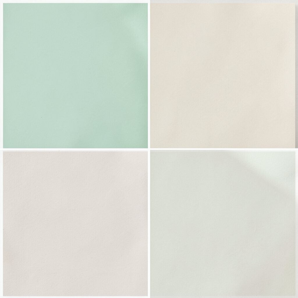
Mint green and soft beige create a fresh look that feels peaceful and clean. The colors have a light, natural feel that works well in many homes.
This palette is nice for kitchens, laundry rooms, and bathrooms. It feels unique because mint adds a cool pop while beige keeps things grounded. You can personalize it with woven baskets, plants, or pale gold handles for a gentle style boost.
5. Lavender, White, and Light Wood
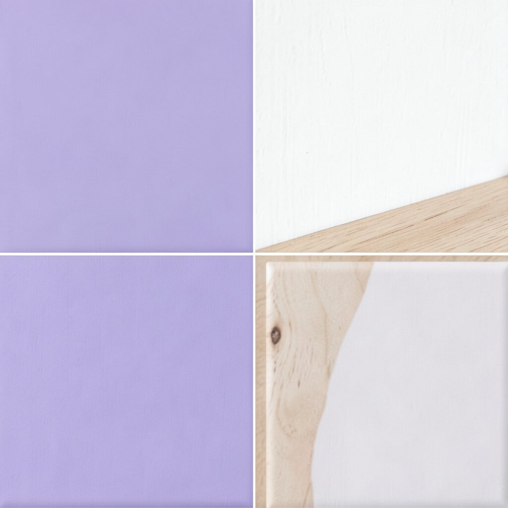
Lavender gives a room a dreamy glow, while white keeps it crisp and bright. Light wood adds warmth so the space feels balanced and calm.
This palette is a charming choice for bedrooms, craft rooms, and cozy corners. It can make a room feel special without being too bold. If you are watching your budget, a lavender accent wall and a few white accessories can go a long way.
Current decorating trends often favor soft, restful colors like this one. Add a knit throw or simple floral art to make the room feel more personal and sweet.
6. Teal, Sand, and Bright White
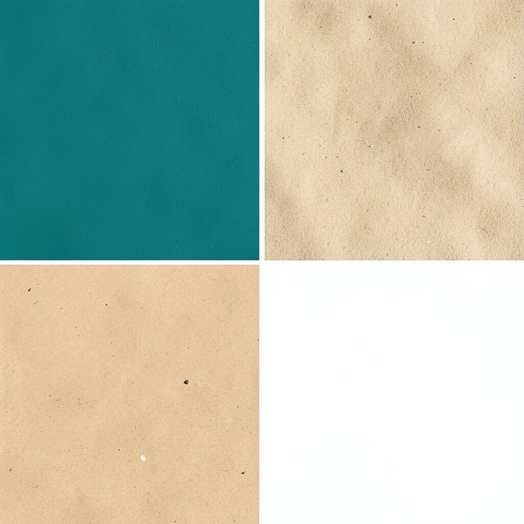
Teal brings rich color, sand adds softness, and bright white keeps the whole room looking fresh. Together they make a space feel lively but still easy to enjoy.
This palette works well in dining rooms, home offices, and family rooms. It is unique because teal gives the room energy without making it too busy. Try using teal chairs, sand-colored curtains, and white trim to create a clean, stylish look.
For a budget-friendly update, paint just one accent wall or add teal table decor. You can also make it more personal with travel photos, woven textures, or sea-inspired art.
7. Blush Pink and Soft Taupe

Blush pink and soft taupe create a gentle, warm look that feels calm and pretty. The colors work together like a soft hug for the room.
This palette is lovely in bedrooms, dressing areas, and sitting rooms. It looks unique when paired with velvet pillows, simple ceramic lamps, or matte metal details. If you want to save money, use blush in small accents and let taupe cover larger items like rugs or curtains.
Many people love this style because it feels modern and cozy at the same time. Add personal touches like family photos or a favorite mirror to make the room feel complete.
8. Lemon, Charcoal, and White

Lemon yellow adds a bright spark, while charcoal gives the palette a strong edge. White keeps everything balanced and helps the yellow pop.
This mix is perfect for people who want a lively room with a bold twist. It can make kitchens, playrooms, or creative workspaces feel full of energy. Use lemon stools, charcoal shelves, and white walls to keep the look fresh and sharp.
If you want an affordable update, start with small items like dish towels, desk tools, or framed prints. This palette feels especially current in homes that like clean lines and happy color.
9. Olive Green, Warm White, and Brass
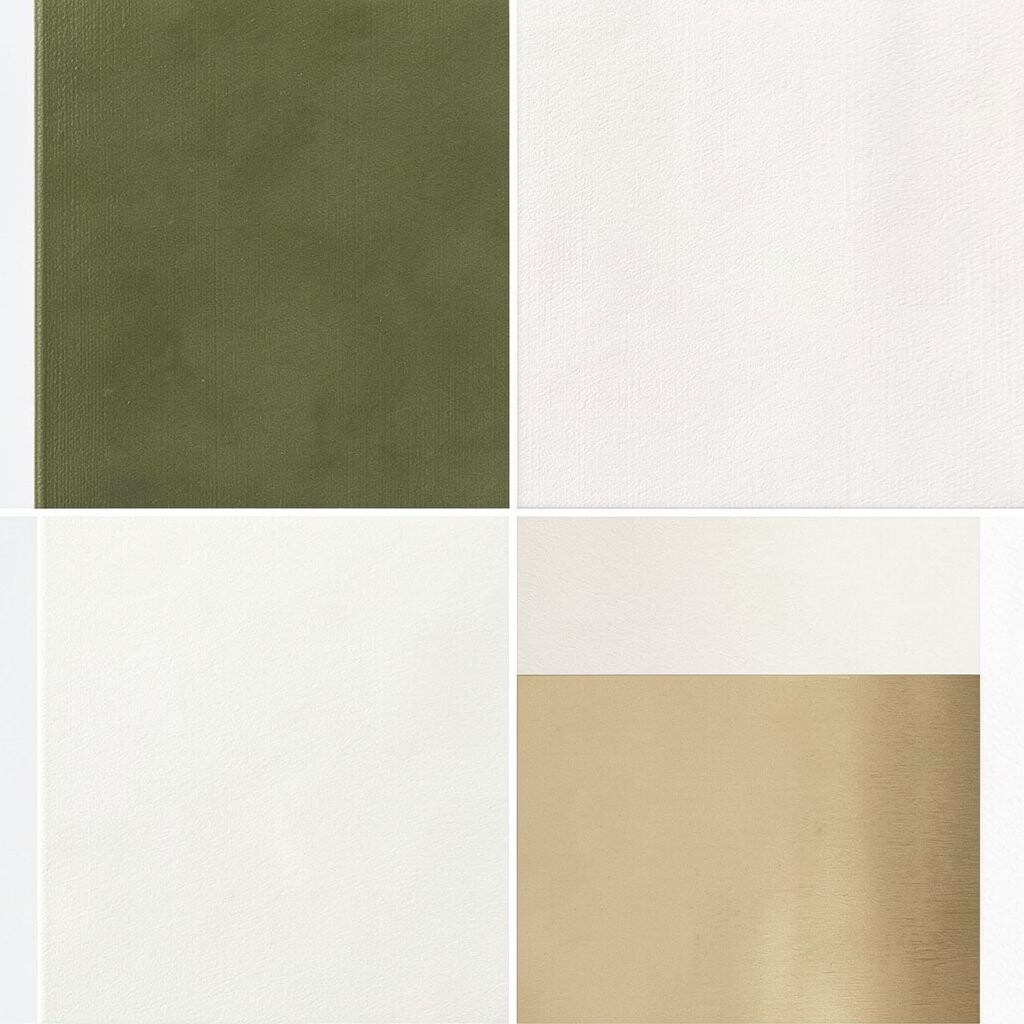
Olive green gives a room a rich, natural feel, and warm white keeps it bright. Brass details add a little shine that makes the space feel special.
This palette is a good fit for living rooms, hallways, and dining areas. It stands out because it feels earthy and elegant at the same time. You can personalize it with leafy plants, textured pillows, or brass picture frames.
For cost control, use olive in one main piece like a chair or cabinet. The rest can stay simple, which helps the room feel polished without a big spending plan.
10. Aqua, Pale Yellow, and Cloud White

Aqua and pale yellow make a room feel sunny, playful, and light. Cloud white gives the palette a soft background that keeps it from feeling too busy.
This combination is great for bathrooms, sunrooms, and cheerful family spaces. It feels unique because it blends cool and warm tones in a way that feels easy and bright. Try aqua towels, pale yellow art, and white shelves for a fresh, happy look.
If you want a simple update, use these colors in accessories instead of large furniture. Small touches like soap dispensers, cushions, or lamps can make a big difference.
11. Terracotta, Ivory, and Sage
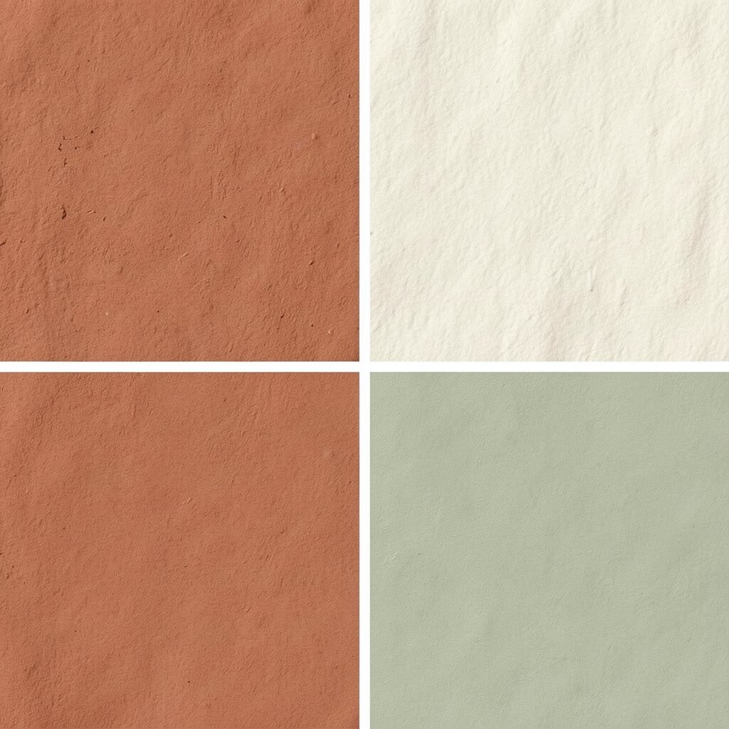
Terracotta brings a warm, sunbaked look, while ivory softens the space. Sage adds a calm green note that makes the palette feel balanced.
This trio works well in kitchens, living rooms, and dining spaces. It feels special because it mixes earthy warmth with a fresh garden feel. You can use terracotta planters, sage curtains, and ivory walls to create a cozy and bright room.
It is also a smart choice if you like a home that feels current but not too trendy. To keep costs down, start with paint and a few simple decor pieces before adding more.
12. Powder Blue and Butter Yellow
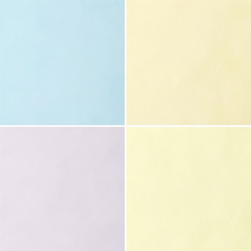
Powder blue and butter yellow create a soft, cheerful look that feels like a sunny morning. The colors are gentle, so they brighten a room without shouting for attention.
This palette is ideal for nurseries, guest rooms, and small apartments. It feels unique because it has a sweet vintage charm that still works in modern spaces. Use butter yellow in pillows or art and powder blue in larger pieces for a balanced look.
Personalize the room with handmade items, soft patterns, or family keepsakes. If you are on a budget, painted picture frames and thrifted decor can help the palette feel complete.
13. Emerald Green, White, and Light Oak
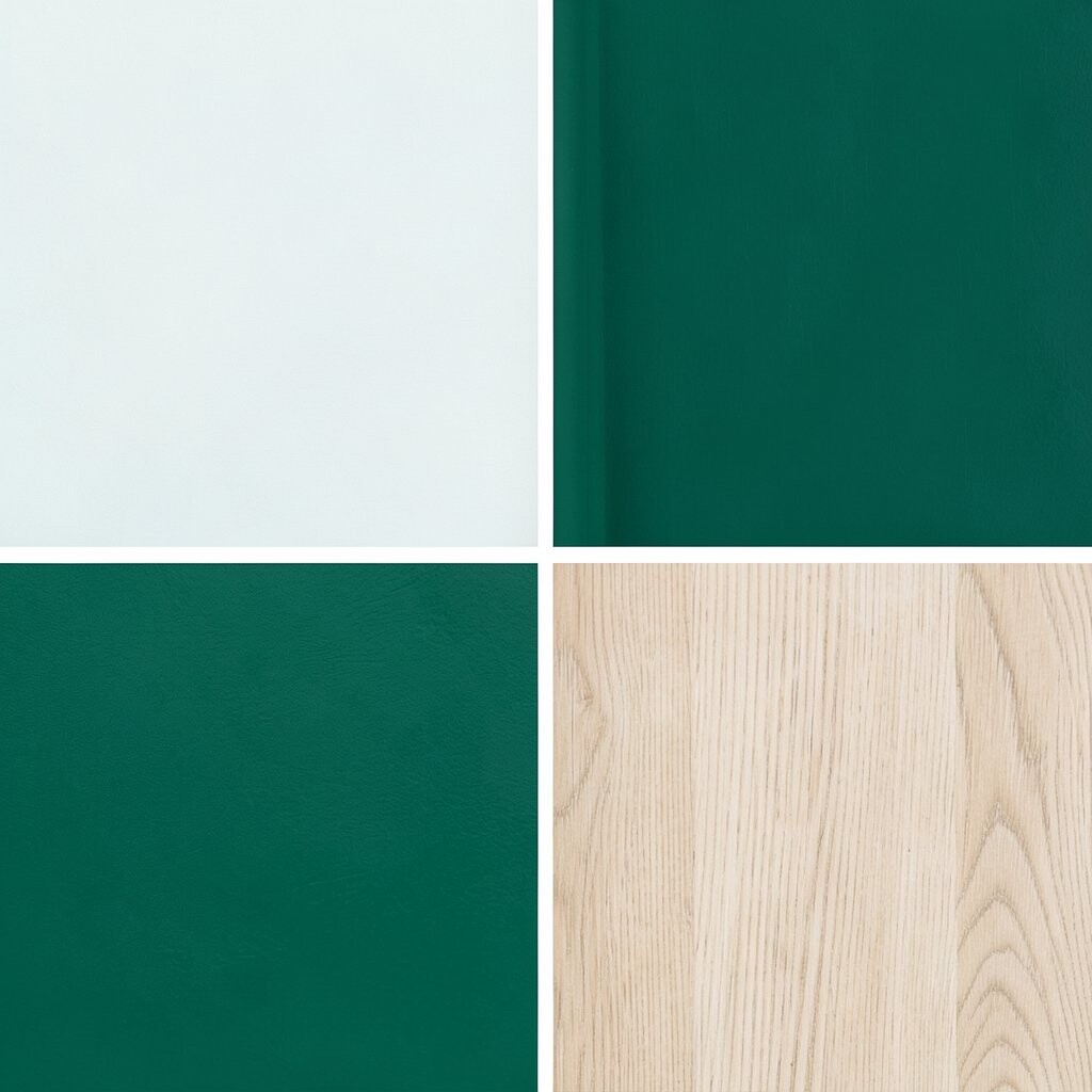
Emerald green adds bold beauty, while white keeps the room open and bright. Light oak brings warmth and stops the palette from feeling too dark.
This mix is a strong choice for offices, dining rooms, and entryways. It stands out because emerald feels rich and lively, yet still calm when paired with clean white. Try a green accent wall, white curtains, and oak furniture for a fresh, stylish effect.
Many people use this kind of palette in current home design because it feels both classic and fresh. For a lower-cost version, choose one bold green item and build around it with simple neutrals.
Add your own style with gold frames, books, or plants to make the room feel more personal.
14. Raspberry, Soft Gray, and White
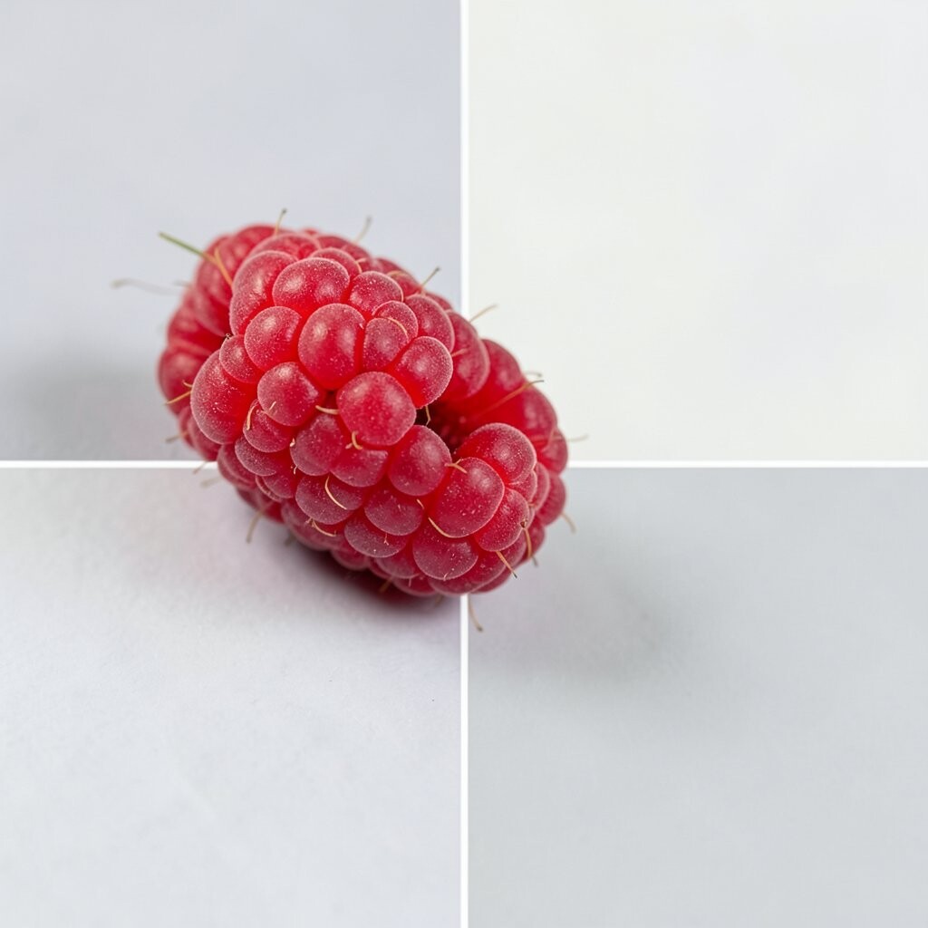
Raspberry brings a juicy burst of color, and soft gray helps it feel smooth and modern. White keeps the whole palette bright and easy on the eyes.
This palette works well in bedrooms, creative spaces, and cozy lounges. It feels unique because it is bold but still elegant. You can use raspberry in a chair, rug, or accent wall and let gray and white calm the look down.
If you want to keep spending low, add color through art, blankets, or small decor pieces first. This palette also fits well with modern trends that favor strong accent colors in simple rooms.
15. Turquoise, Sand, and Driftwood Brown
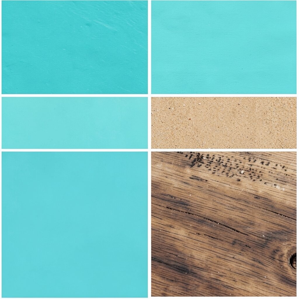
Turquoise adds a fresh splash of color, while sand and driftwood brown create a relaxed, beachy feel. The mix can make a room feel bright, easy, and full of life.
This palette is a great fit for patios, bathrooms, and relaxed living spaces. It feels unique because it brings the calm of nature and the energy of water together. Try turquoise pillows, sand curtains, and driftwood-style furniture for a look that feels breezy and inviting.
For a budget-friendly version, use this palette in textiles and small decor instead of large changes. Add shells, woven baskets, or simple coastal art to make the room feel more personal and complete.