Your walls can feel dull even when everything else is perfect. A tile mosaic adds color, texture, and a little wow factor.
From tiny accents to bold statements, these ideas help you design something personal without making the room feel busy.
1. Sunburst Mosaic Behind a Reading Chair

Picture a warm sunburst pattern centered behind your favorite chair. Each curved tile line radiates outward, making the whole corner feel alive.
Use small square tiles for the rays and keep the center slightly brighter for a glowing effect. Choose honey, cream, and soft orange shades to match natural light, or pick jewel tones for a deeper mood. If you want it easier, sketch the sunburst on paper first and tape a guideline to the wall before you start.
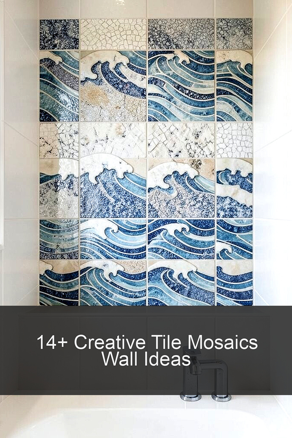
2. Coastal Wave Tiles in a Bathroom Niche

Imagine gentle waves wrapping the inside of a built-in niche. The pattern looks calm and helps the space feel cleaner the moment you step in.
Go with blues, sea glass greens, and white highlights so the water vibe stays fresh. You can make the waves feel more realistic by using slightly different tile sizes or subtle shifts in color. For practical results, waterproof the surface well and use grout that resists mildew, especially in high-moisture areas.
For personalization, add a thin band of tiny pearlescent tiles along the edge like a splash of light. If you’re working on a budget, focus the full wave pattern on the niche back only and let the surrounding wall stay simple. This approach keeps costs lower while still looking like a designer finish.
3. Geometric Tile Arches Over a Console

Think of arches made from crisp mosaic lines that frame your entry or living room console. The curved design draws the eye and makes even a narrow hallway feel wider.
Choose contrasting grout colors for sharp definition, like white grout against darker tiles or dark grout against light tiles. Start by laying dry pieces on the floor so your curve stays smooth and the spacing matches. A good match to current style is mixing matte tiles with a few glossy accents for controlled shine.
To personalize it, echo the colors from nearby art or a rug by using one bold shade for the arch center. If you want to keep costs down, use a smaller mosaic area and let the console lighting do the rest. You’ll get impact without needing to tile an entire wall.
When installing, use a level and a flexible adhesive so the arch doesn’t drift while it cures. Clean as you go because dried grout can dull the crisp look.
4. Color-Blocked Mosaic Gallery Wall

Picture a grid of mosaic squares that behaves like a friendly artwork. Color blocks bring movement to a wall while still looking organized.
Pick a palette that matches your room, then vary the tile finishes for depth. Matte tiles reduce glare, while small glossy pieces add sparkle when light hits them. For a practical build, choose a consistent tile thickness and measure your spacing carefully before mounting.
To personalize the wall, include a few “signature” tiles like tiny hexagons or long rectangles as accents. If you’re cost-conscious, use fewer expensive tiles and fill the rest with solid, budget-friendly options. This still looks intentional because the color plan does most of the heavy lifting.
5. Handwritten-Look Monogram Tile Border
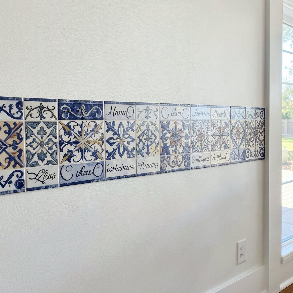
Imagine a monogram made from small tiles, with curves that resemble handwritten lettering. It turns a plain wall into something warm and welcoming.
Choose one letter shape, then outline it with a thin contrasting grout line for clean edges. You can keep the design subtle by using mostly neutral tiles, then add a splash of color on the inner strokes. A monogram works well around a doorway, above a dresser, or behind a desk without overwhelming the whole room.
For personalization, coordinate the letter style with your home decor, like modern straight angles or classic rounded forms. To manage cost, use a limited area and buy tiles by the sheet where possible. Even a small border can feel like a custom piece.
Before you apply anything, mock the letter on kraft paper so you can adjust size and placement. Dry-fit pieces help you confirm the readability from standing height.
6. Mosaic Tree of Life for a Cozy Nook

Picture a tree made from layered tiles that climbs upward like a slow daydream. Branches formed by tiny pieces add texture you can almost feel.
Use earthy greens, warm browns, and soft cream to keep the design gentle and natural. The mosaic works especially well in a reading nook, kid’s play area, or a calm corner in the living room. For practical steps, plan the layout in sections so it stays balanced and not lopsided.
To personalize, include small “leaf” clusters in your favorite colors or match the tree to a plant theme in the room. If you want to control cost, make the trunk and major branches detailed, then simplify the leaves with fewer tile tones. This gives the look of complexity without buying every possible color.
Make it easier to install by choosing pre-mapped mosaic sheets for the leaves. You’ll get a neat finish with less cutting.
7. Metallic Accent Ripple Above a Bar Cart

Visualize a ripple band of metallic and neutral tiles hovering above your bar cart. When the light catches it, the room feels more festive without adding clutter.
Try silver, champagne, or bronze tiles, then pair them with cream or taupe surrounding tiles. Keep the ripple narrow so it reads like a highlight rather than a full wallpaper. This style fits what many people love right now, mixing warm metals with simple backgrounds.
For personalization, adjust the ripple direction to match your wall length and make it feel like it follows the flow of the room. If you’re keeping costs in check, concentrate the metal tiles in the center band and use budget-friendly solid tiles for the rest of the wall. A small shine can feel more luxurious than large coverage.
8. Tiny Tile “Starlight” Pattern in a Nursery

Imagine a field of tiny mosaic stars sprinkled across a wall like a gentle night sky. It’s playful, soothing, and still looks beautiful when the room grows up.
Use dark navy or charcoal as the base, then choose small white and silver tiles for the stars. You can add a few slightly larger star shapes to create a pattern that feels intentional. Practical installation matters here, so keep edges clean and avoid rough grout lines where a child might touch.
To personalize, pick a theme that matches the rest of the nursery, like ocean stars, galaxy colors, or simple constellations you draw with grout. For cost considerations, star patterns let you use small amounts of special tiles while keeping the majority affordable. It also reduces the amount of cutting, which saves time.
Use a soft lighting fixture so the stars glow instead of glare. Low glare keeps the room calm at bedtime.
9. Mosaic Fireplace Surround With a Modern Frame

Picture the fireplace getting a crisp mosaic frame that makes the whole area feel finished. The warmth of the fire plus the sparkle of tile turns the center of the room into a statement.
Choose heat-friendly tiles and keep your pattern simple around the firebox. A modern trend is using large mosaic blocks or a clean vertical line motif for structure. Practical tips include using proper mortar rated for your surface and ensuring the area can handle temperature changes.
Personalize the surround by matching the palette to your existing finishes, like matching stone tones or adding a single color that ties to throw pillows. If cost is a concern, focus the most detailed mosaic on the visible face and keep side sections lighter. That way you get high impact where people actually look.
10. Mosaic Waterfall Accent on a Stairway Landing

Imagine tile pieces flowing down the wall like a mini waterfall. The motion feel makes stair landings less awkward and more inviting.
Work with diagonal or staggered lines to create the “fall,” using a gradient from deeper tones at the top to lighter tones at the bottom. This kind of shading looks great in photos and in person because it adds depth. For practical safety, use tiles that won’t chip easily and grout that holds up to foot traffic and cleaning.
To personalize, borrow colors from nearby walls or banisters so it feels connected, not random. For budget, you can tile only the feature strip instead of the full landing wall. The waterfall effect still works because the eye follows the movement.
Keep your lines straight by using guides and checking alignment after each few rows. Taking small breaks helps you stay accurate.
11. Monochrome Mandala Centerpiece on a Feature Wall

Picture a mandala made from concentric tile rings that pull your eyes toward the center. Even a monochrome palette can feel rich because of texture and rhythm.
Choose black, white, gray, or off-white tiles, then mix matte and glossy pieces for contrast. A mandala can be a great way to personalize a living room because it gives the wall a focal point without needing big furniture changes. Practical installation works best when you build the design outward in layers, checking symmetry as you go.
To keep costs down, use a limited number of tile colors and rely on variation in finish rather than buying many shades. Current trends often favor calm neutrals with strong patterns, and this fits that look nicely. Consider placing a small shelf below so you can display a plant or a framed print to complete the scene.
When grouting, use a consistent application technique so the pattern stays sharp. Wipe carefully so haze doesn’t dull the tile shine.
12. Patchwork Mosaic in a Laundry Room or Mudroom

Imagine a patchwork wall that looks like fabric squares, but made from tile. This design adds character to hardworking spaces that usually stay plain.
Use small rectangles or squares in coordinating colors, then vary the pattern density so it feels lively. A patchwork wall helps the room feel brighter because it reflects light in many directions. For practical tips, choose tiles that handle frequent cleaning and moisture, and seal grout if your tiles are more porous.
Personalize the patchwork by repeating a couple of your favorite colors throughout the home, like a sage green and warm cream theme. For cost considerations, mix premium tiles as “hero” pieces and keep the rest budget-friendly. You’ll get the quilt effect without the price of a full luxury wall.
Plan your layout before sticking anything down so the patchwork feels balanced, not random. Label sheets or groups so you don’t lose track mid-project.
13. Framed Mosaic Tile Planks Around a Mirror

Picture a mirror framed by mosaic tile planks like a thin border around a portrait. The border style makes small bathrooms and entryways feel more polished.
Choose planks or long rectangular pieces to create an updated look compared with all-square mosaics. Keep the border thickness consistent, and align grout lines for a clean finish. This is practical because the tile area is limited, which helps you control budget and speed up installation.
To personalize, match the tile direction to your decor, like vertical lines for height or horizontal lines for width. Add a single metallic or glass tile strip in the top section for a bright highlight. Many current home trends favor framed accents because they look custom while staying simple to maintain.
For installation, dry-fit the border pieces and confirm the mirror gap so nothing sits uneven. Once it’s level, adhesive goes smoothly.
14. Colorful Tile Mosaic Message Wall for a Kid’s Space

Imagine a wall that shows playful words made from tile mosaic, like “hello” or a short favorite phrase. The texture turns everyday letters into art.
Use big, readable letter shapes so the design stays clear from a distance. Bright colors help the room feel energetic, but you can still keep it tidy by limiting the palette to a few tones. Practical considerations include using a grout finish that resists staining and cleaning any spills quickly.
Personalize the message by tying it to your child’s interests, favorite animals, or a family motto. If cost matters, form the letters using small tiles only where the outline is needed, then fill with larger sheets. You still get the mosaic charm without spending on every square.
Secure loose edges and avoid sharp tile cuts at kid height. Rounded corners and careful sanding make the final look feel safe and smooth.
15. Oversized Mosaic Ombre Circle for a Foyer Statement

Picture an enormous circle in mosaic tiles centered on your foyer wall. The ombre effect makes the center feel like a soft spotlight.
Start with deeper colors at the outer edge and blend toward lighter tiles near the middle for a calming gradient. This design adds brightness because light tiles reflect more, and the curve guides the eye toward your front door or entry art. For practical tips, consider using mosaic sheets in curved sections so you avoid lots of tiny cuts.
To personalize, echo your home’s style by choosing warm tones for cozy interiors or cool tones for modern spaces. For cost considerations, you can do a partial circle that still reads bold from the doorway, especially if the wall is narrower. This gives a dramatic look while keeping tile use under control.
Take time to measure the center point and dry-fit the curve. A careful layout makes the final mosaic look intentional instead of hurried.